Goldwin
Branding a Japanese Legacy
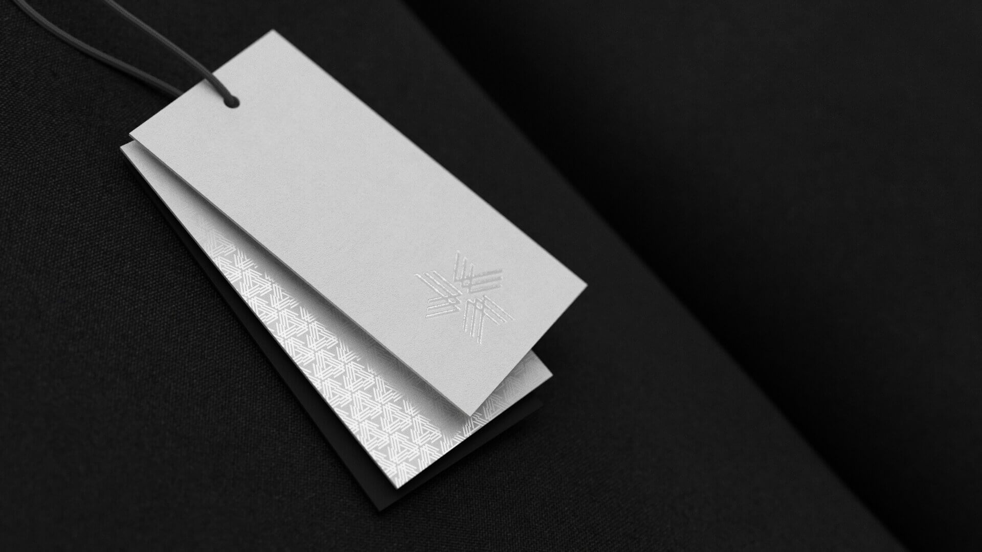
- Brand Identity
- Packaging
- Type Design
For more than 70 years, the unity between humans and nature has been the driving philosophy behind Goldwin. Through an obsessive passion for detail they design products which strive to create a circular economy, rooted in a belief system that the greatest innovations are born from nature’s teachings.
HS was commissioned to re-design the visual identity for this legacy Japanese brand. Our brief was to create an iconic mark and visual system that would carry the organisation and its team forward into their next exciting chapter.
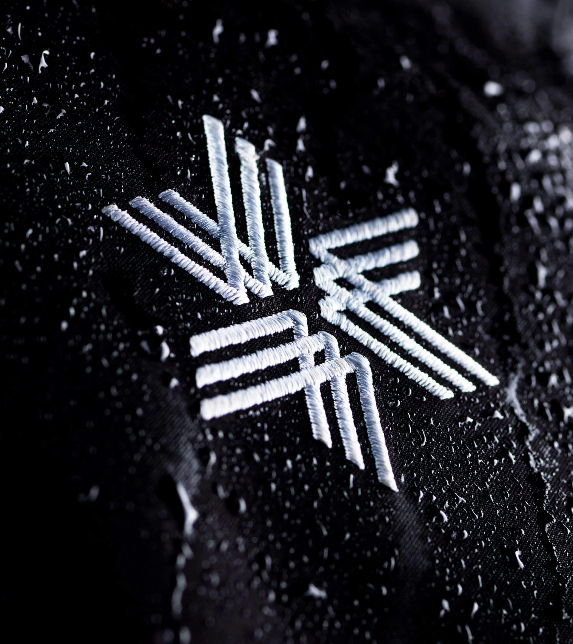
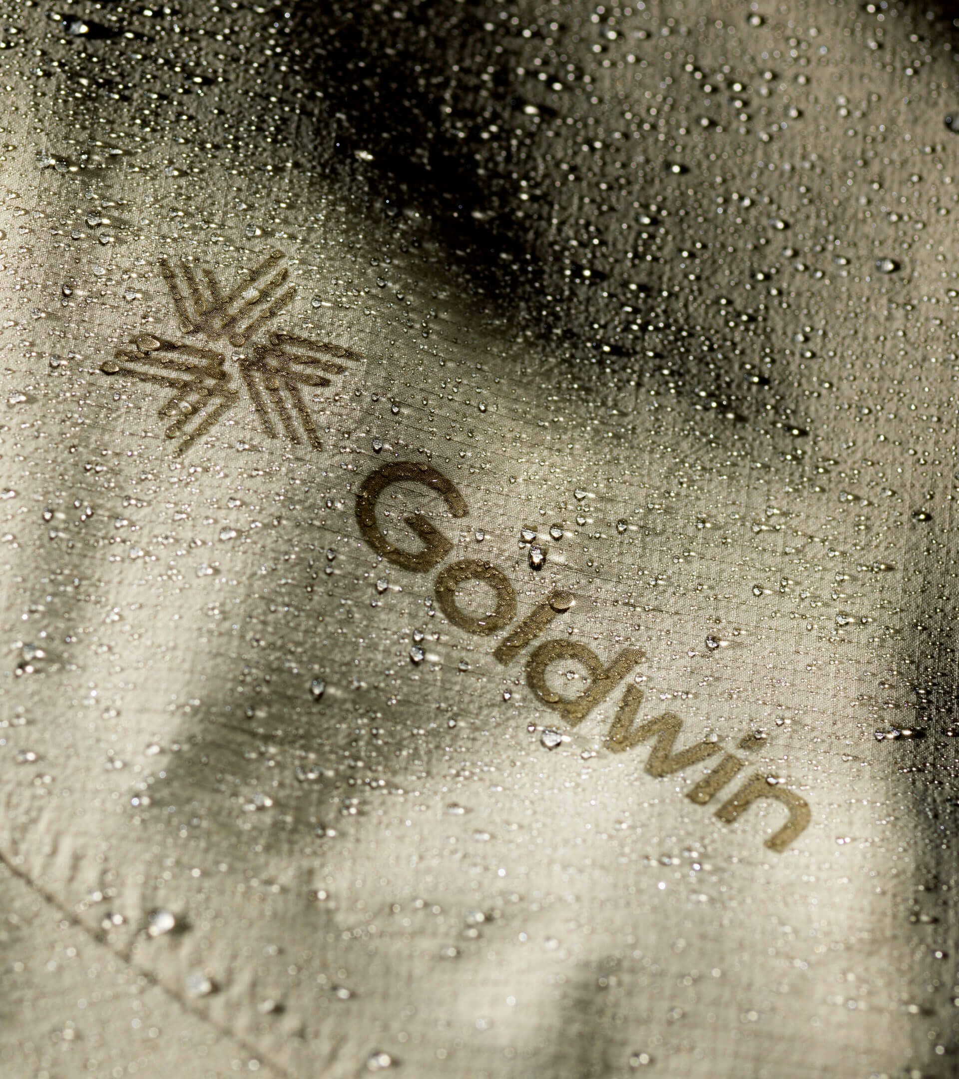
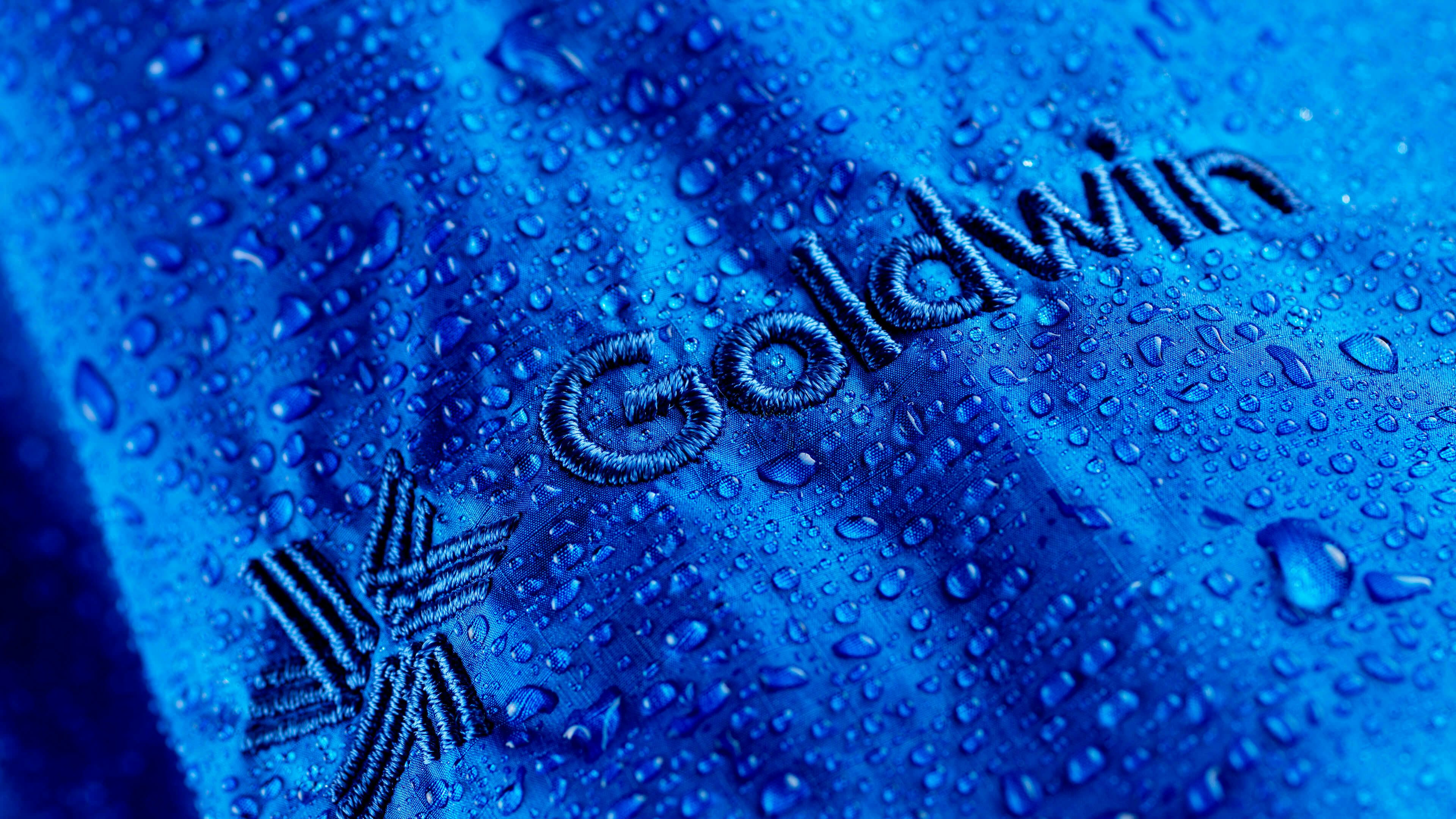
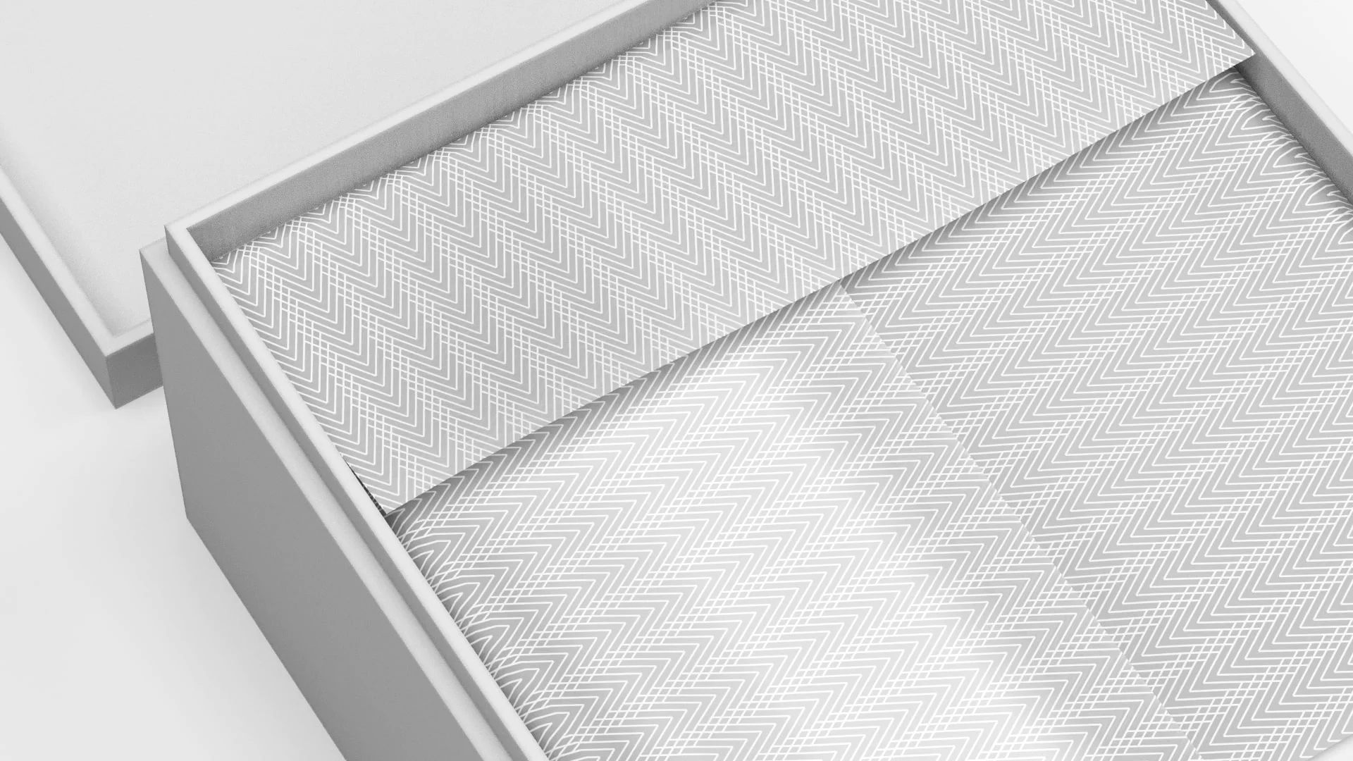
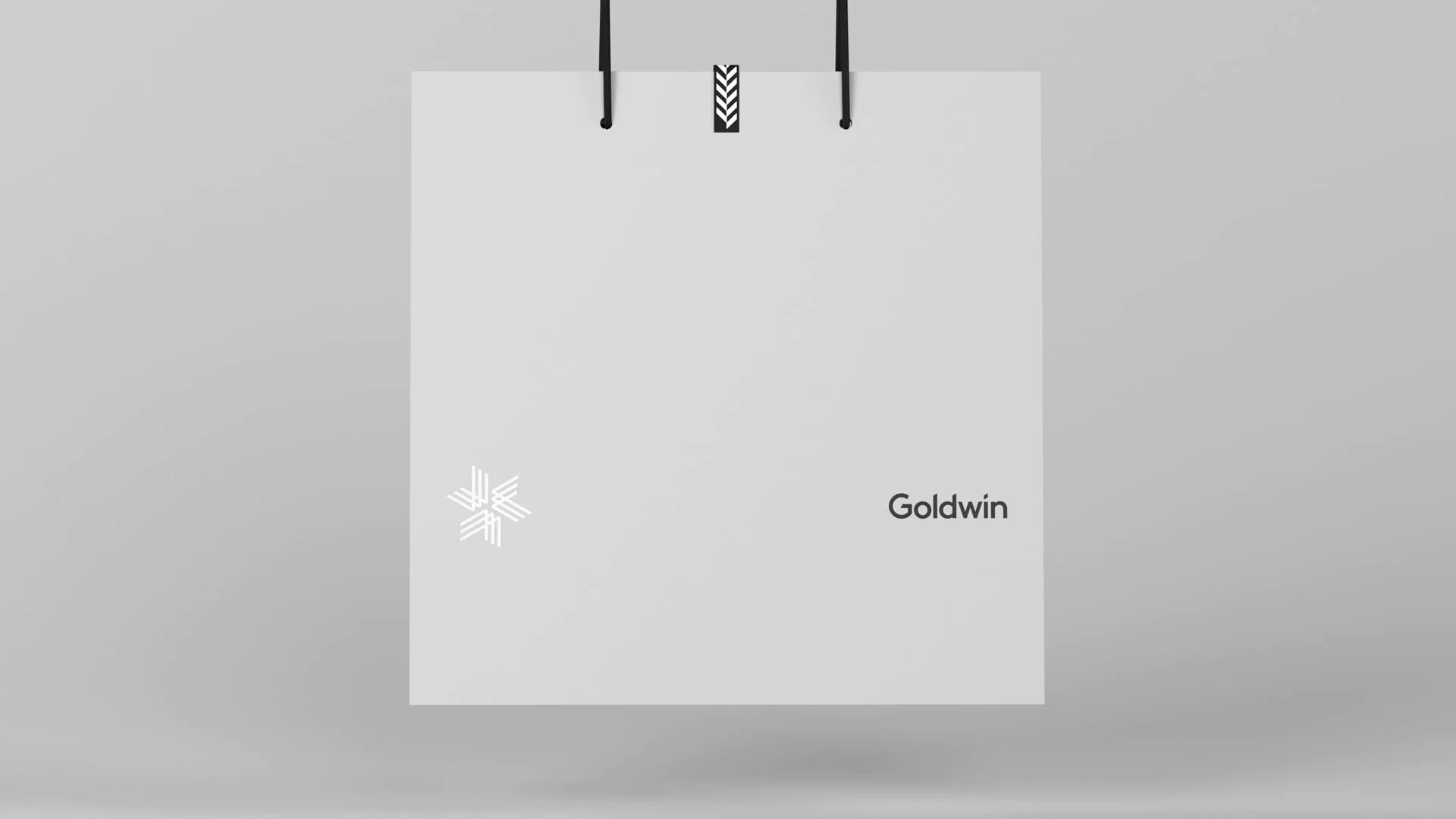
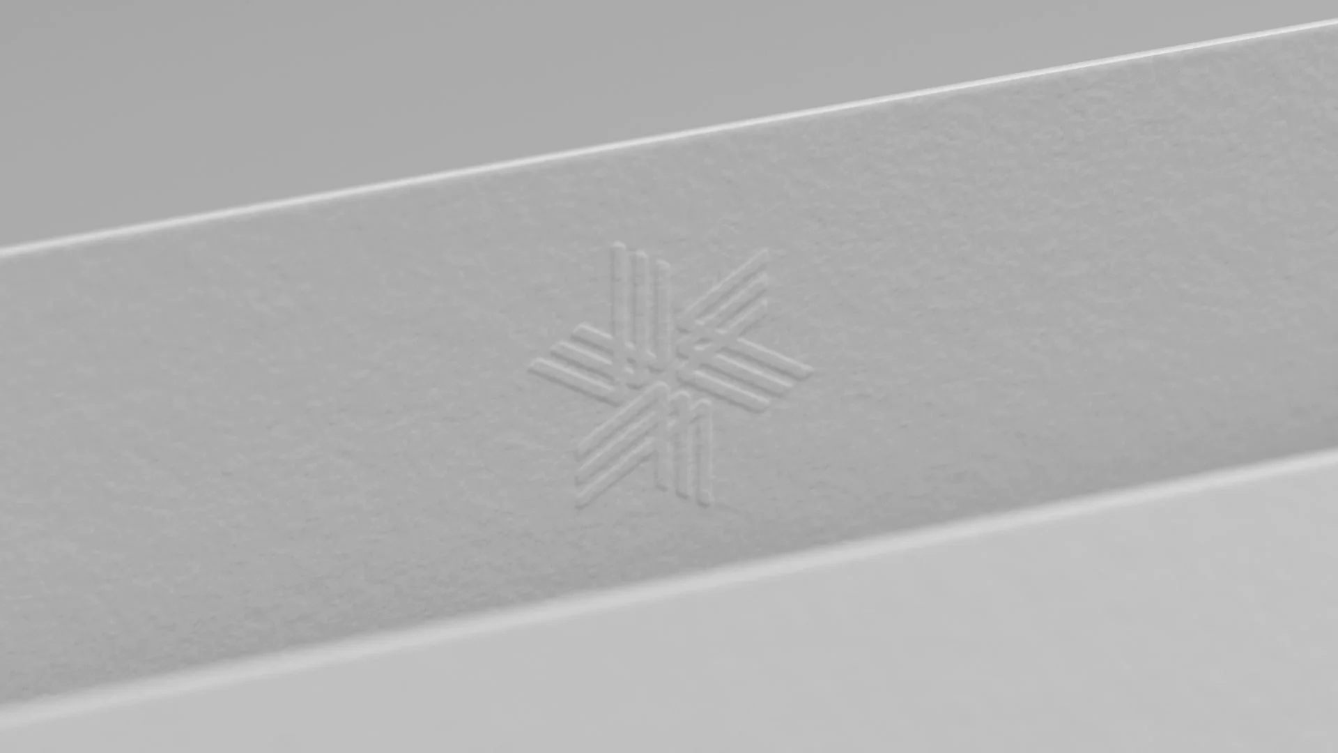
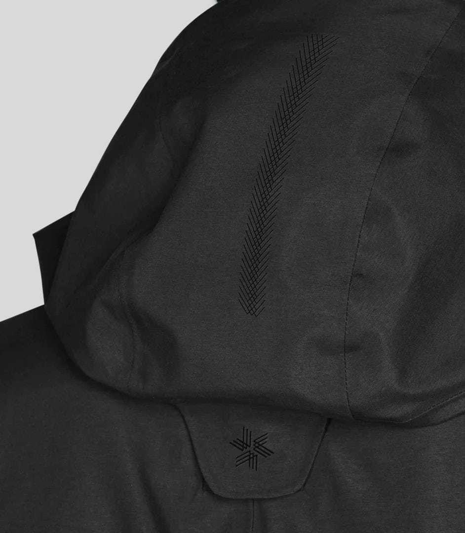
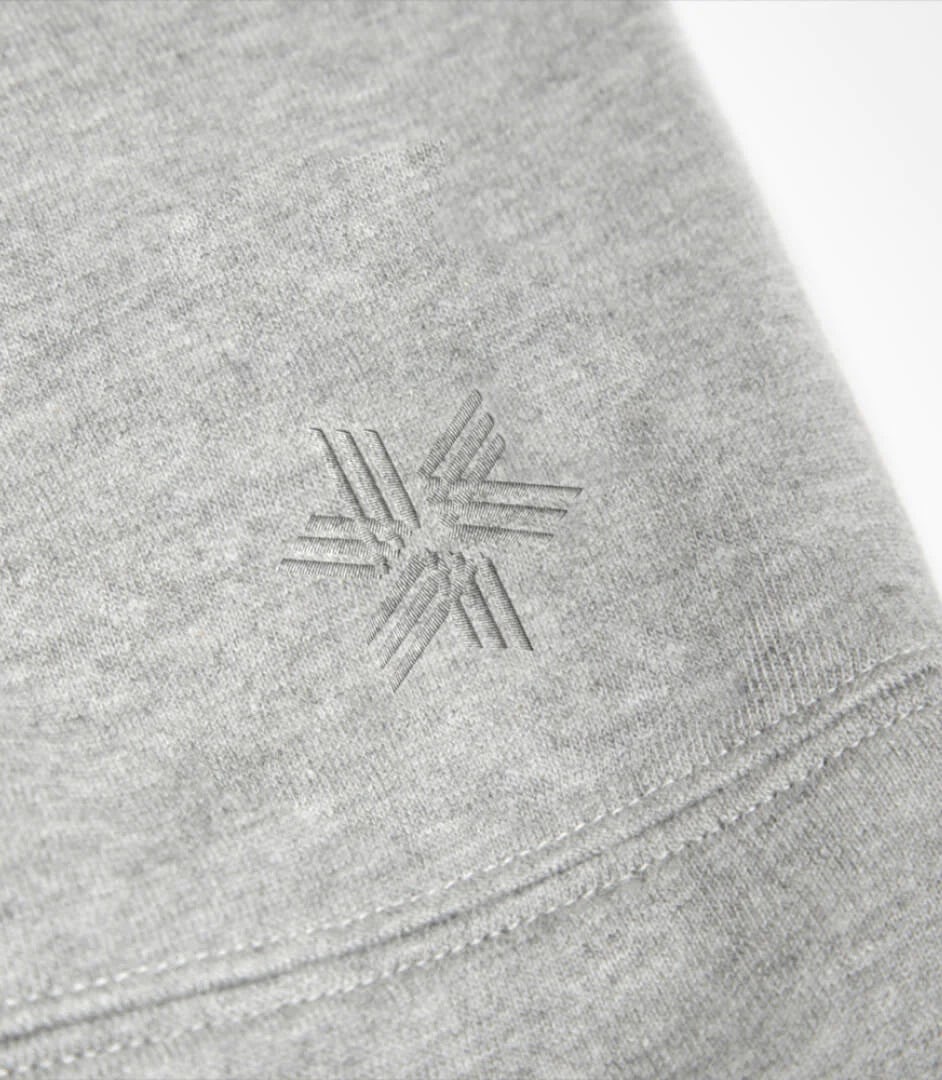
The final mark represents a convergence of three elements – a union of parts which each express a different theme; speed, movement and energy. A subtle nod to the brand’s heritage in ski-wear and athletics is suggested in the dual track lines which together form an emblem that feels kinetic, harmonious and balanced.
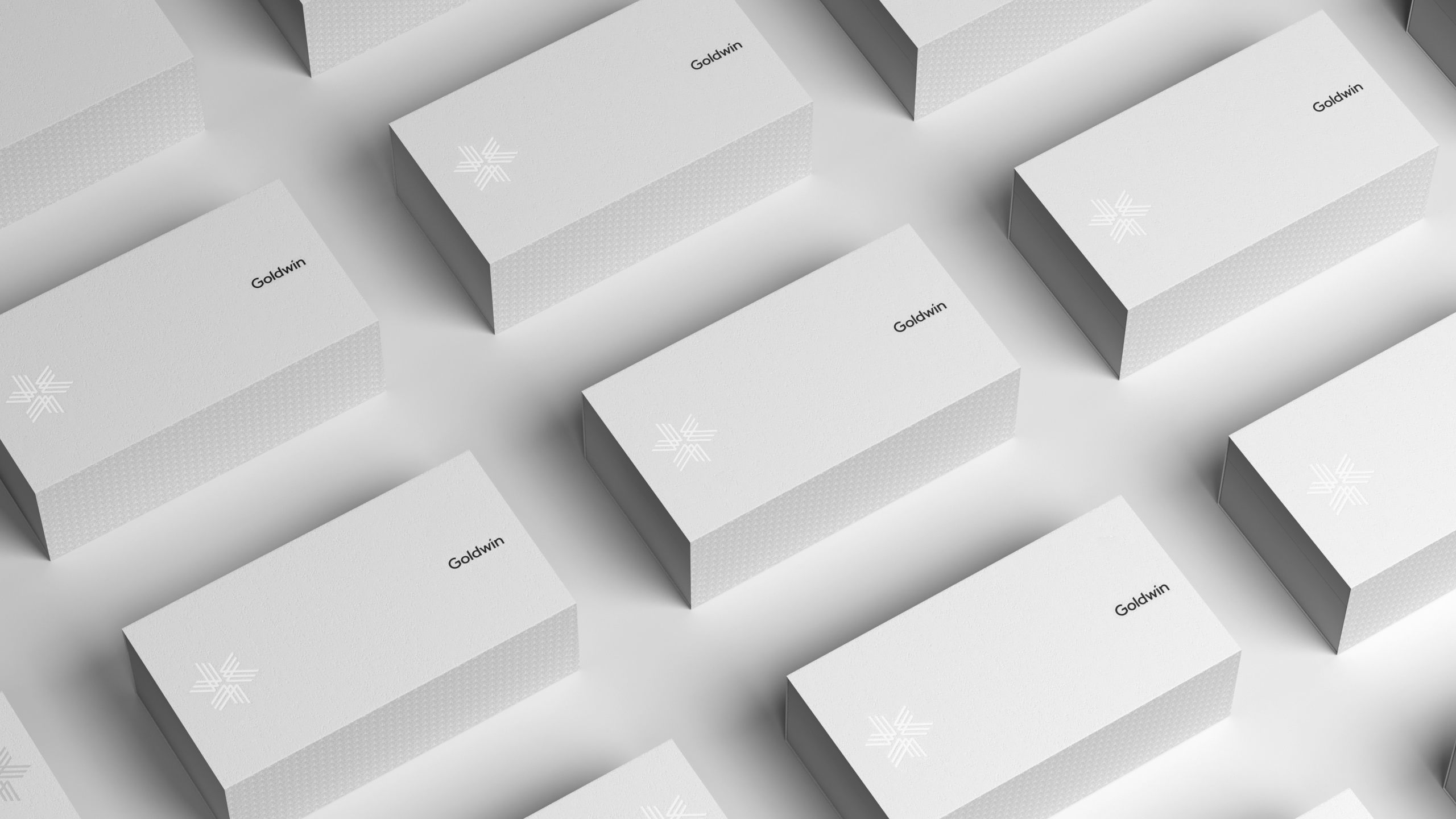
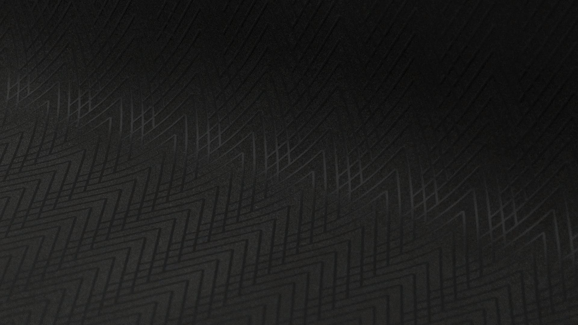
An overarching consideration was the application to clothing and product. Taking a modular approach, the individual elements can be deconstructed and reconfigured in a number of ways – as repeat patterns or embroidery detail. An evolutionary aspect inherent to the form.
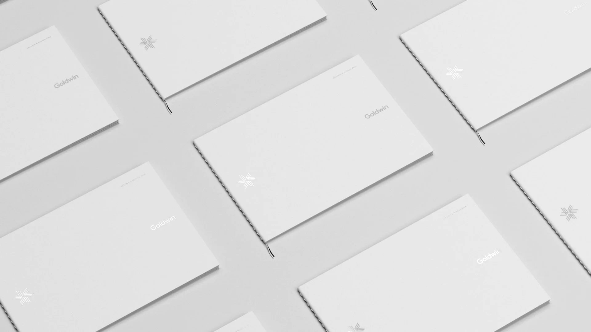
The supporting typeface is a bespoke sans serif designed by HS that features a series of chiselled terminals, echoing the geometry of the mark itself. We created a complete visual tool kit that was implemented across all touch points, from Art Direction, product design to packaging and in-store retail environments.