Editors
Black Gold
- Art Direction
- Campaign
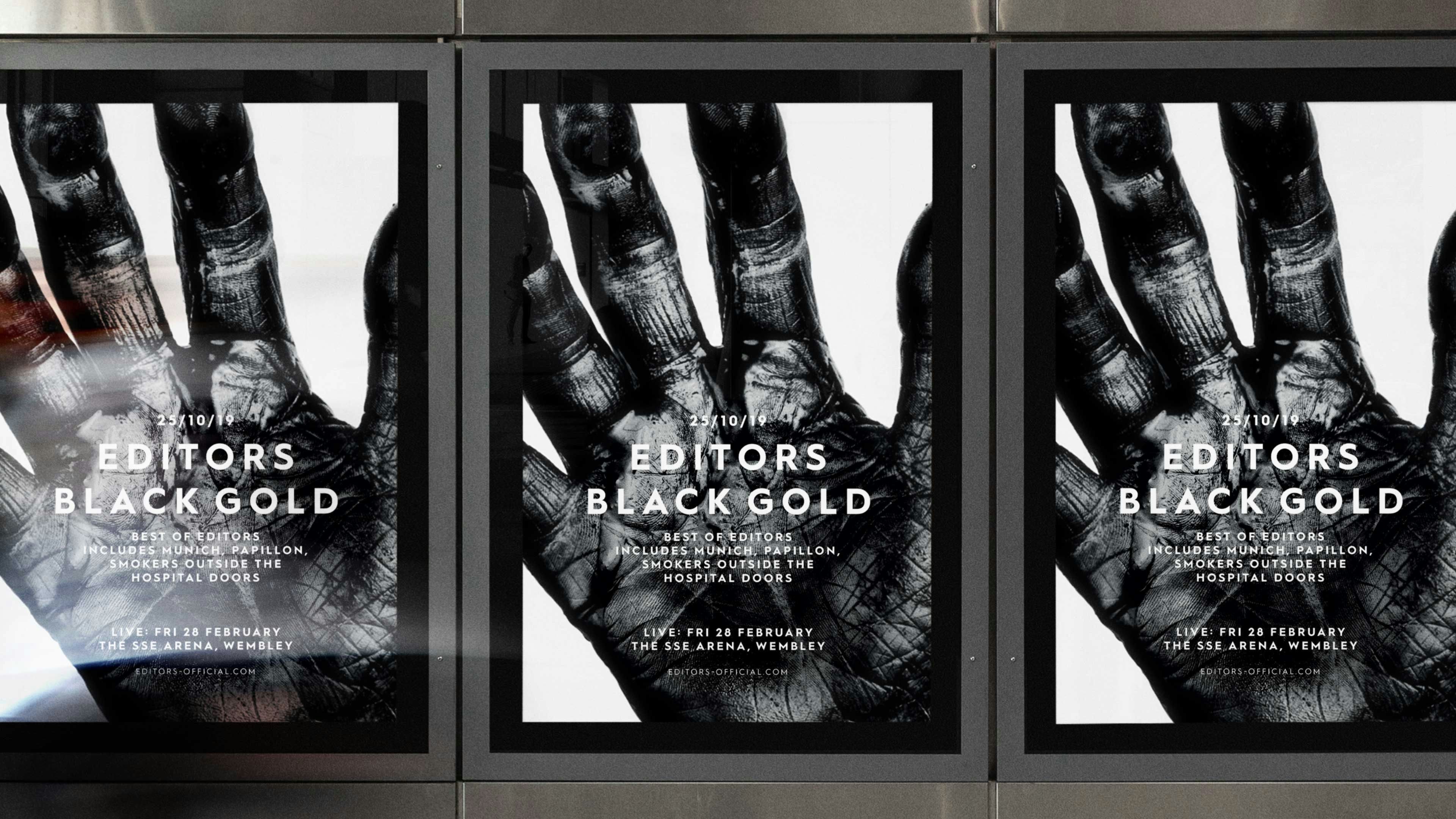
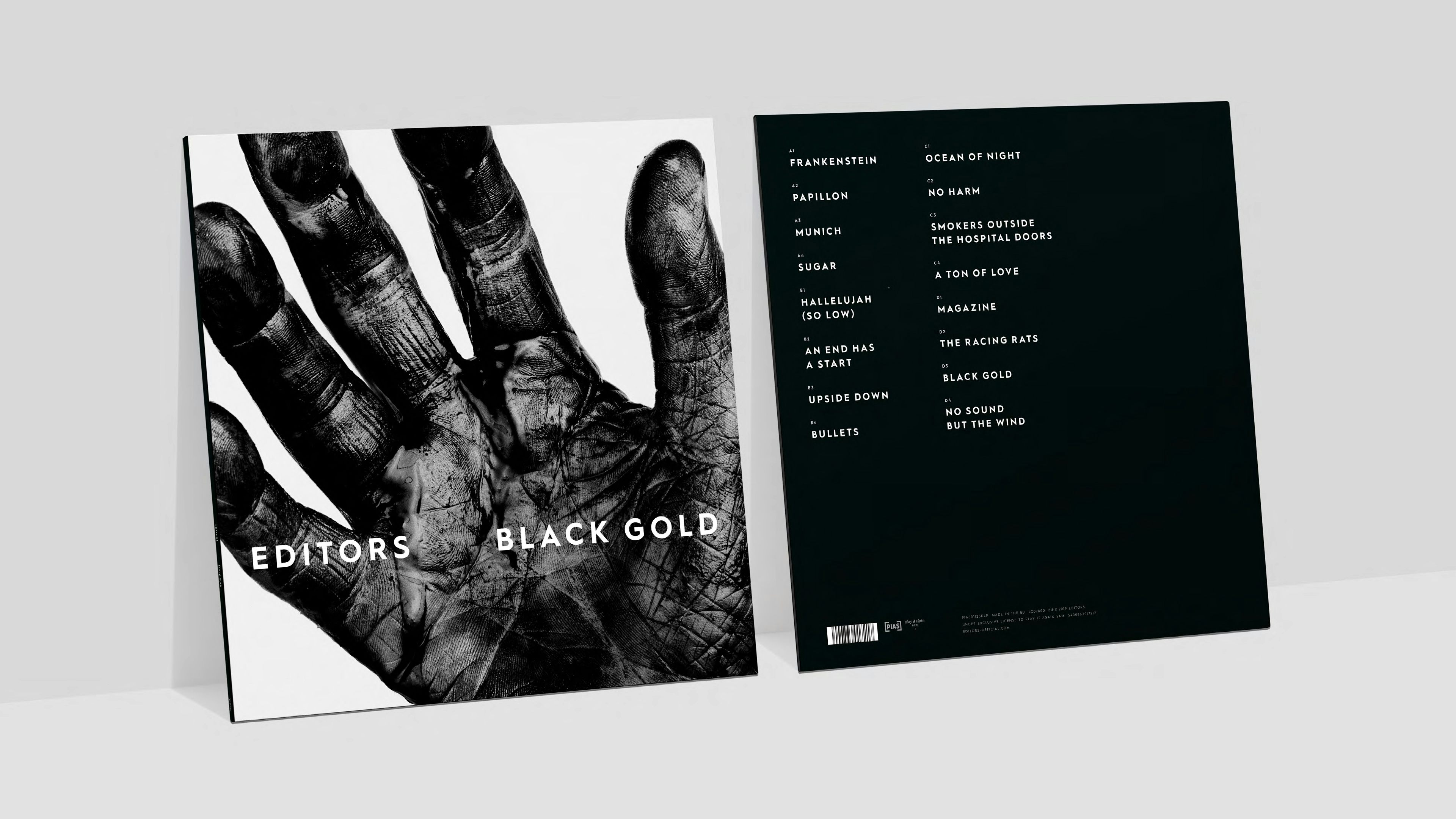
‘Black Gold’ is the term given to crude oil when it is first extracted from the land. Black in appearance and gold because of its inherent value. HS were commissioned to create the campaign and packaging for this compilation album from the Editors.
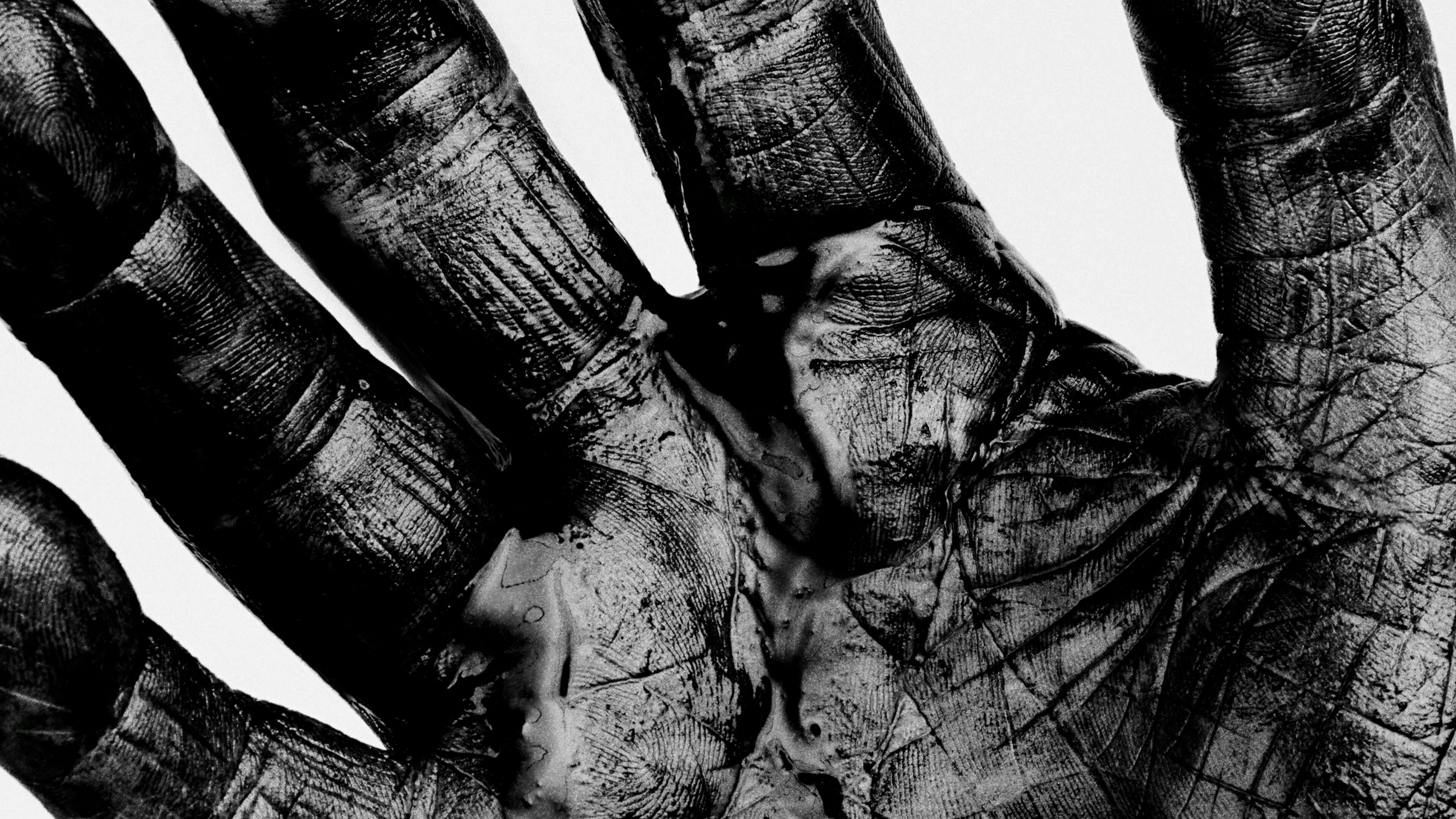
Inspired by Richard Avedon’s early portraits of oil field workers in the American West and Irving Penn’s studies of small trade workers– a simple, graphic still life of an open hand reveals the texture of crude oil engrained into the surface of the skin. A complex tapestry, busy with the threads of life, we wanted to present a living hand cadenced in a world of possibility and connection to others.
Symbolic of power, strength, healing, harvesting and creating, the markings of a hand can reveal so much – an open invitation to discover a world of other stories past and present.
We commissioned Photographer Nadav Kander to shoot this iconic still-life study, alongside portraiture of the band themselves.
Credits
Design and Art Direction: Hingston Studio
Photography: Nadav Kander
Hand Subject: Rodney Hingston