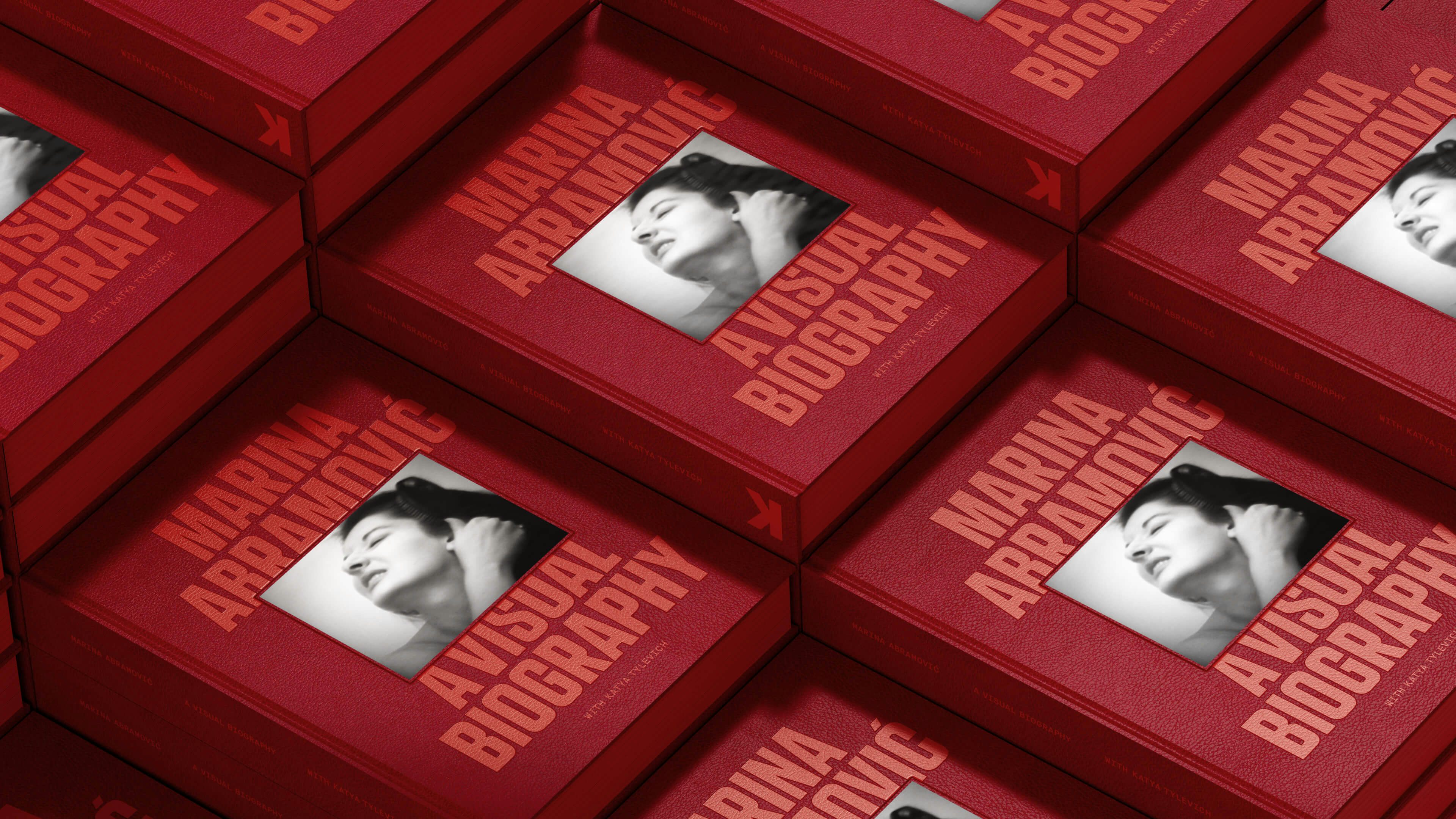
Mas des Infermières
Branding a Mythical Place
- Art Direction
- Brand Identity
- Packaging
- Strategy
- Type Design
- Web Design
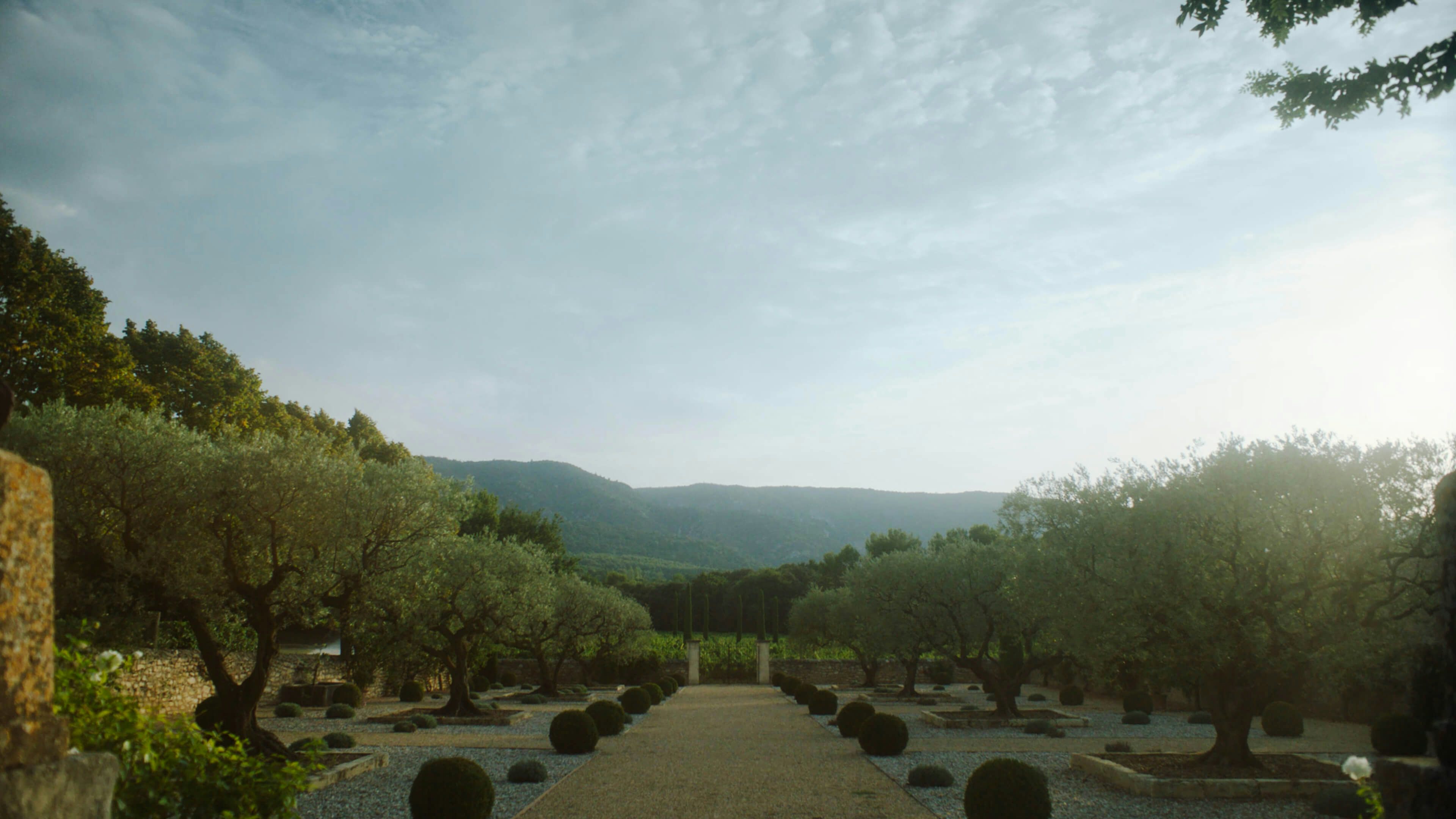
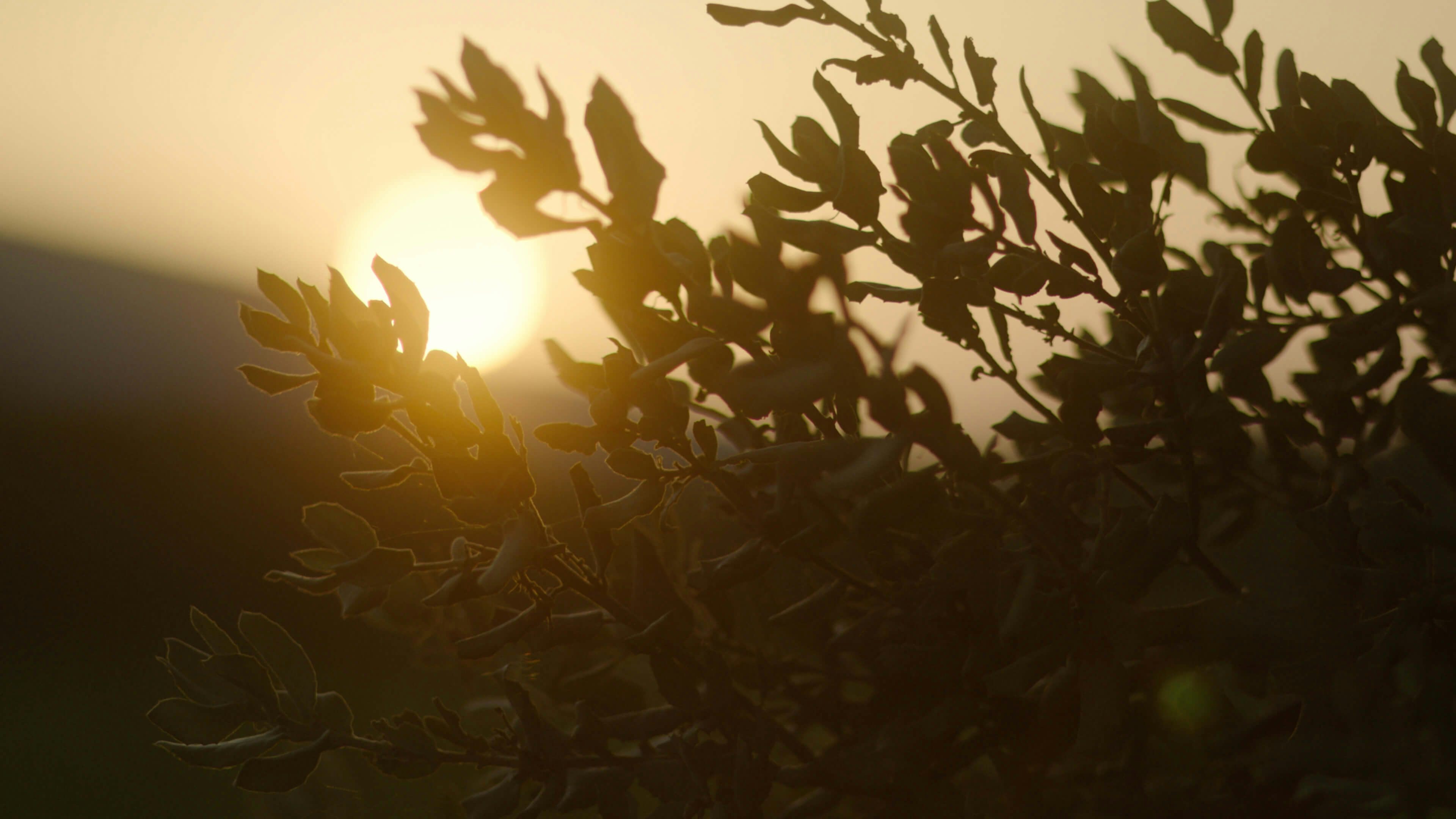
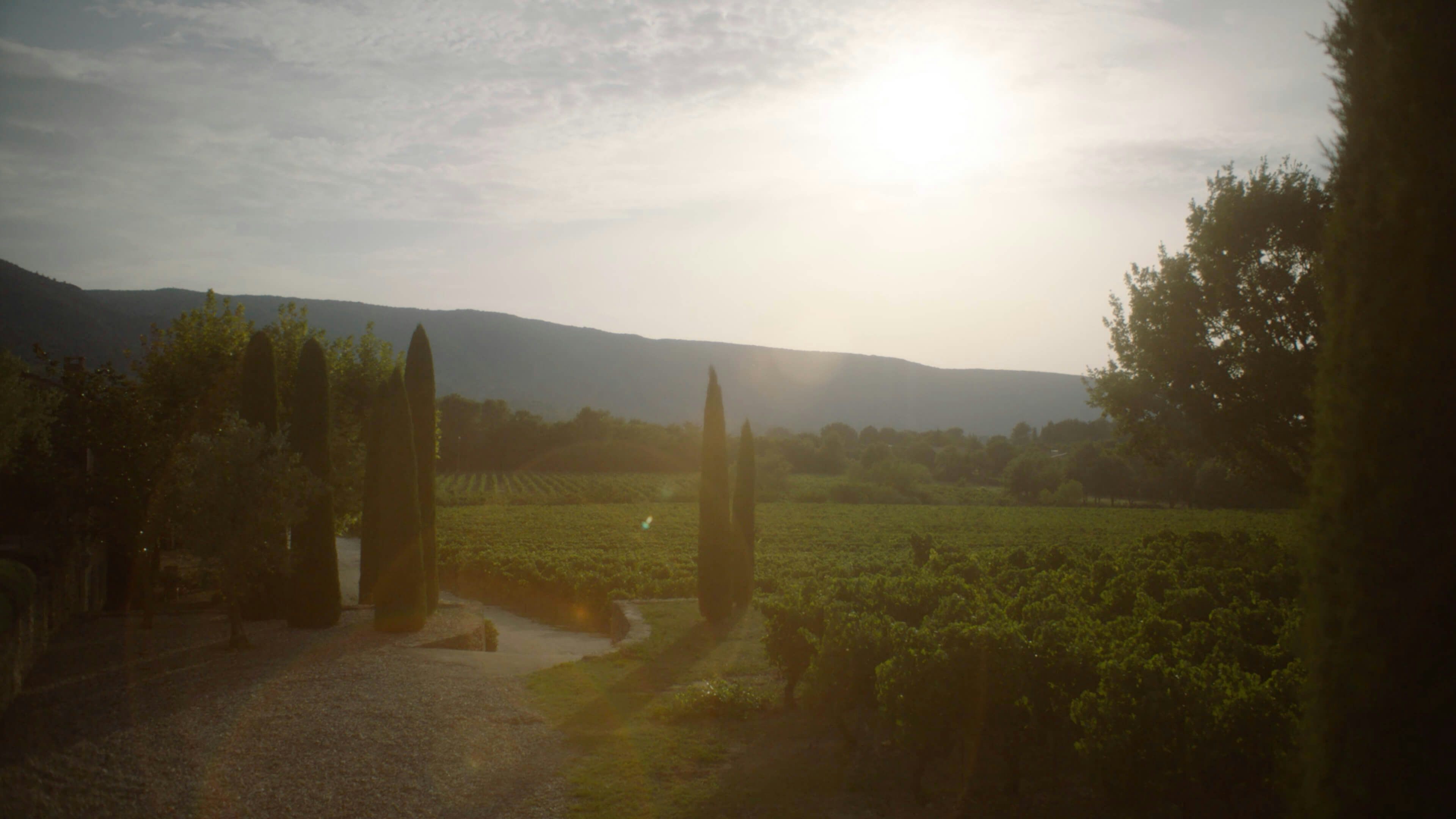
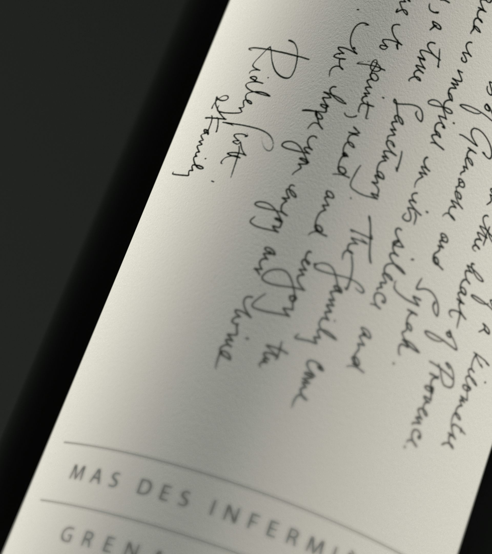
The Mas des Infermières estate is a mythical and private place; a vast, rambling and rich land where exceptional wines are created under the warmth of the Provençal sun. Since 1992 the Scott family have gone there to paint, to read and to enjoy the life. HS worked closely with proprietor Sir Ridley Scott to create the positioning and visual identity for the estate.
The Cave is the product of a long ambition to bring together the excellence of winemaking and the craft of film making into one dedicated space. Guests are invited to explore the estate, whilst immersed in artefacts from Mr Scott’s own cinematic world. Architecturally the Cave draws on features of a classic Provençal cellar yet with a distinctly contemporary approach, a design ethos that is carried throughout the estate.
Storytelling sits at the heart of the Mas. There are many histories – mythical and religious – associated with this area. As one of the greatest storytellers of our time, Mr Scott was keen to draw on these narrative threads and weave them into the world of the brand.
The identity is comprised of a number of component parts.
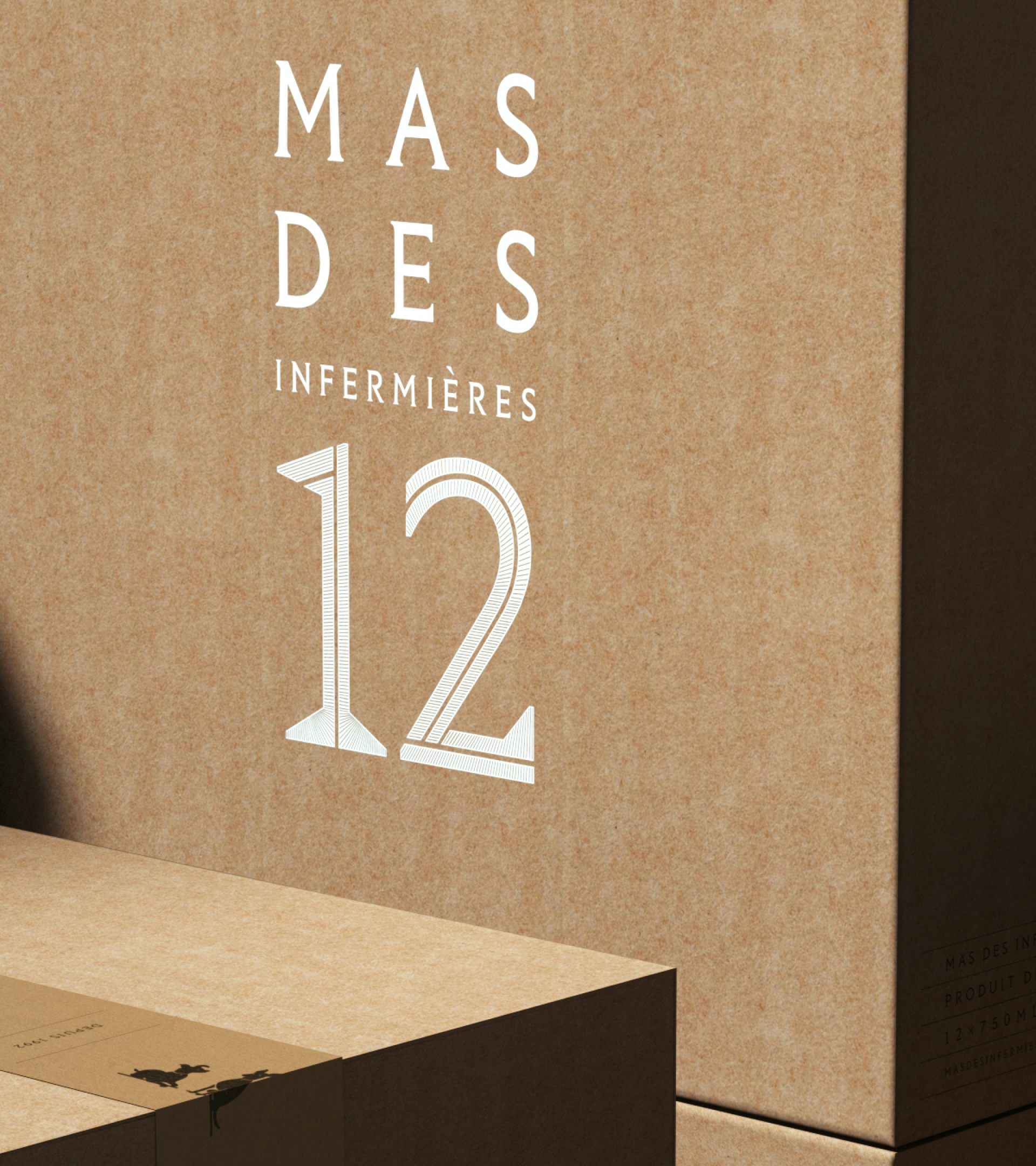
Situated in the historic Luberon region and fed by the ‘Source’, the wonder of Mas Des Infermières can only be discovered by entering through its symbolic gateway – a carved stone lintel inspired by the ancient Sator Square. In early conversations, the Scott family shared images of the Sator located on site. (The Sator square, in brief, is a five-line palindrome, rendered in Latin, of five words: SATOR, AREPO, TENET, OPERA, and ROTAS).
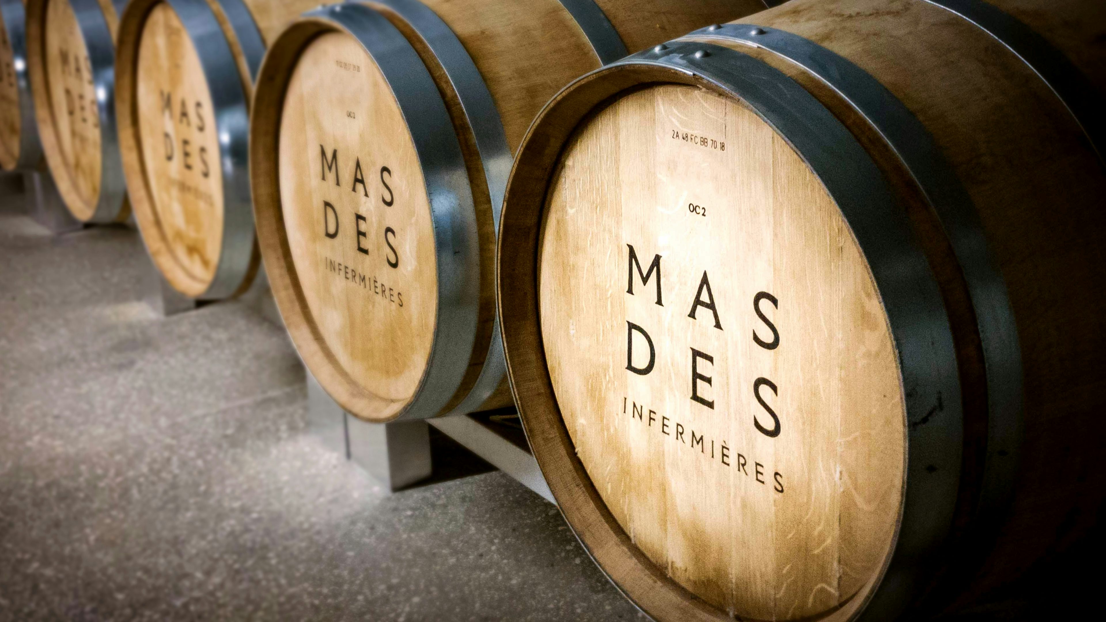
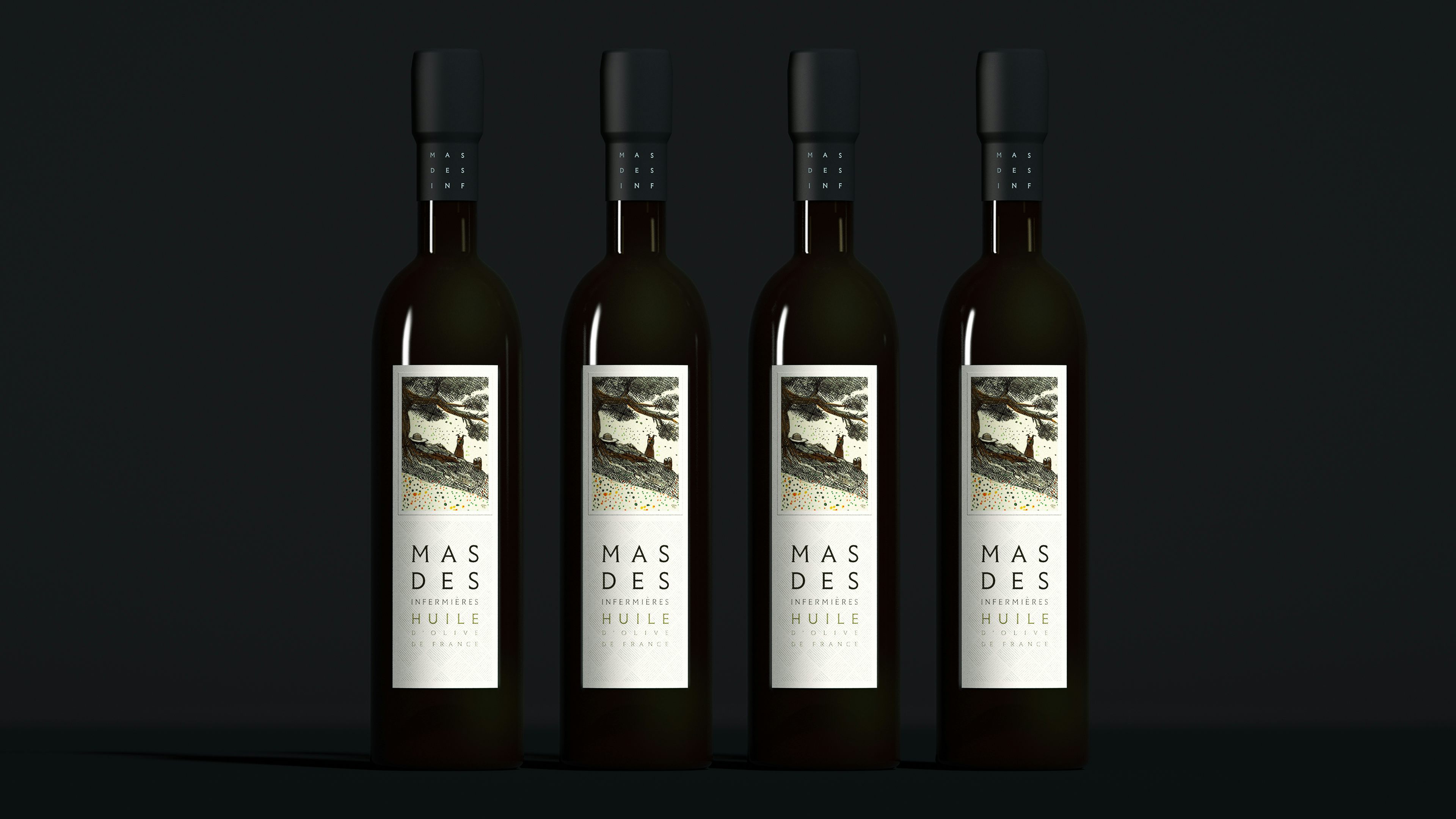
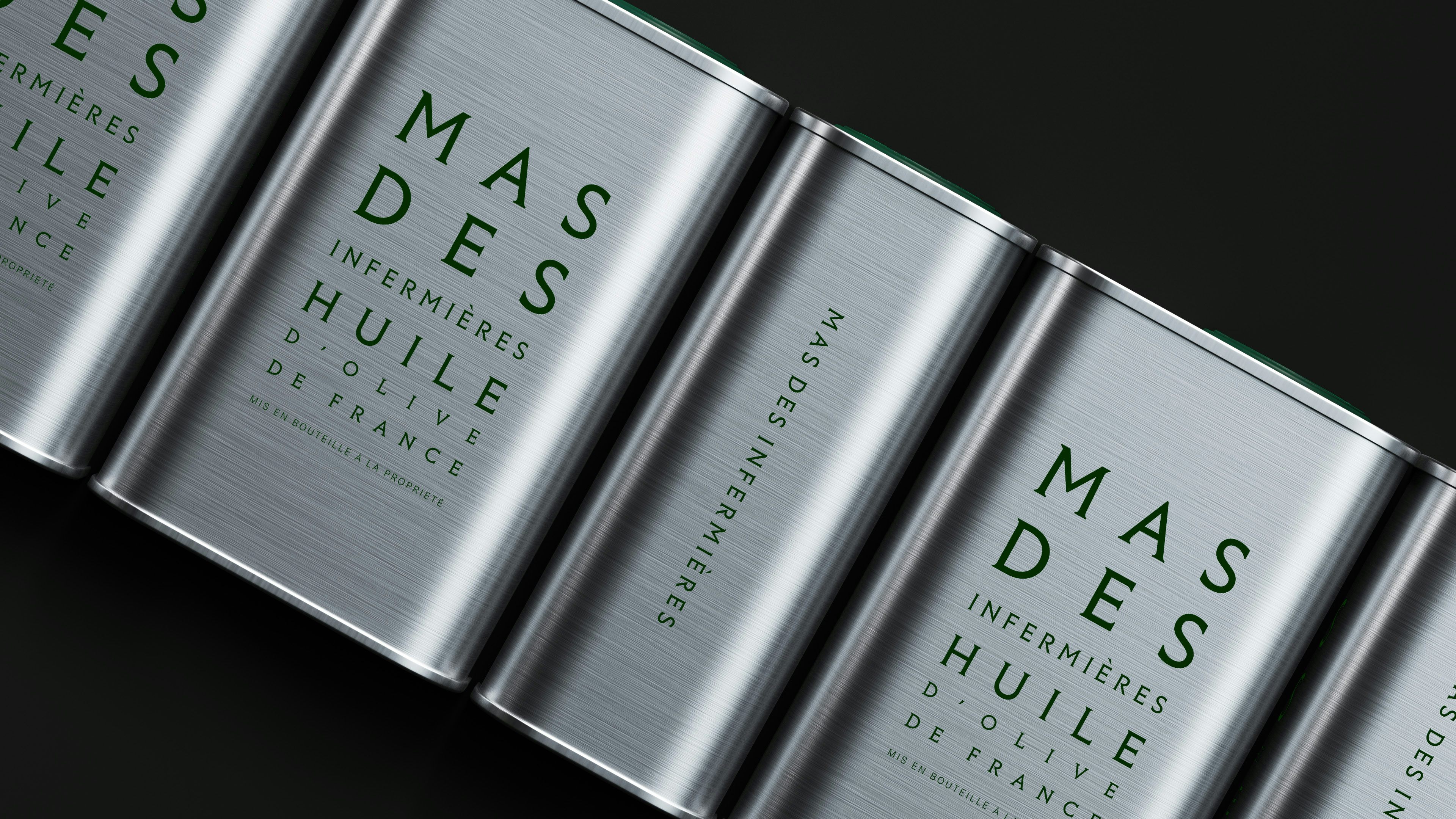
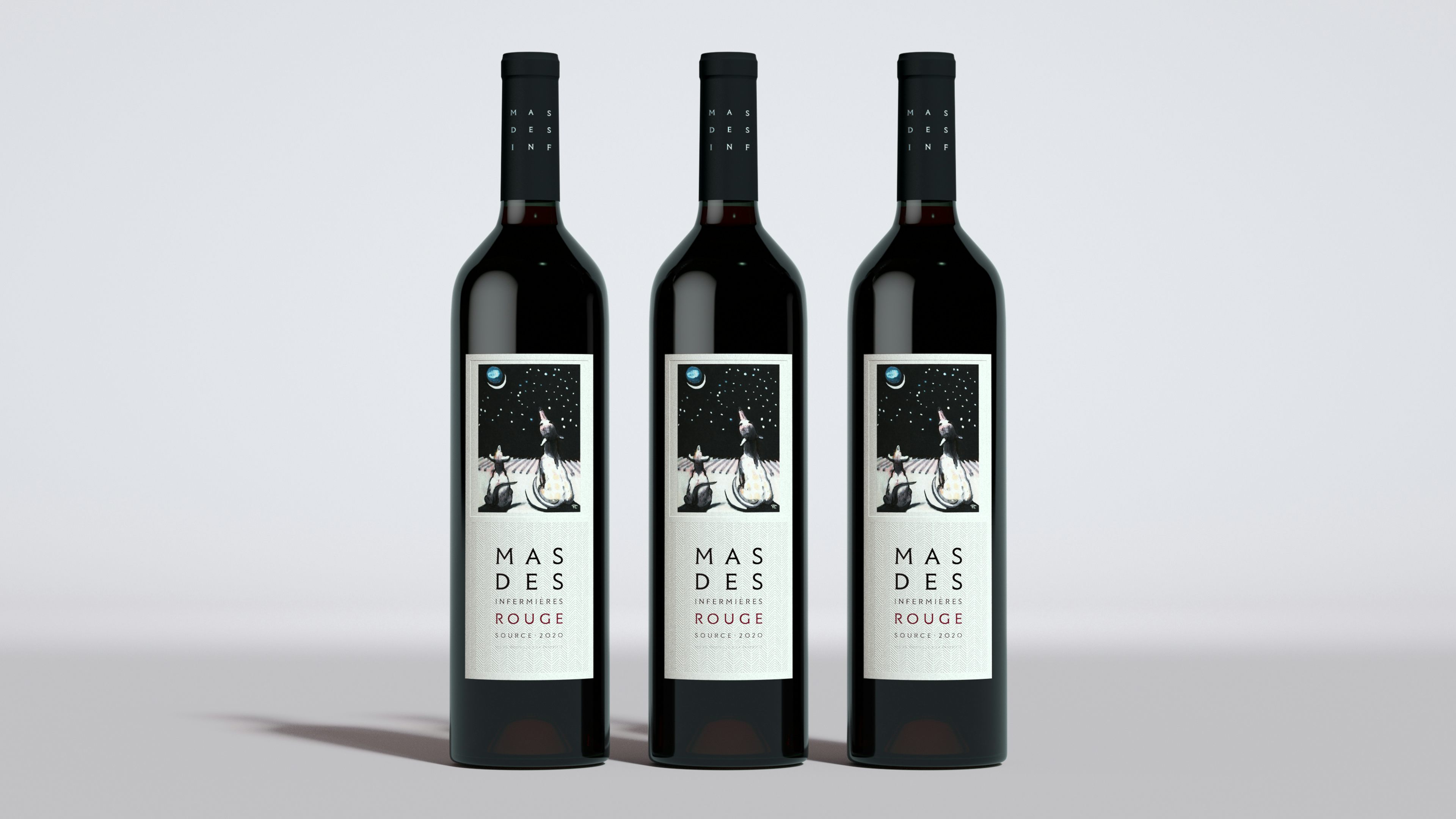
This proved to be the key to unlocking the identity system. Taking inspiration from the 5×5 grid structure formed the basis of our typographic approach. We devised our own interpretation of the grid within the wordmark itself, this was then expanded into the totemic arrangement which plays host to additional information on product labelling.
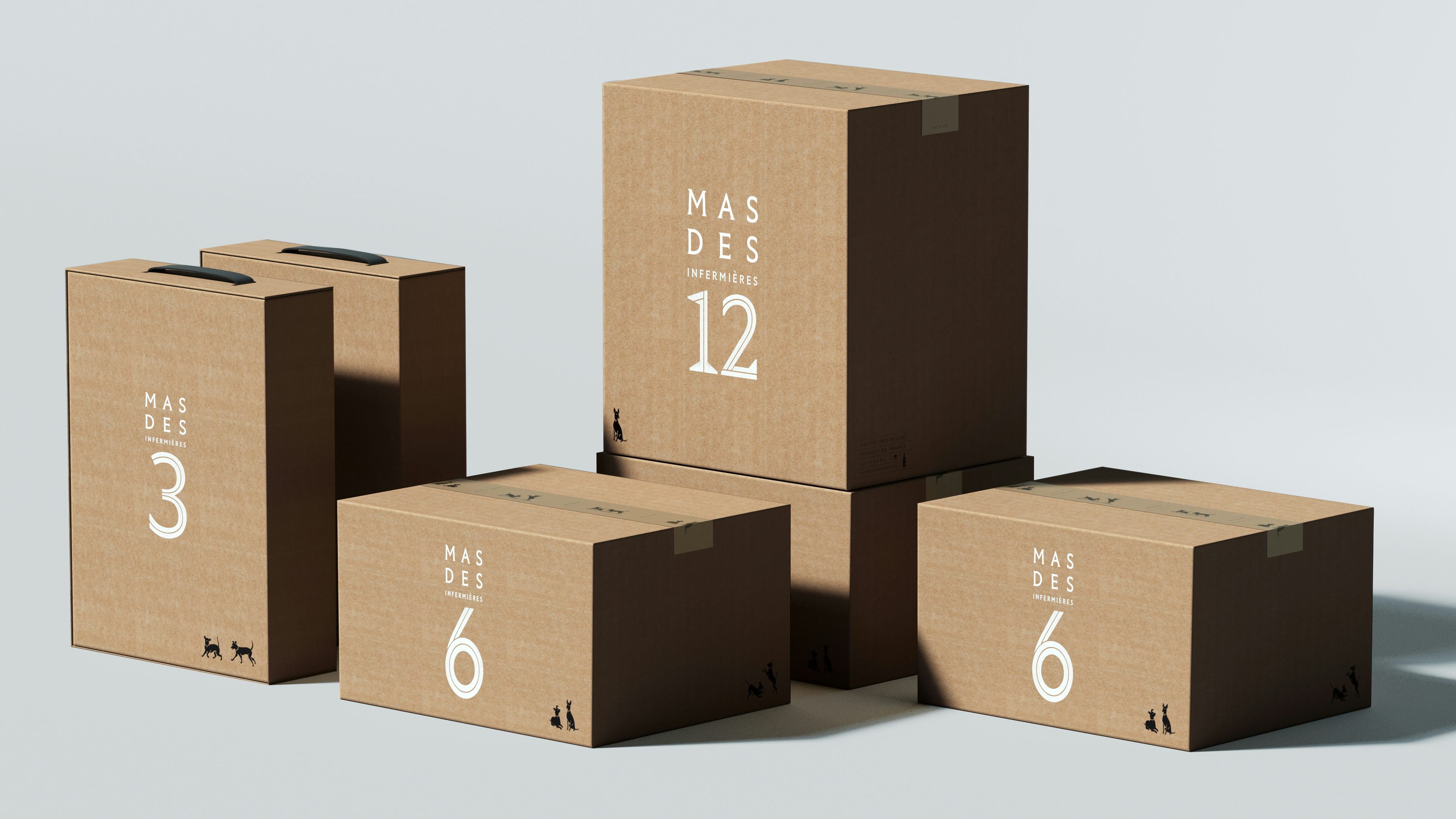
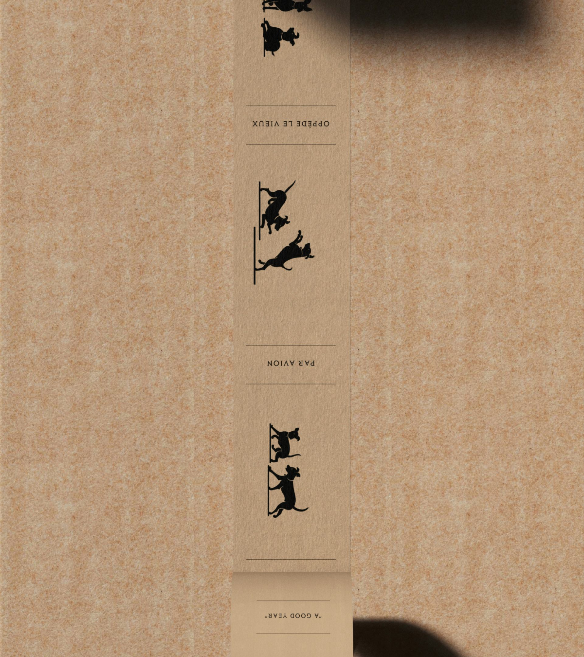
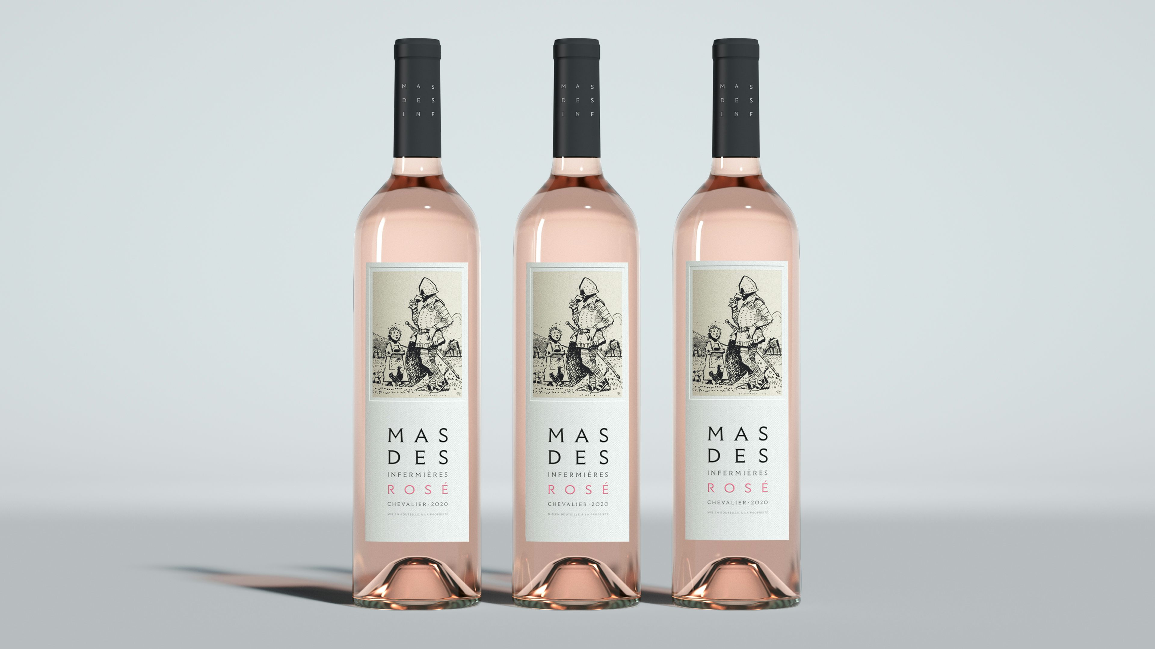
The typographic rigour of the identity is juxtaposed with the presence of ‘Les Toutous’ (the two dogs) who are the guardians of the estate. Their presence is felt throughout, appearing sometimes as a central motif and others as a more playful or incidental detail.
Each wine has a story, with its own notes, its own provenance; a series of emotions conjured up by texture, taste and tone. These characteristics are expressed through the illustrations which adorn the labels. Each one drawn by Mr Scott, they depict different scenes set in Oppède and always featuring Les Toutous. They also bring a sense of playfulness and wit, whilst serving as a reminder of the creator.
The identity has been carried across all product labelling and packaging, website and through the estate itself. A three year project, every detail, every component has been carefully considered, discussed and rationalised with Mr Scott. The resulting identity forms the basis of something that can grow and evolve with the brand and this extraordinary place.
The identity has been carried across all product labelling and packaging, website and through the estate itself. A three year project, every detail, every component has been carefully considered, discussed and rationalised with Mr Scott.