Rambert
A Radical New Identity
- Art Direction
- Brand Identity
- Campaign
- CGI / Animation
- Strategy
- Type Design
Rambert is Britain’s leading contemporary dance company. Originally founded by radical visionary, Marie Rambert, the organisation dates back to 1914, when the former Ballet Russes dancer arrived in London, fleeing the outbreak of the First World War. Always pushing the cause of dance forward, Rambert is also one of the world’s most diverse dance companies. Through performance and wellness courses, their primary focus is to be inspiring, daring and engaging to participants from all backgrounds.
HS worked closely with the organisation to build a bold and dynamic voice for an important new chapter. Our brief was to deliver a future facing, digital first identity, that would aid the company’s mission to bring dance to an entirely new audience.
The objective of this new communication strategy would be to build a fanbase, not just a customer base, creating a connection and dialogue that extends beyond ticket sales.
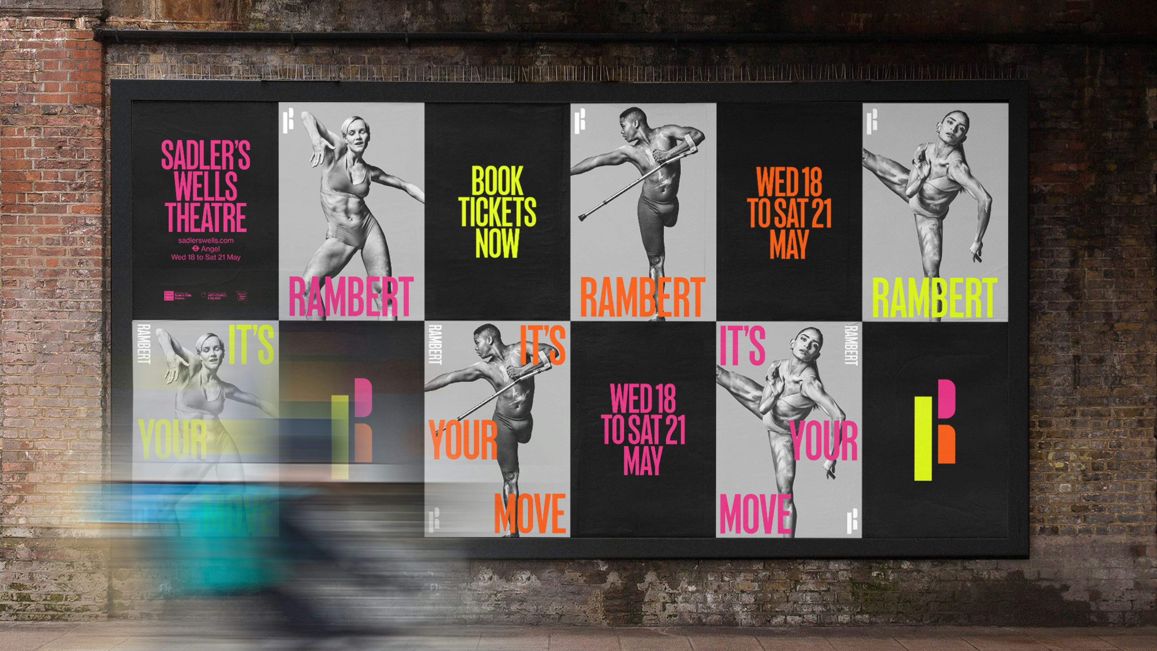
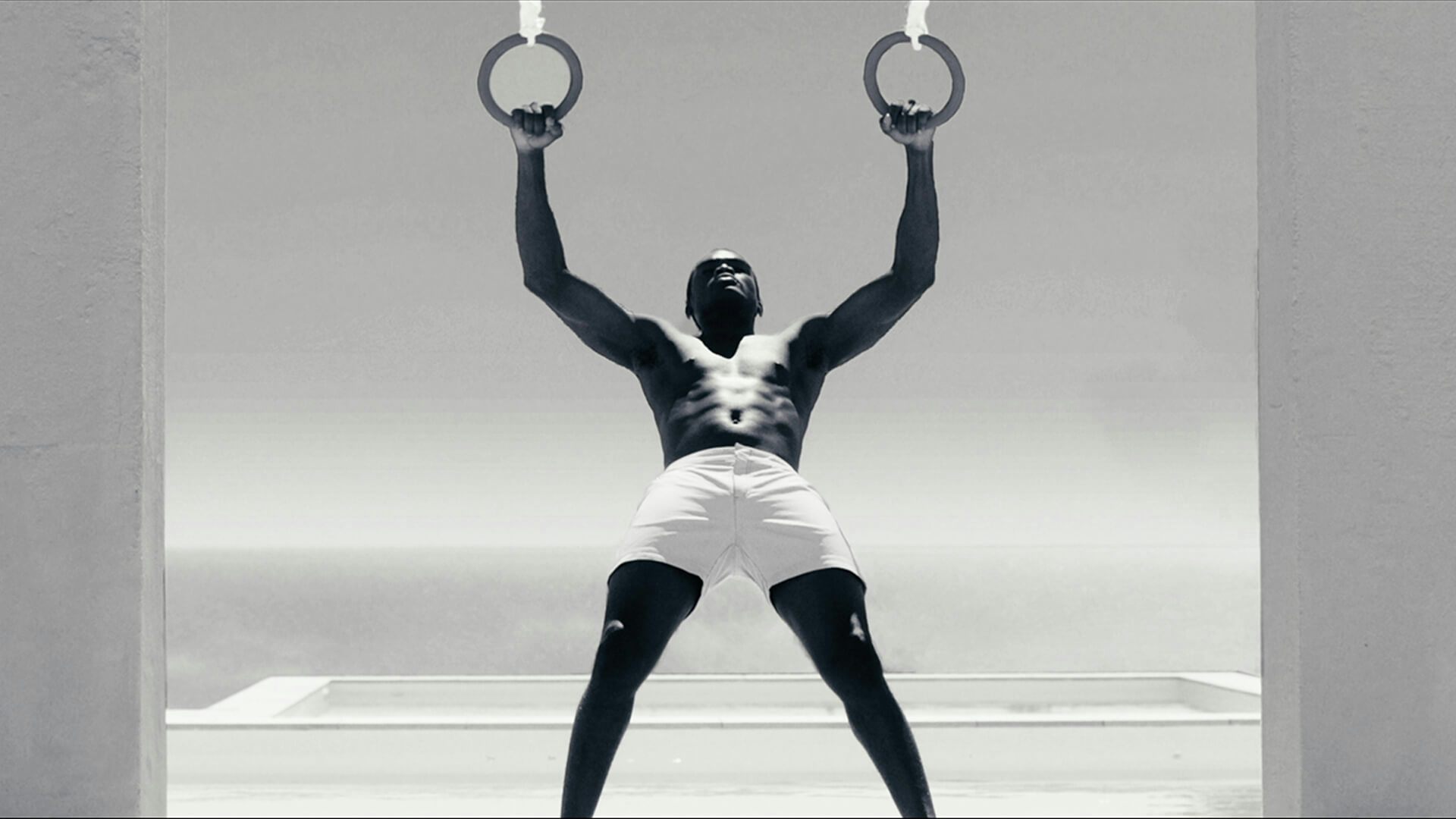
Firstly, we defined an intention and a tone of voice for the brand. A series of bold provocations were conceived, these were directed at the audience and employed as primary messaging across communications. Individual dancers form the basis of the brand campaign. Presented as superheroes and leaders, they are elevated through extreme pose and body language – mid-performance, stoic and powerful, their unconventional image is intended to ignite interest, inspire and motivate action.
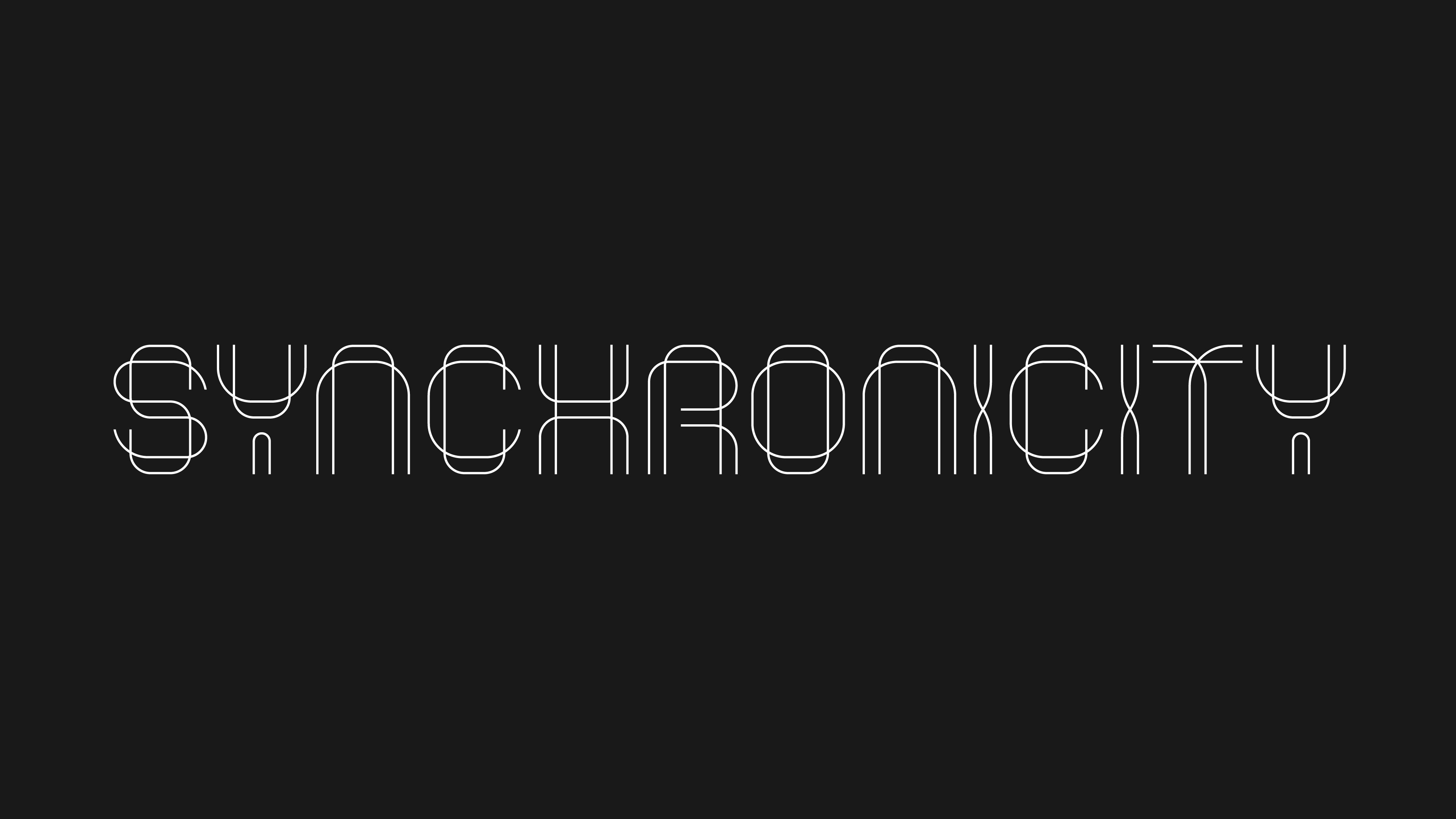
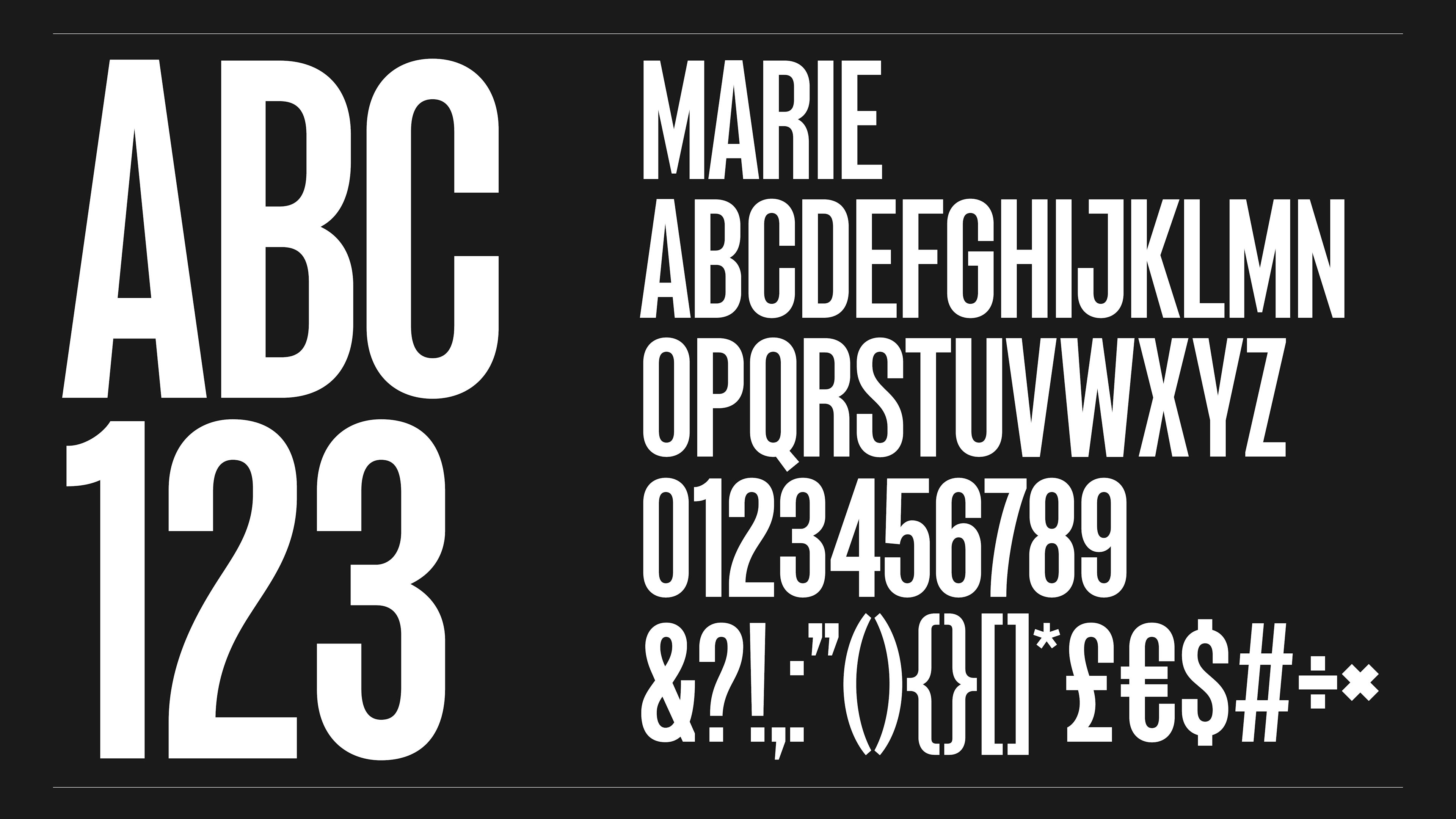
The Rambert wordmark itself is a bespoke, condensed typeface. This is then extended into a full custom font. Titled ‘Marie’ (a nod to the company’s founder), the typeface is a bespoke cut of an existing font, Marsden Slim.
This is supported by the dynamic ‘R’. Constructed of three segments, this unique device adopts a kinetic behaviour in digital or screen-based environments – harnessing the gestural quality of a dancer in motion, its poised stance evokes a kick or vertical movement. This in turn, allows for multiple configurations to appear in application, ensuring that the mark always remains fluid and playful in appearance.
The new visual identity draws on cues of Rambert’s past, whilst celebrating the company’s radical vision for the future. A dynamic synergy of type, written word and image give the brand a bold, contemporary voice. A voice that evokes the provocative energy and attitude of Rambert performance, yet pushes the organisation beyond the conventions of dance.
Credits
Marie Typeface:
Design: Hingston Studio and J Foundry
Coding and Engineering: Jason Vandenberg at J Foundry
Campaign:
Stills Photography: Mariano Vivanco
The dynamic ‘R’ is constructed of three segments, this unique device adopts a kinetic behaviour in digital or screen-based environments – harnessing the gestural quality of a dancer in motion, its poised stance suggests a kick or vertical movement. This in turn, allows for multiple configurations to appear in application, ensuring that the mark always remains fluid and playful in appearance.
The new visual identity draws on cues of Rambert’s past, whilst celebrating the company’s radical vision for the future. A dynamic synergy of type, written word and image give the brand a bold, contemporary voice. A voice that evokes the provocative energy and attitude of Rambert performance, yet pushes the organisation beyond the conventions of dance.
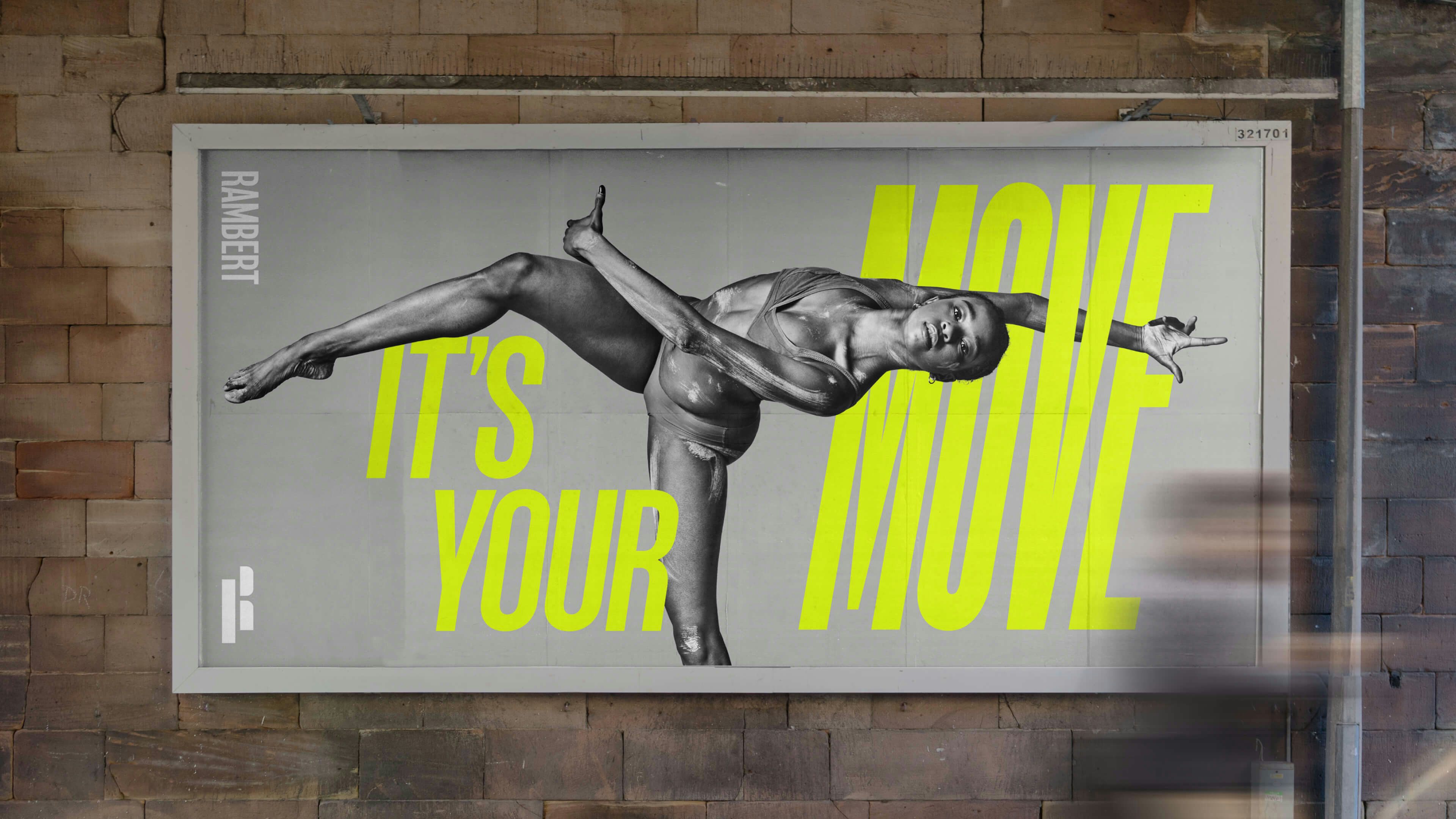
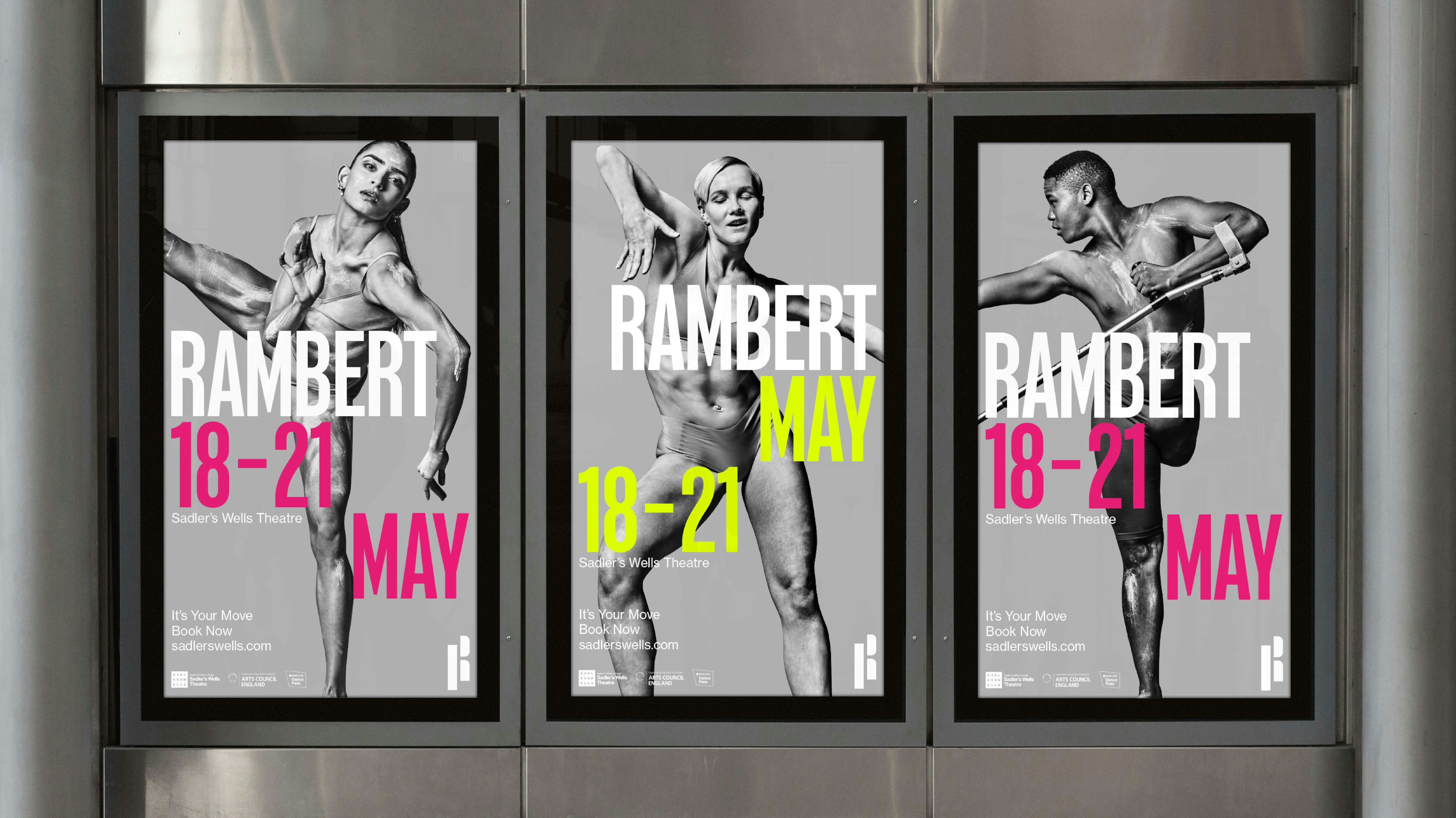
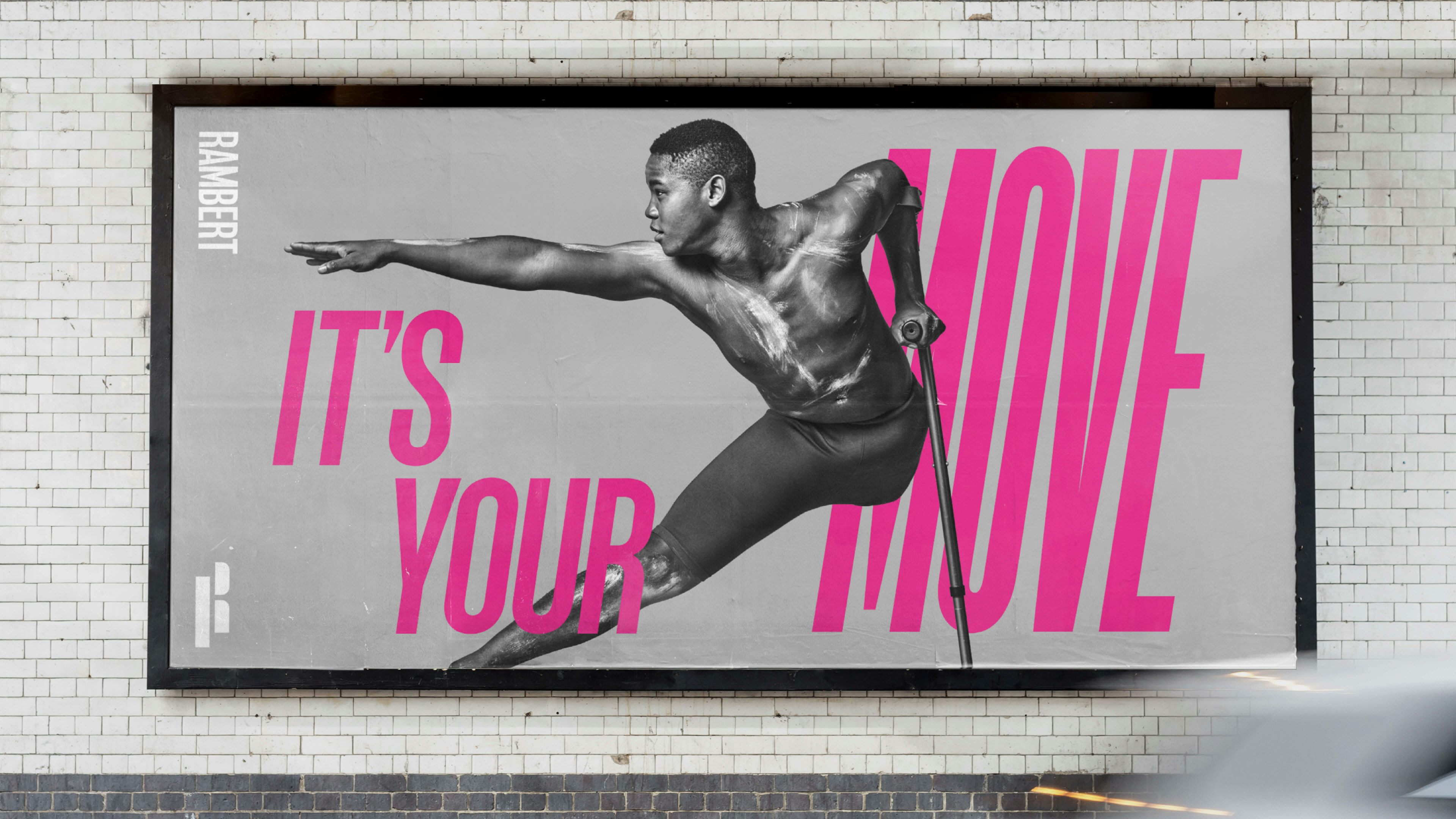
A series of bold provocations were conceived, these were directed at the audience and employed as primary messaging across communications. Individual dancers form the basis of the brand campaign. Presented as superheroes and leaders, they are elevated through extreme pose and body language – mid-performance, stoic and powerful, their unconventional image is intended to ignite interest, inspire and motivate action.