Serpentine Galleries
A Digital First Identity
- Brand Identity
- Digital Design
- Strategy
- Type Design
- Web Design
Commissioned by the Serpentine in 2019 – ahead of the galleries’ 50th anniversary – HS worked closely with the organisation to build a bold and dynamic new voice for its next ten year chapter. With a growing impetus on art that can be experienced across new platforms and beyond the physical walls of a gallery, the brief was to deliver a future facing, digital first identity.
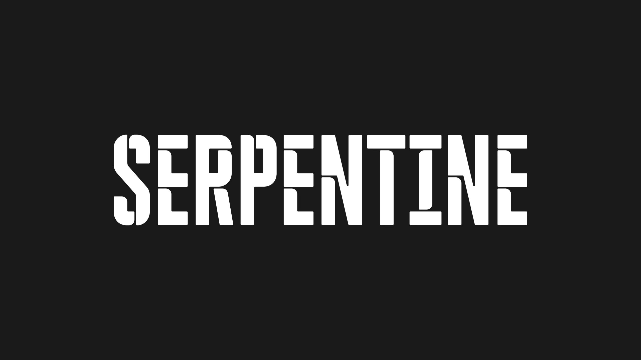
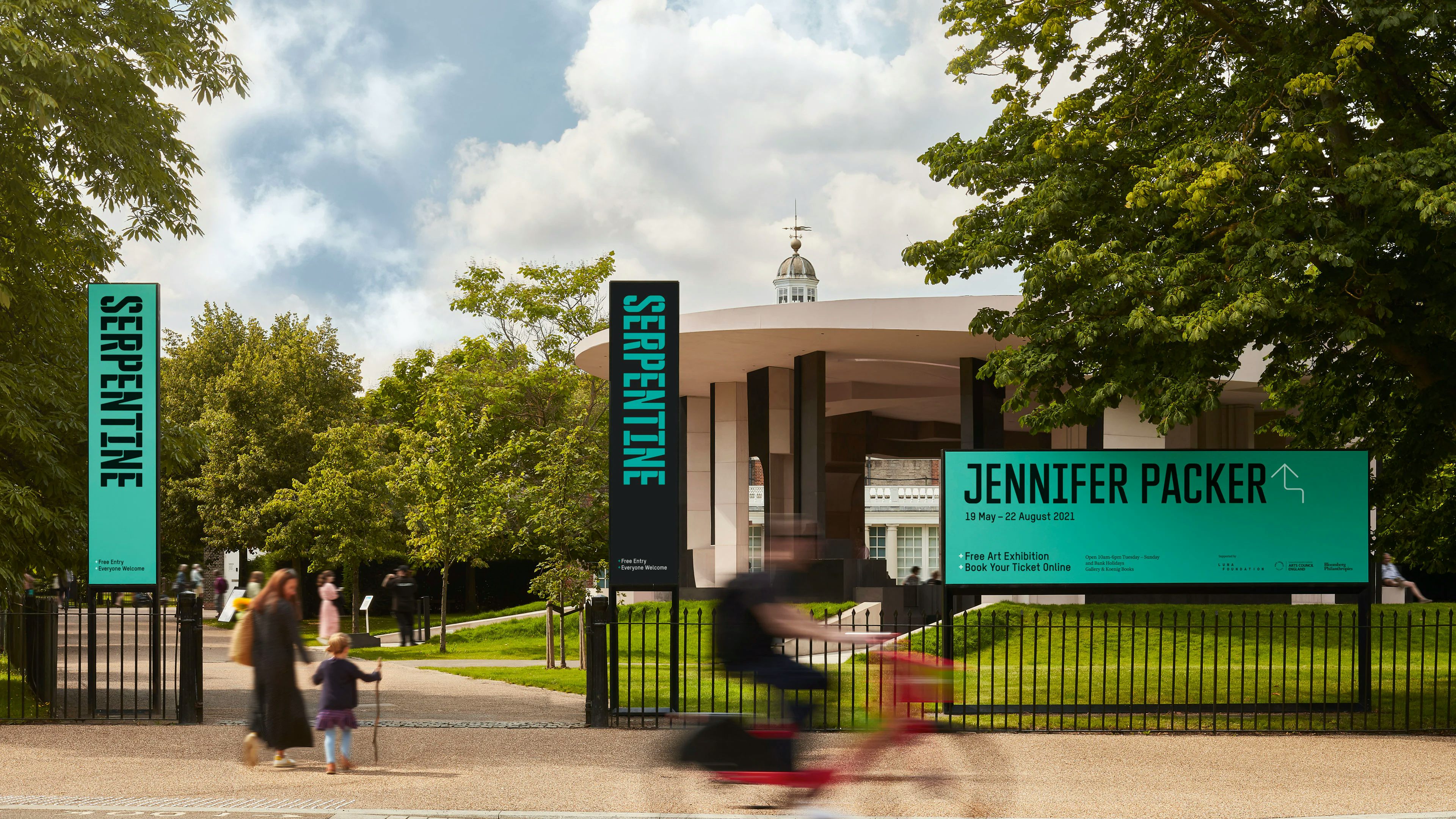
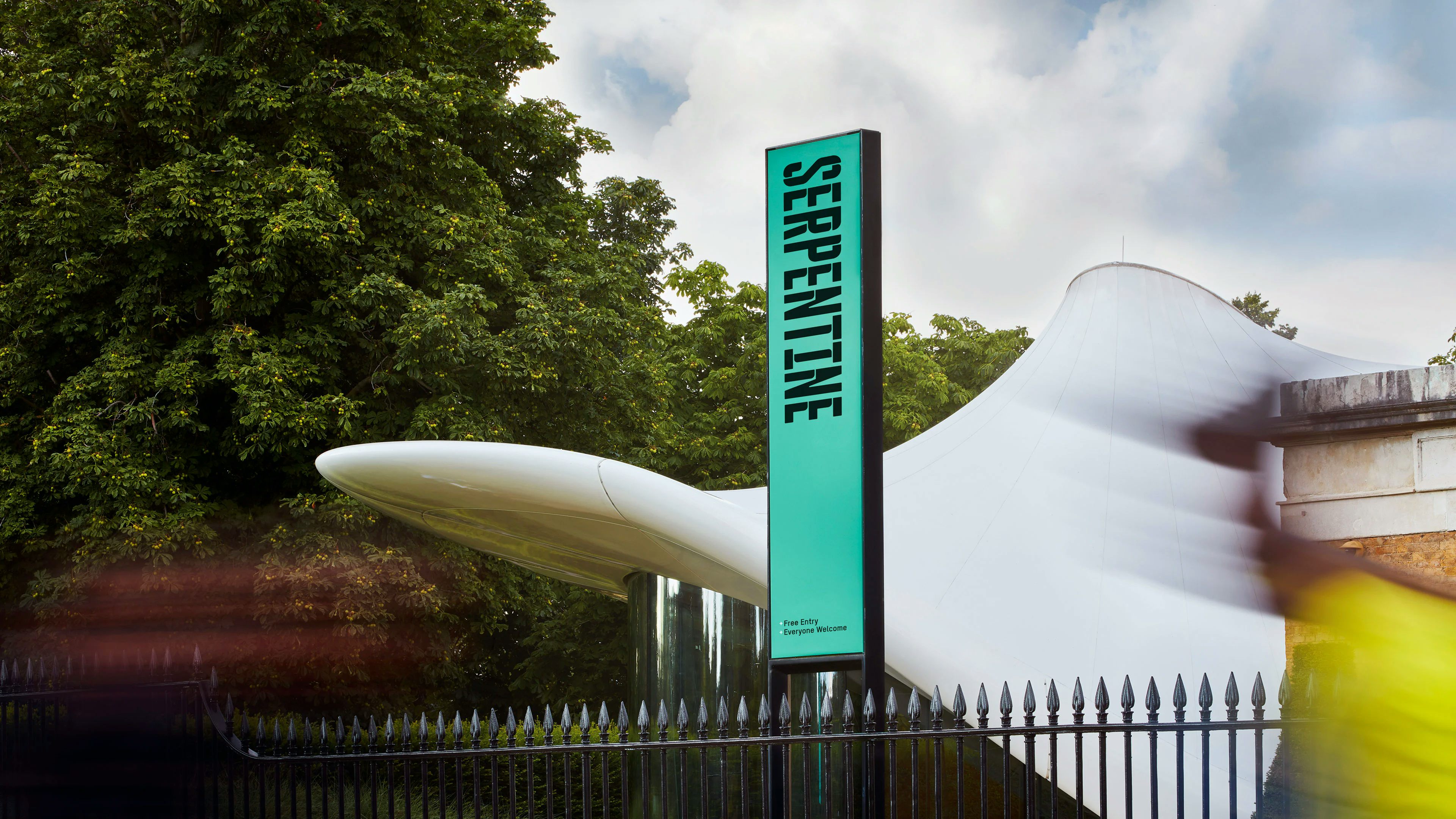
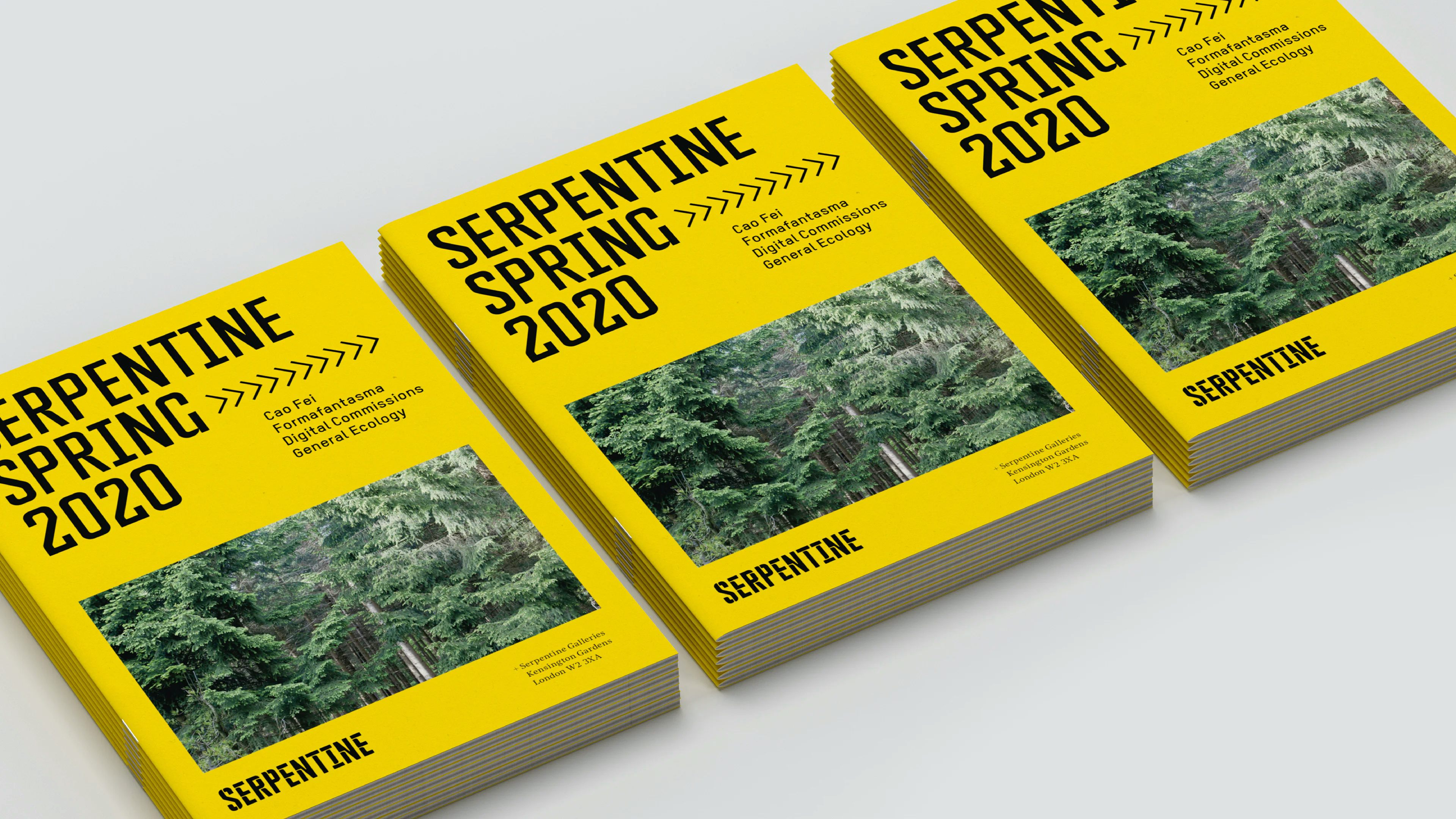
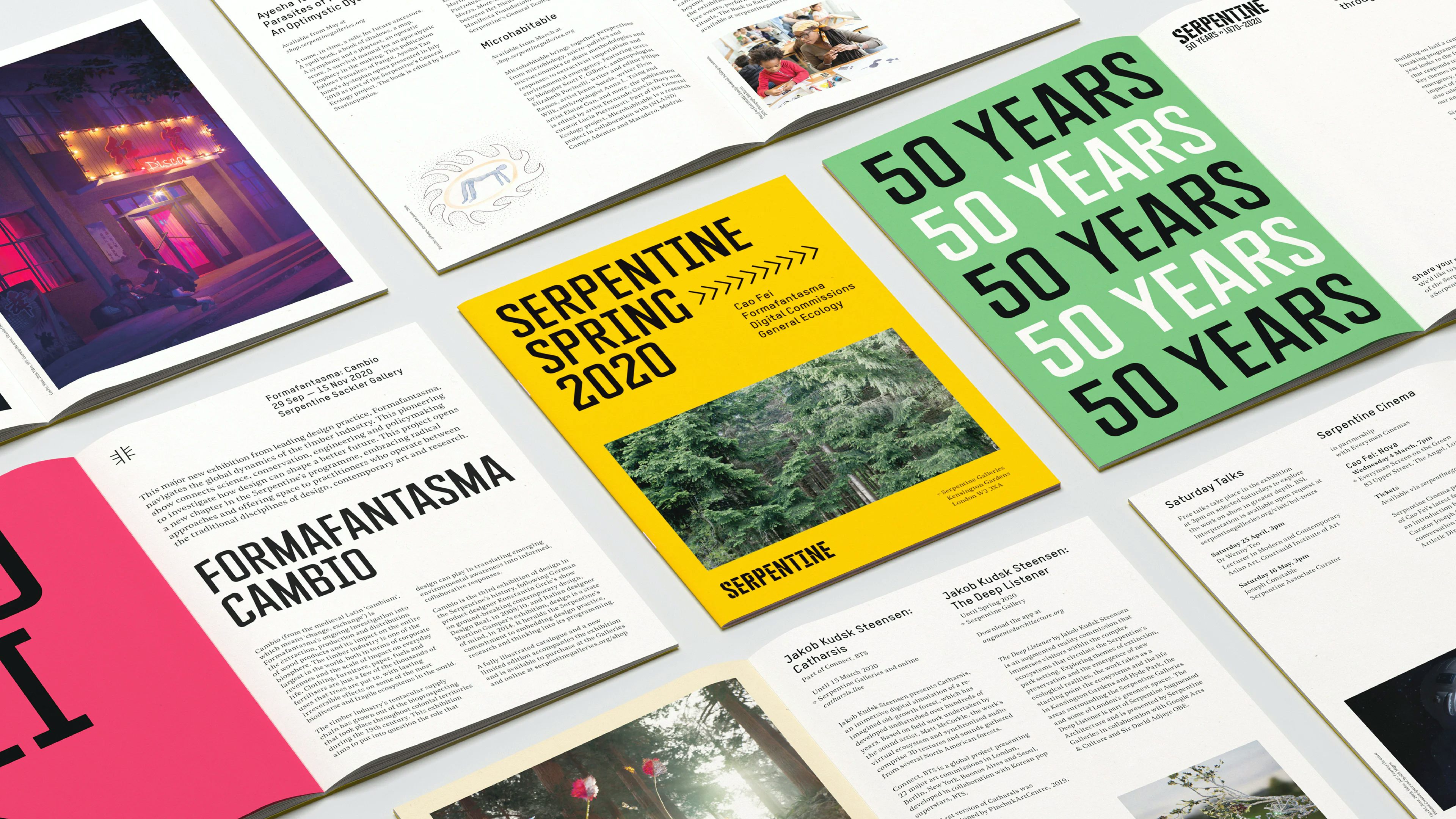
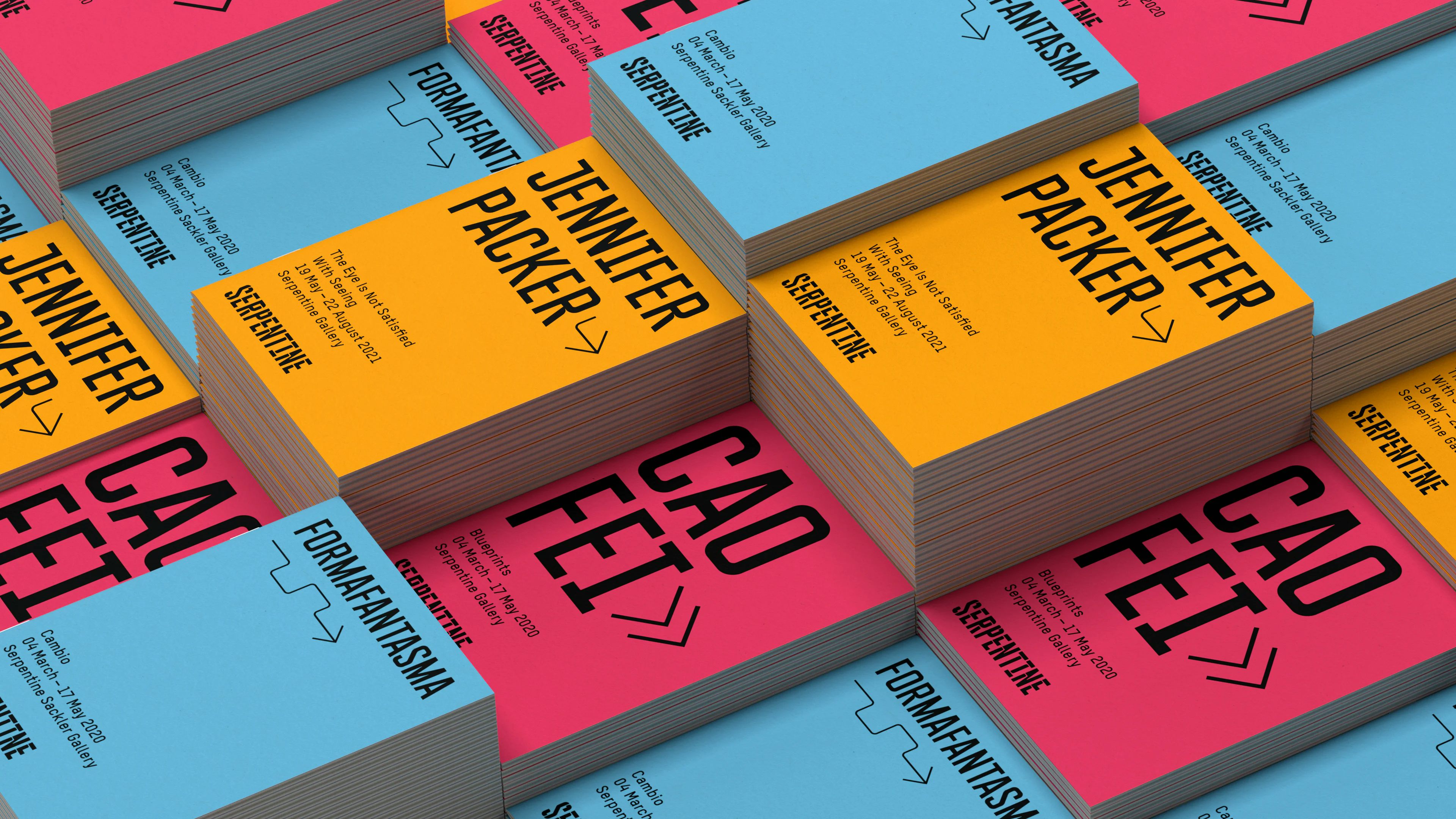
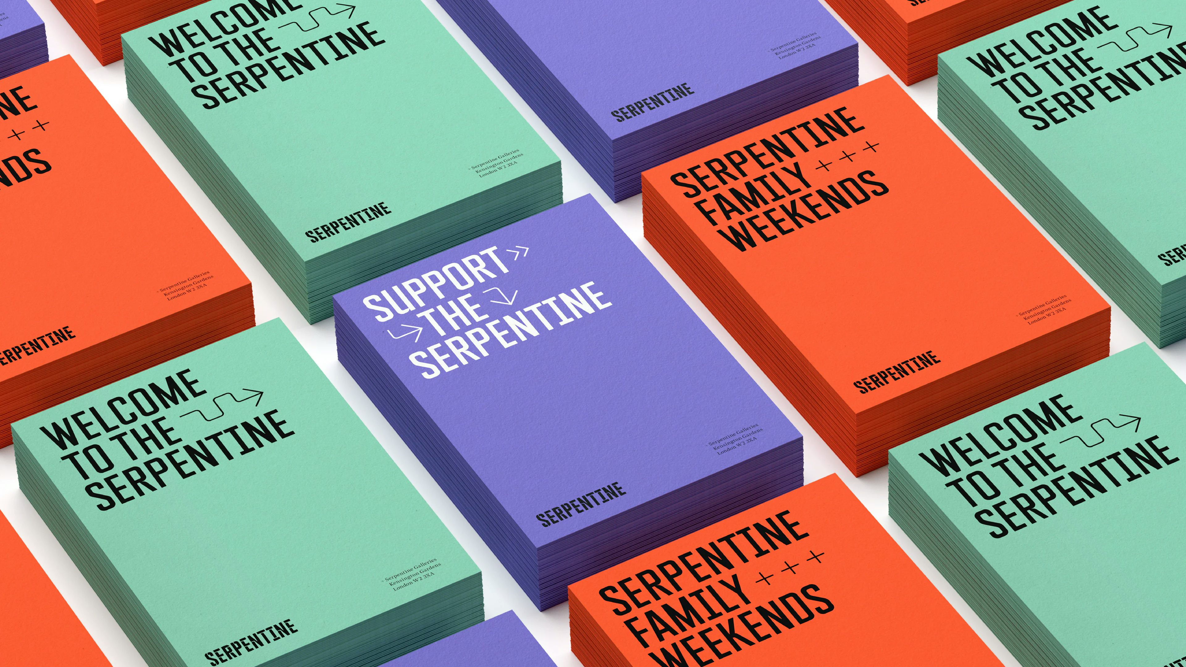
The new Serpentine language is rooted in three central ideas: An urgent voice. The fluid exchange of thought and experience. The surrounding environment of the park. The word mark itself is a bespoke, condensed typeface, evoking urgency and strength. A series of interventions have been introduced by way of radial cuts to each letterform. These interventions create a sense of movement through the wordmark and a non-concrete state. Its modularity reflects the fragmented – yet connected – physicality of the galleries themselves, and also that of the Serpentine lake, with its irregular geography.
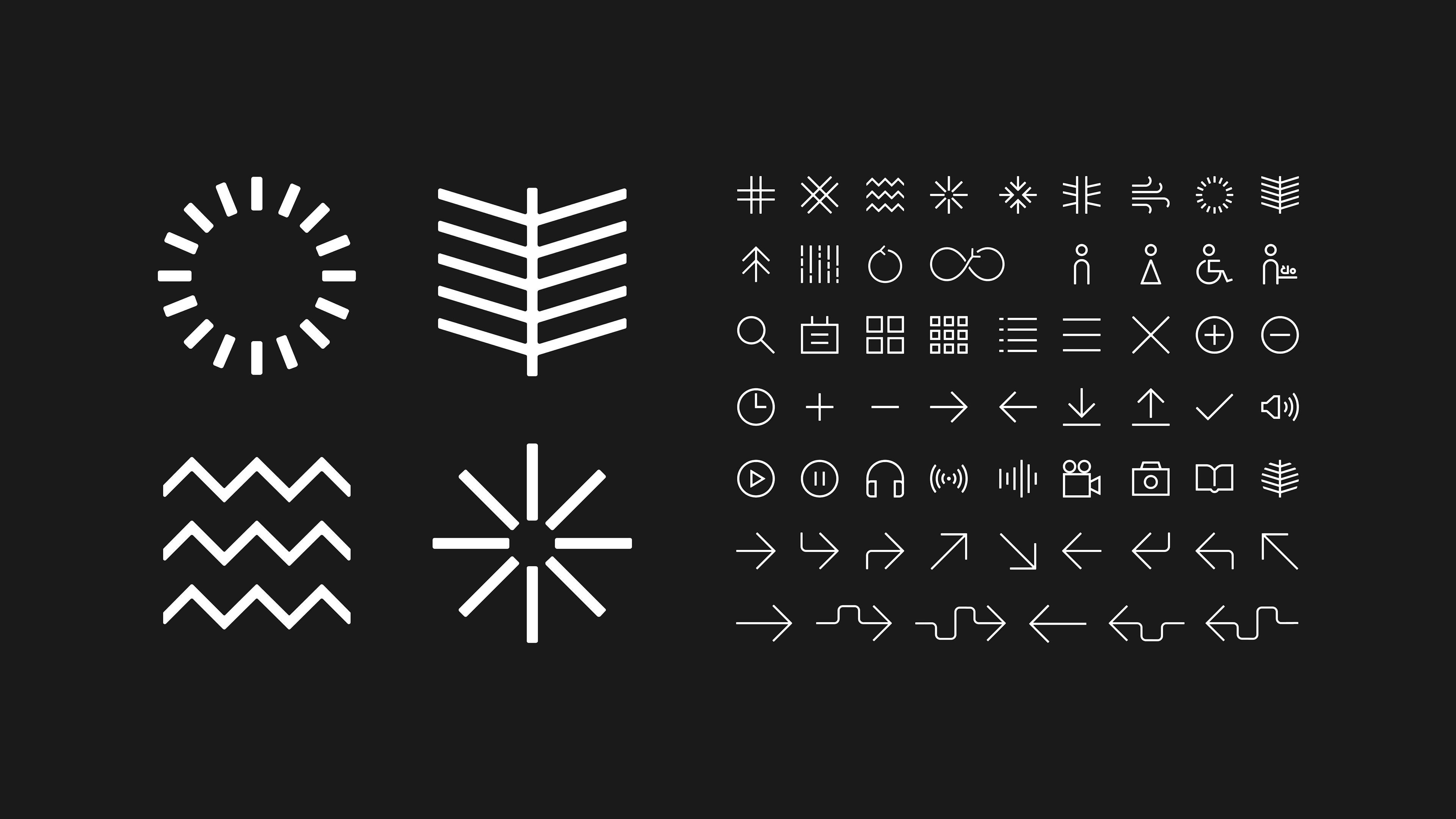
These modular letterforms adopt kinetic behaviour when viewed in a digital space, the wordmark yielding multiple patterns that reference the galleries’ surrounding environment. Growth rings from trees, wind patterns, fluidity of the surrounding water, or light passing through branches all make distinct acknowledgement of the physical location.
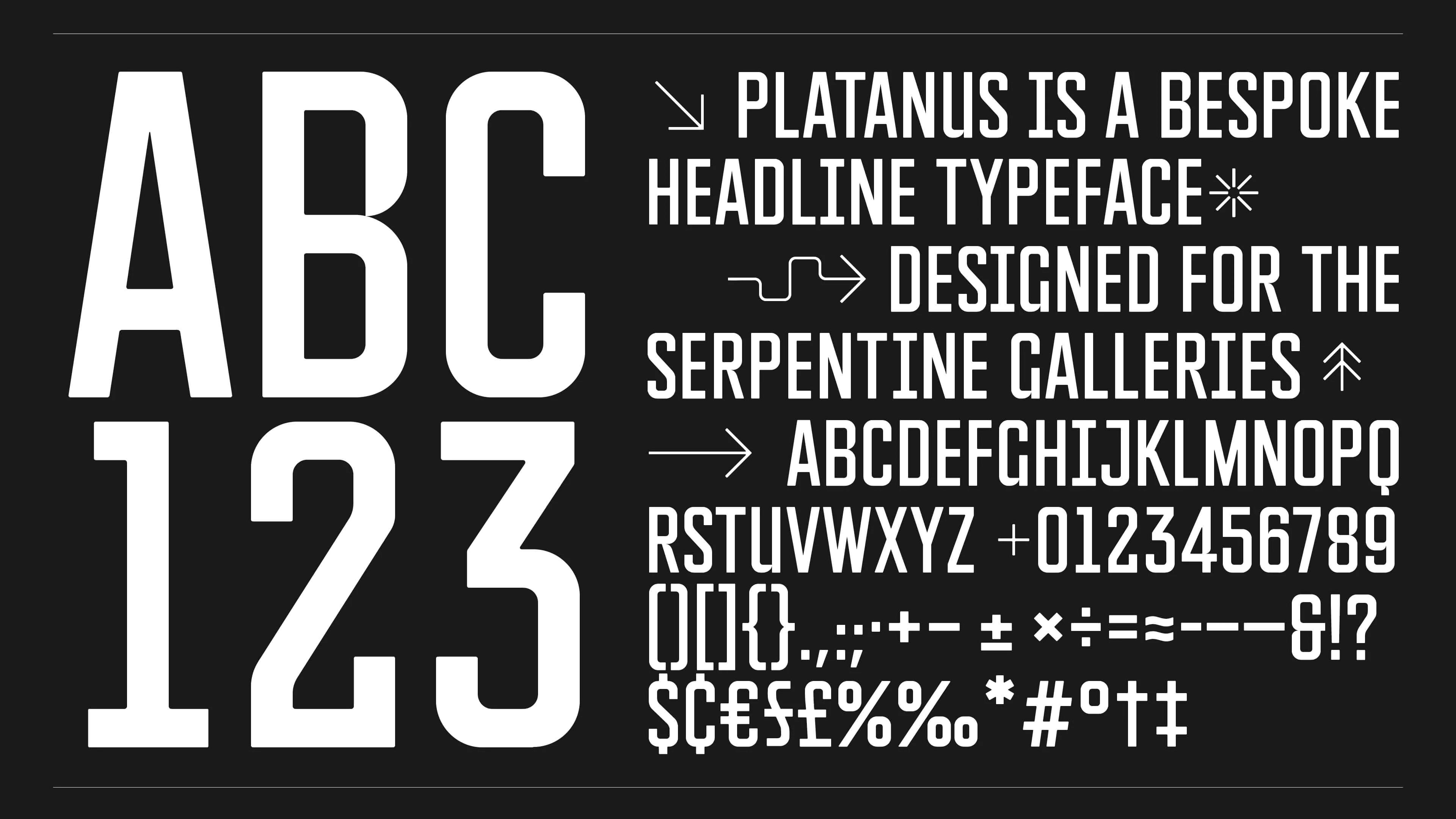
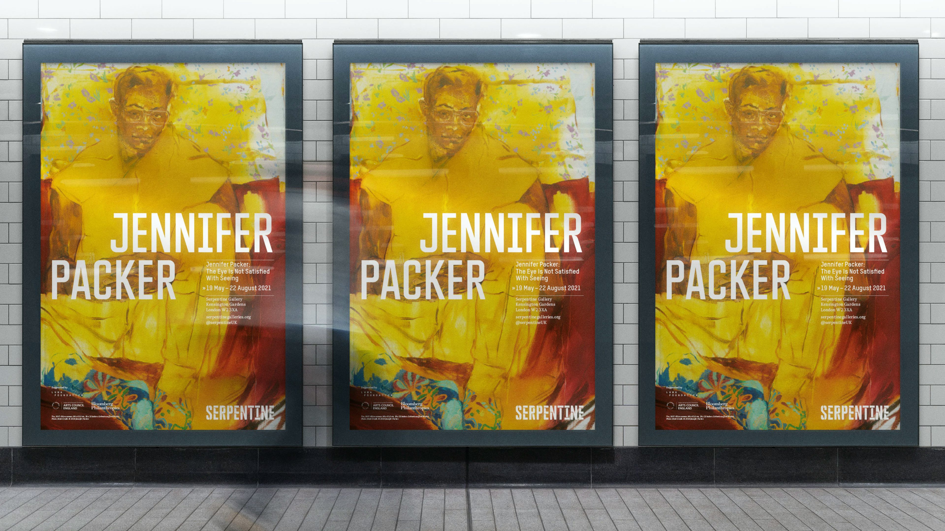
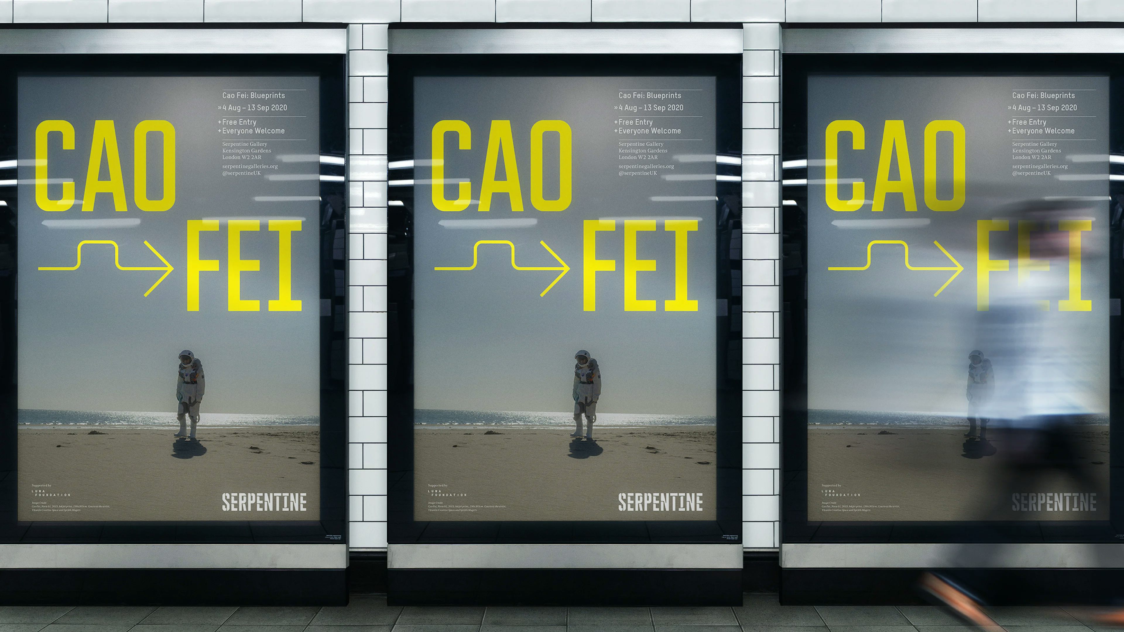
The supporting typographic system consists of three typefaces: ‘Platanus’ – is a bespoke headline typeface designed by HS, and takes its Latin name from the prevalent tree species found in Hyde Park (the Plane Tree).
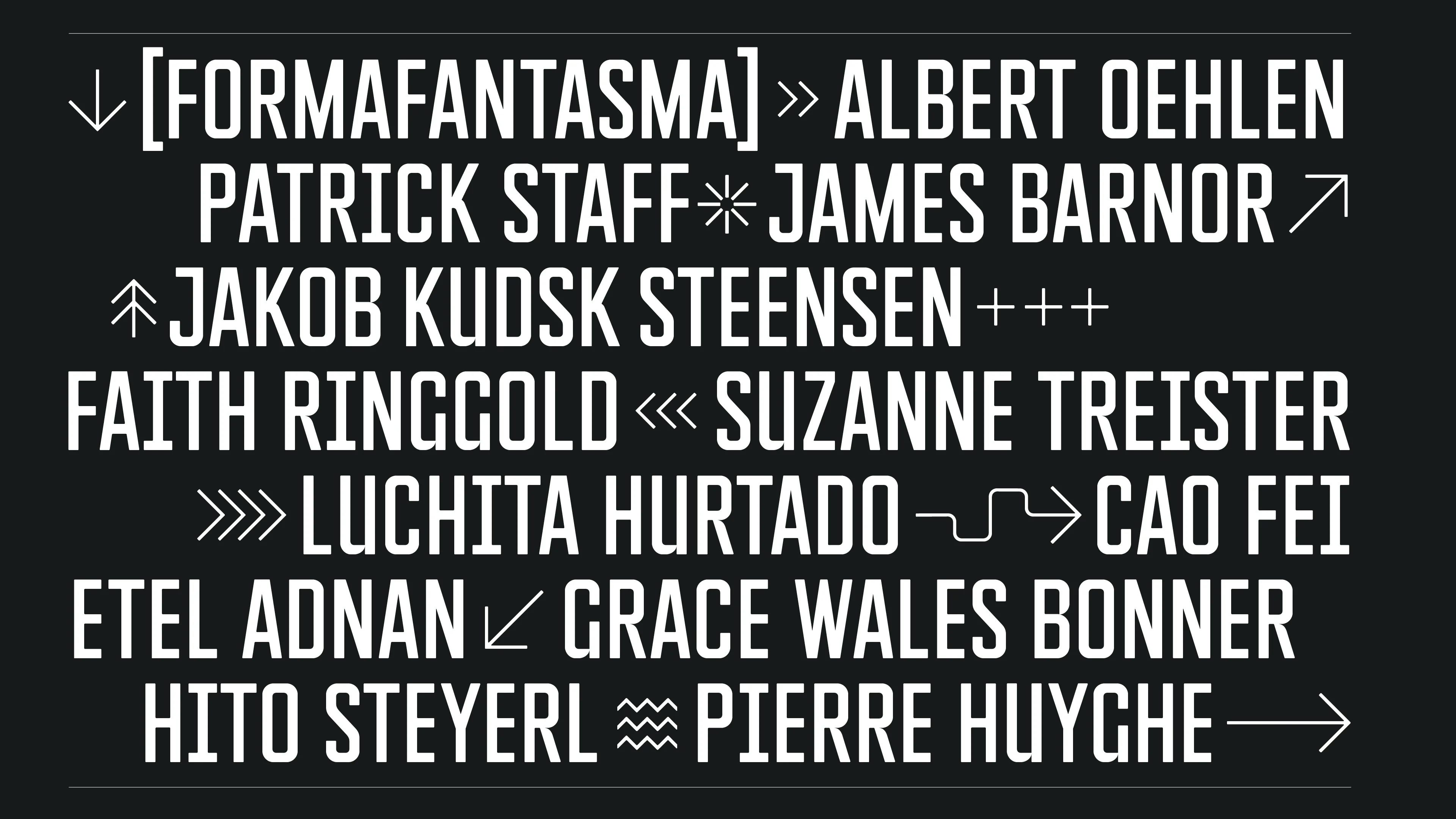
‘TStar’ and ‘Noe Text’ (secondary and tertiary typefaces) establish a strong juxtaposition with the logotype and headline. The system is augmented with a series of bespoke symbols and glyphs. This set of playful arrows and accompanying icons brings an opportunity for emphasis or punctuation and suggests lateral thinking. More than a logo, the identity employs a new visual language and behaviour for the organisation, supporting the Serpentine’s continued outreach to new audiences with endless capabilities, across multiple platforms.
Credits
Platanus Typeface:
Design: Hingston Studio
Coding and Engineering: F37 Foundry
Website:
Creative Direction: Hingston Studio
Design: The Unloved
Development: Effect