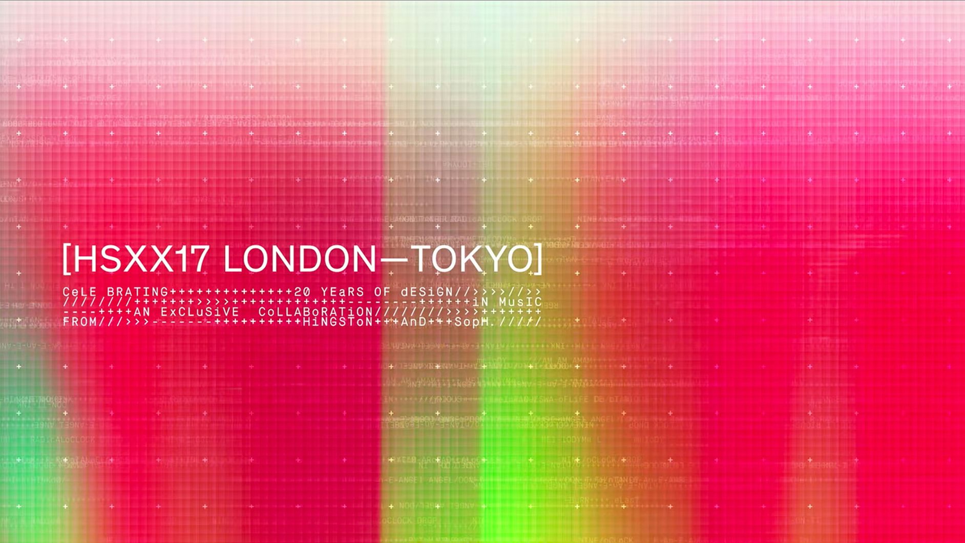
SOPH.20
Celebrating Two Decades
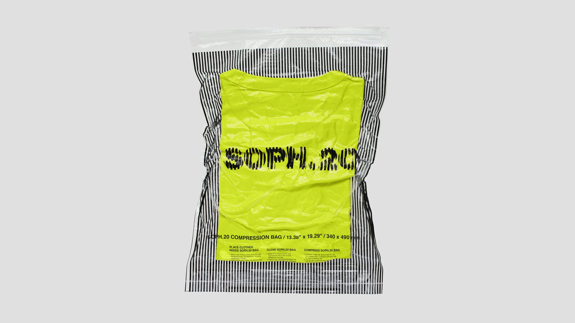
- Brand Identity
- Packaging
- Type Design
Founded in 1998 by Hirofumi Kiyonaga – SOPH is a pioneer in Japanese streetwear and football culture. Their clothing sits at the intersection of traditional craftsmanship, technical detail and American heritage. The brand has remained at the forefront of Japanese fashion innovation for more than two decades.
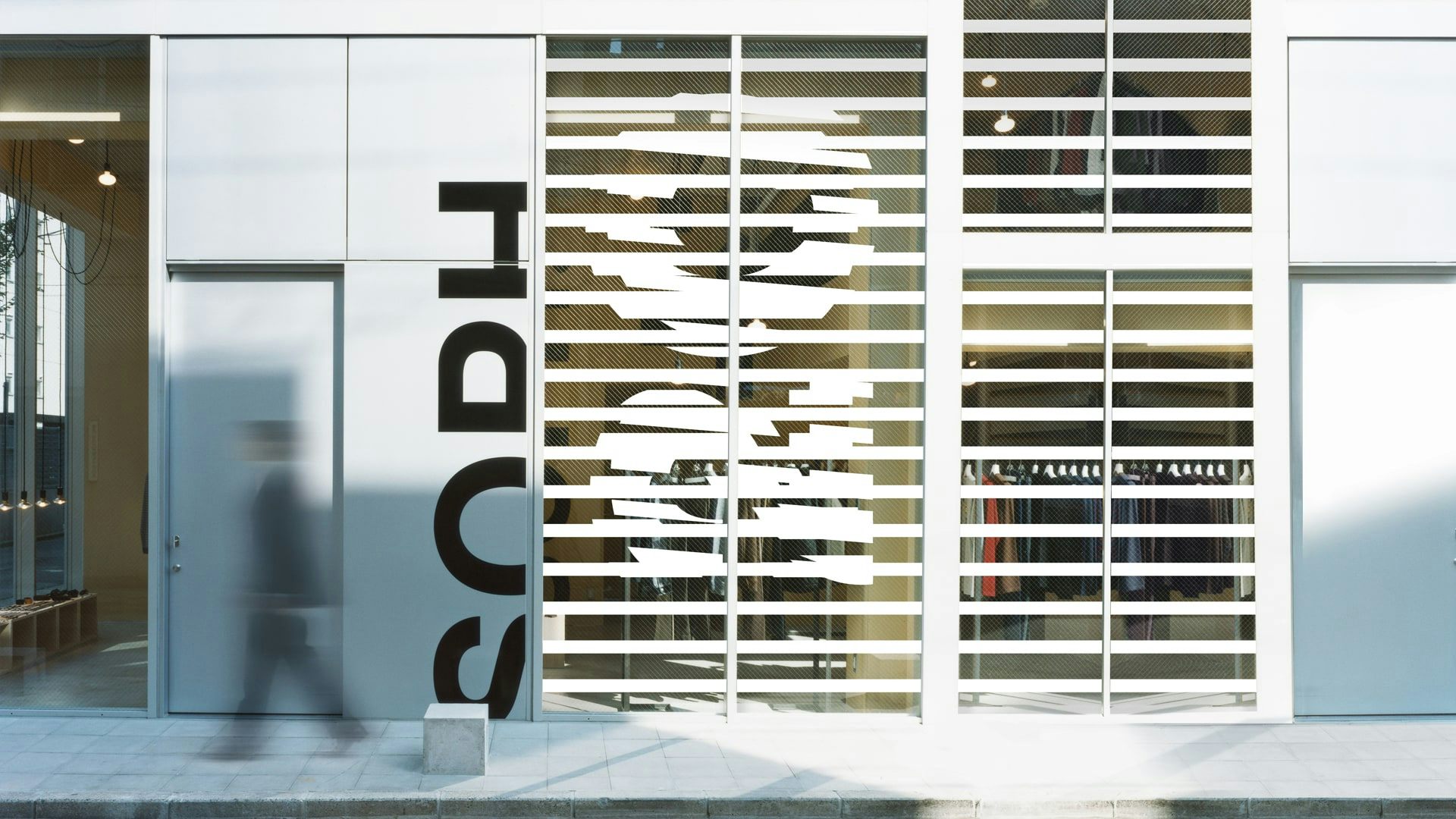
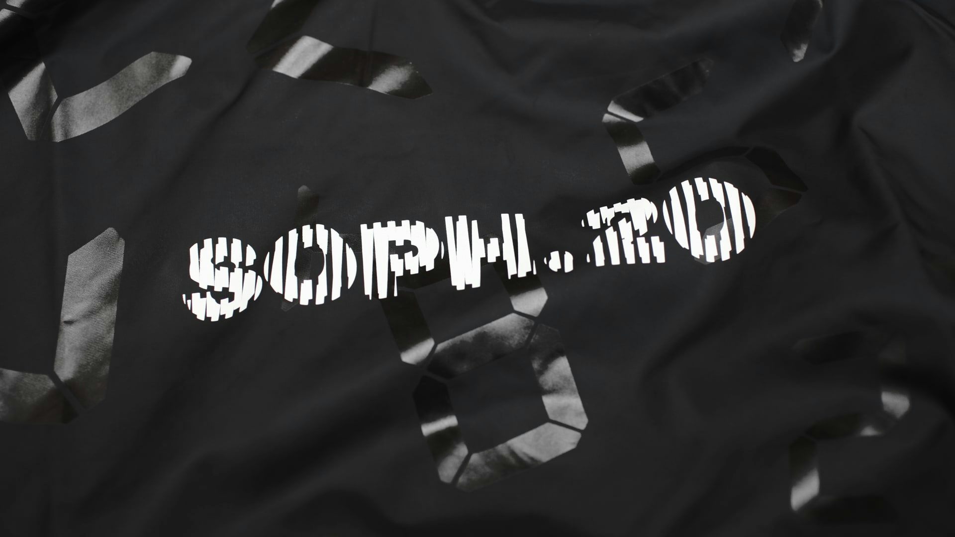
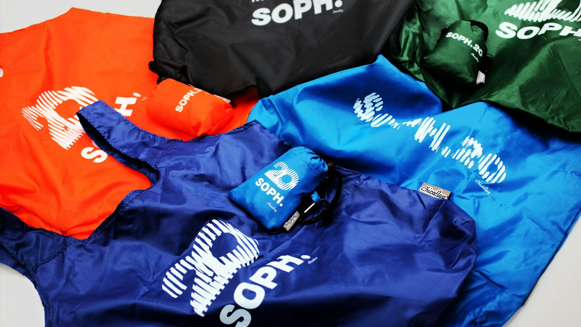
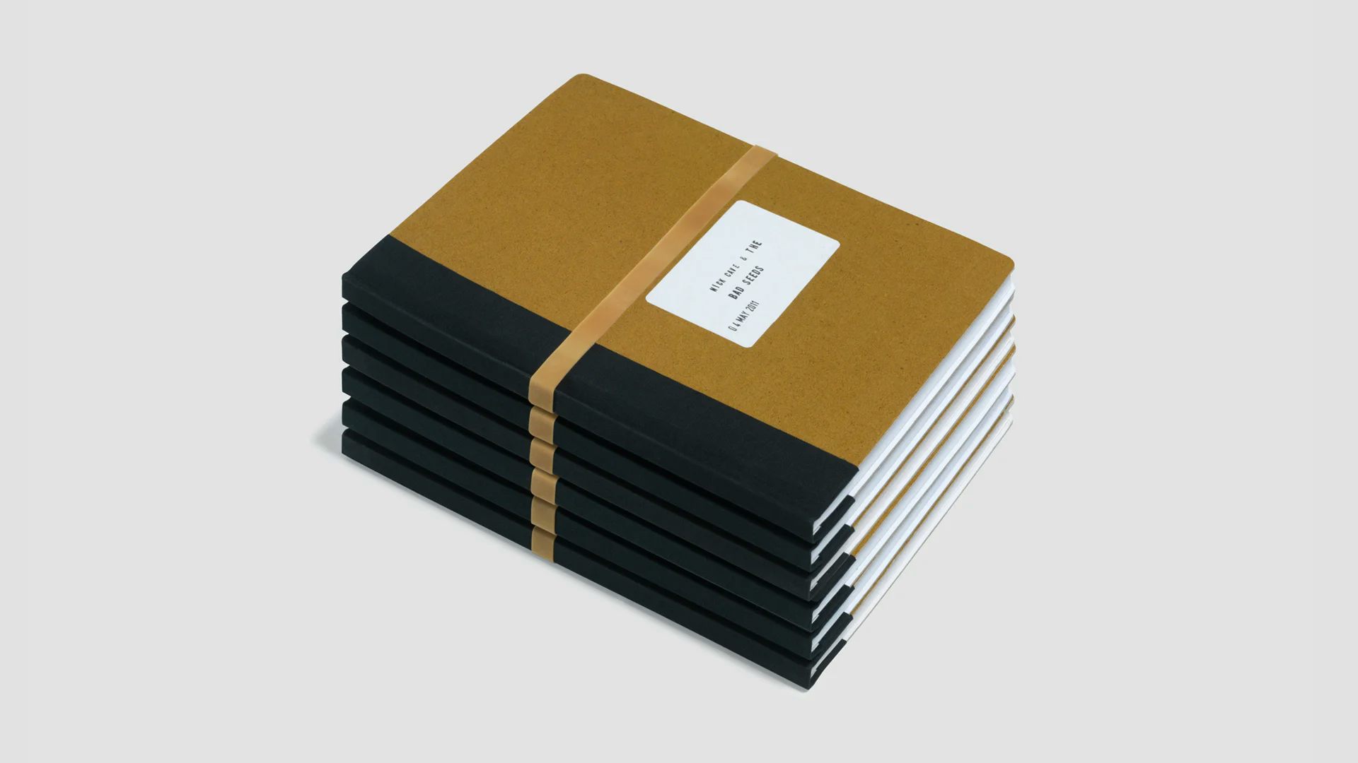
To celebrate these twenty years, Hingston was invited to design the visual identity and supporting collateral for the anniversary. It was important for the mark to function as a stand-alone static component as well as digital applications. The identity spearheaded a twelve month campaign in which a series of highly coveted product collaborations were released – each of these carried its own iteration of the wordmark, customised to the specific product application.
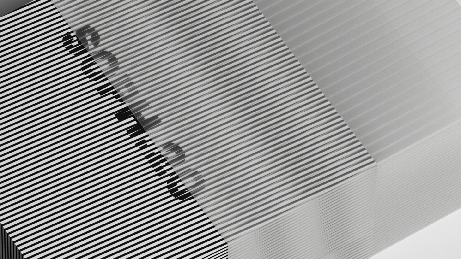
Drawing on the SOPH ethos and their relentless desire for progression, our animated logo not only marks a moment in time for the brand – but most importantly, looks forward to their next exciting chapter. In addition to product, the identity was carried across packaging, labelling and store environments.