Wattshot
A Pioneering Spirit
- Art Direction
- Brand Identity
- Packaging
- Strategy
Wattshot is a bold new statement in the world of premium spirits. Delivering a unique drinking experience, it’s ‘secret botanical ingredients’ ignite a compelling narrative that is new, sensory and a point of discovery.
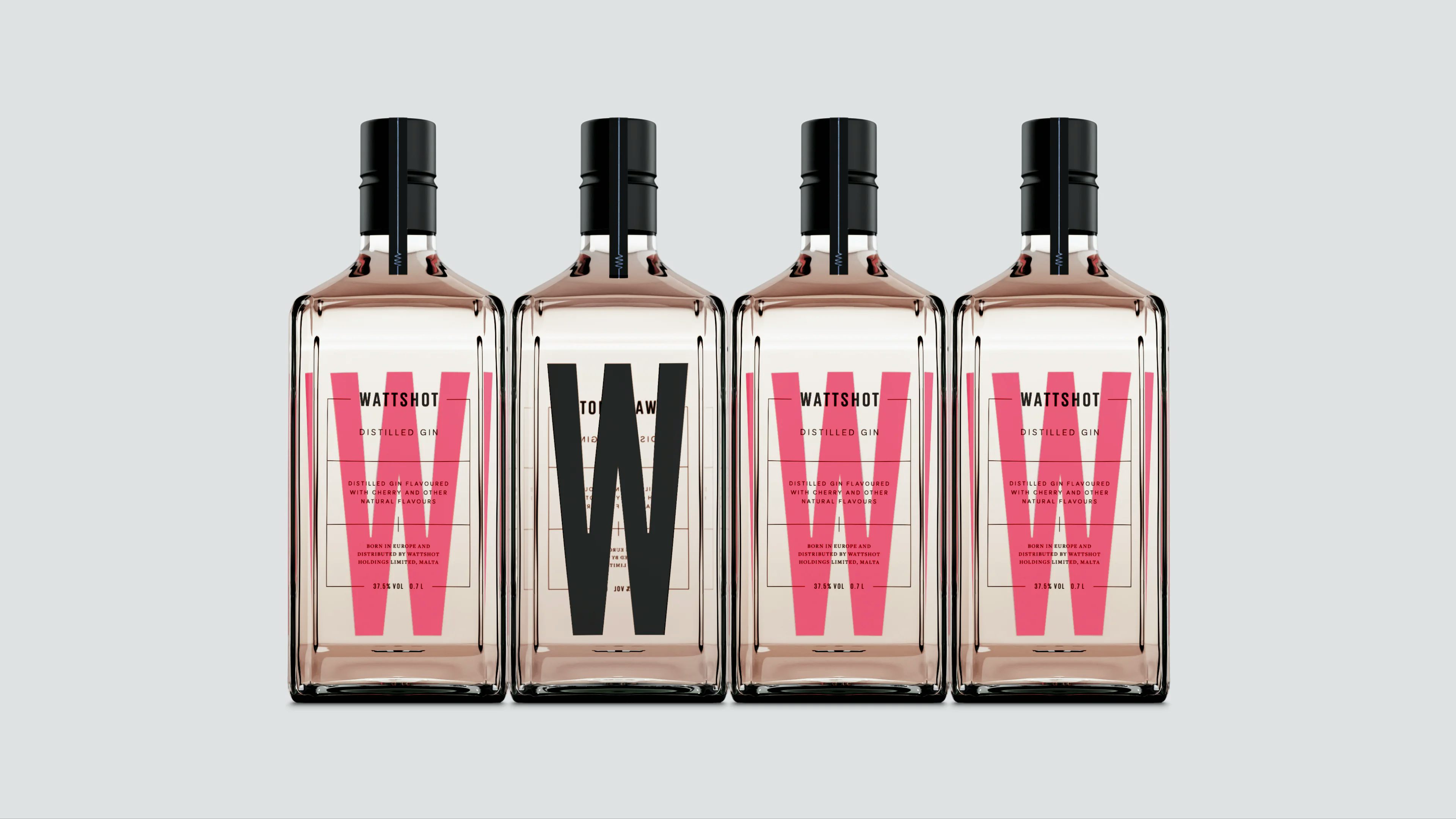
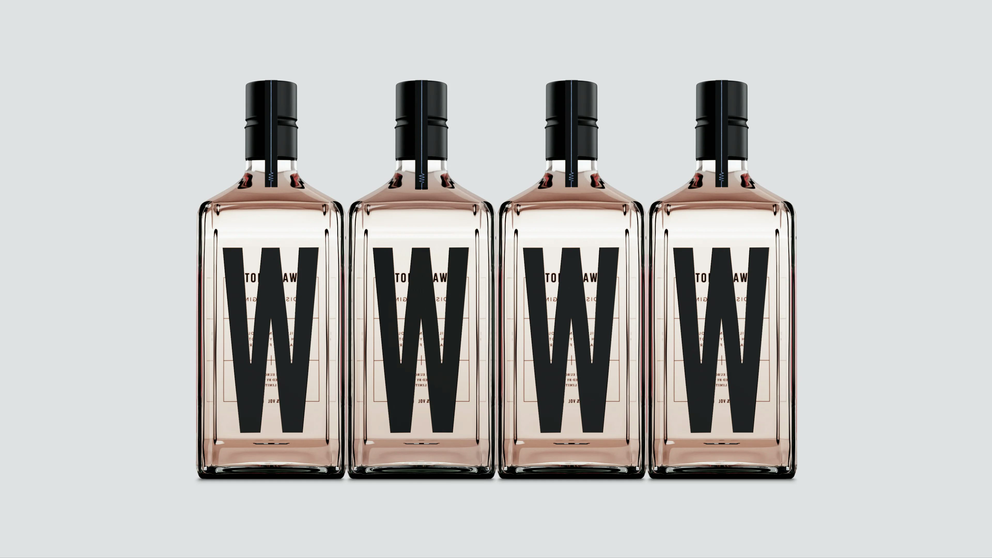
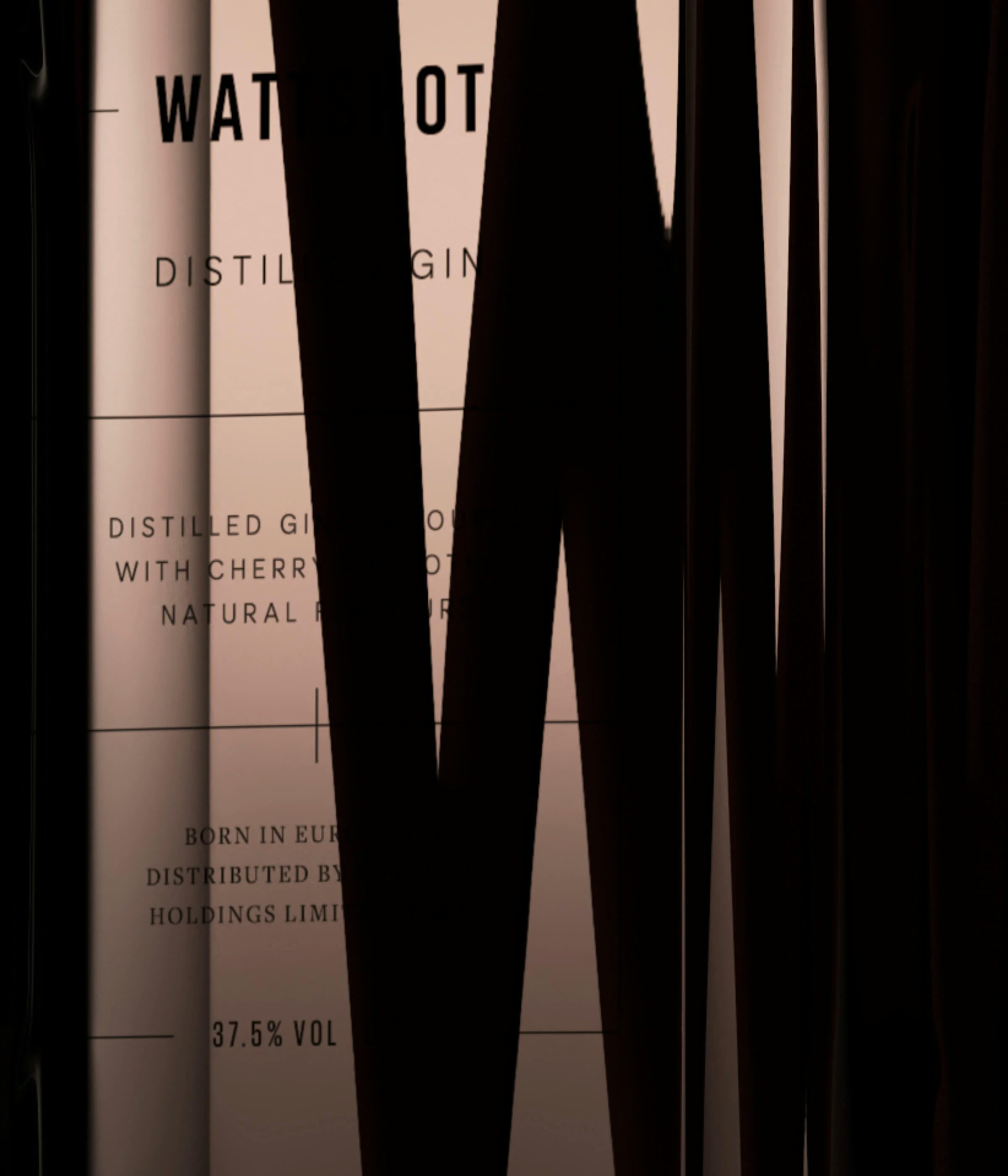
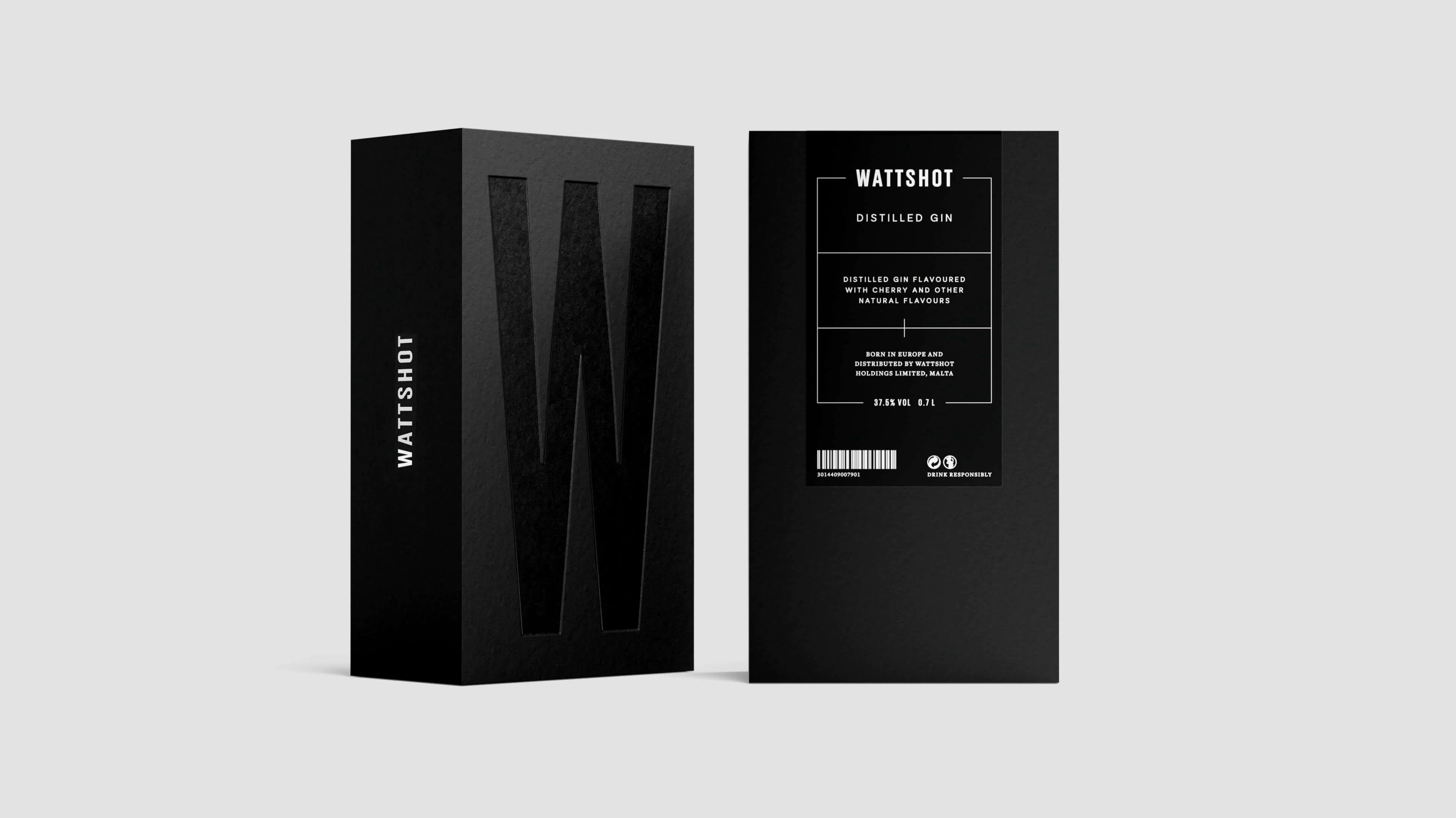
HS defined the positioning, brand narrative and visual identity for this exciting new product. Taking the form of a geometric glass block – the bottle carries a sense of weight and presence – yet the glass and the liquid itself are completely transparent, with minimal distortion. These material properties presented an opportunity to utilise all surfaces of the vessel simultaneously – allowing us to create something which could be viewed from either the front or the reverse. Making a feature of the transparency also ensured that the branding is visible under different lighting scenarios, an important consideration in environments such as a bar, restaurant or club.
The condensed ‘W’ creates a bold signifier, but also functions as a colour coding system to denote different flavours and product extensions. Always rendered in black on the reverse, the internal surface colour changes dependent on the ingredients – pink for cherry blossom, green for apple blossom, and orange for vanilla bean.
Having already garnered a number of awards, Wattshot is aiming to drive valorisation of the shot market, establishing a new premium benchmark in the category.