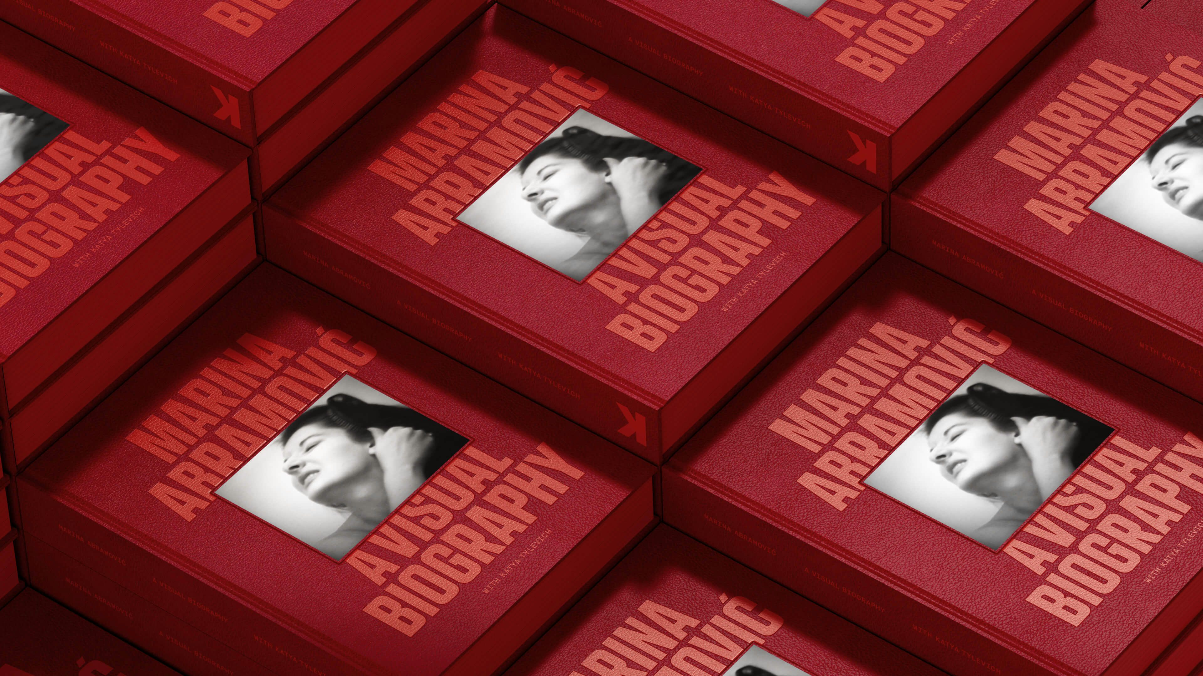
Young Fathers
Heavy Heavy
- Art Direction
- Campaign
Heavy Heavy is the fourth album from the Young Fathers. Defined by small acts of joyful resistance, the record is a celebration of music as shared and spontaneous practice. It’s immersive qualities invite the listener to join in, to stand up and sing.
Rooted in themes around humanity, the three band members express the notion of growing a fellowship, providing for their families, but also the bond they hold with their extended community. The album summons the feeling of an elevated state, unbridled energy and the desire for physical release – the feeling of being untethered and liberated.
Kayus Bankole explains “Throughout the process of recording the album we had been watching a lot of videos of people moving, dancing and letting loose through movement. No choreography, no script, just real time reaction and expression.”
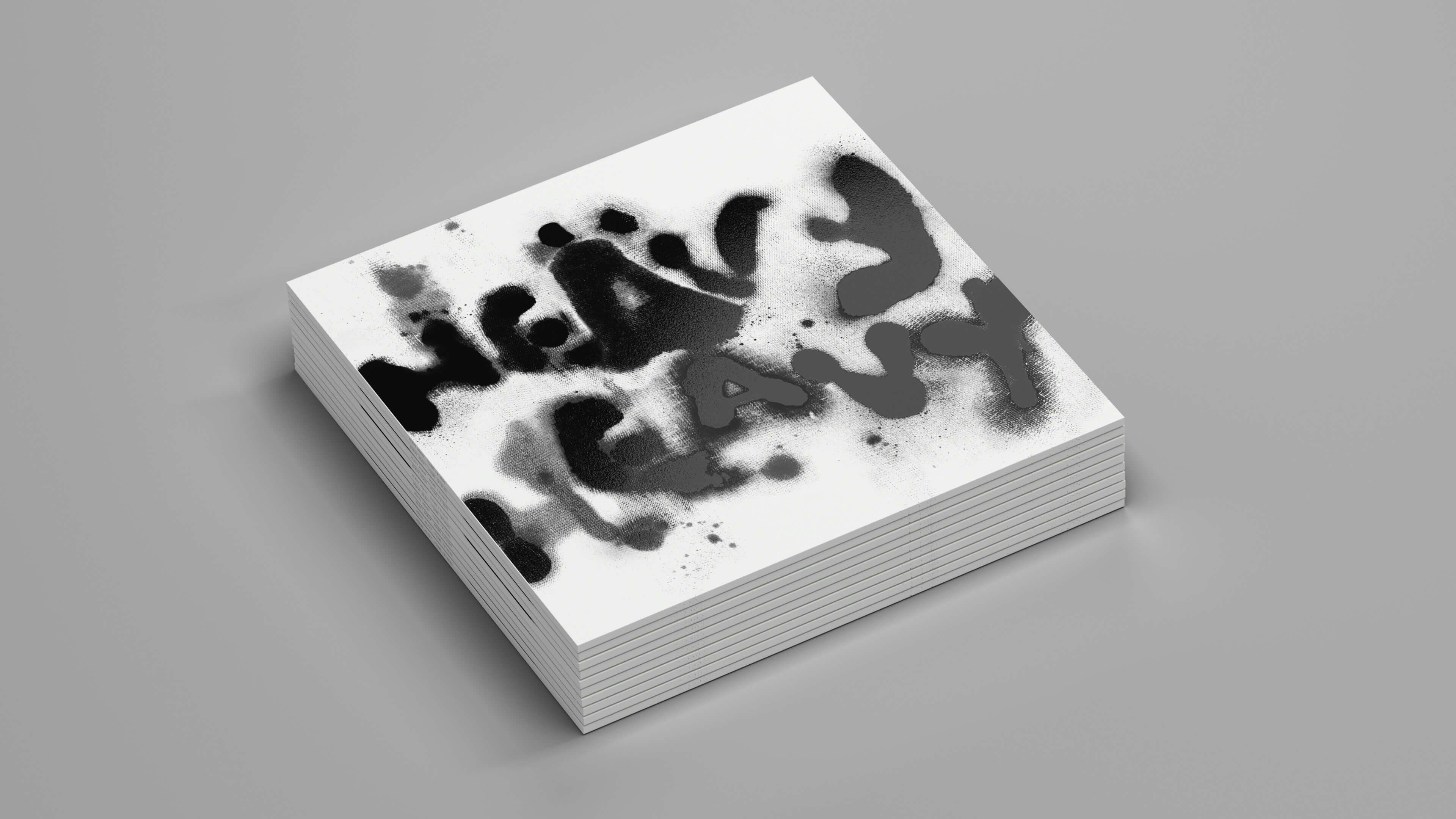
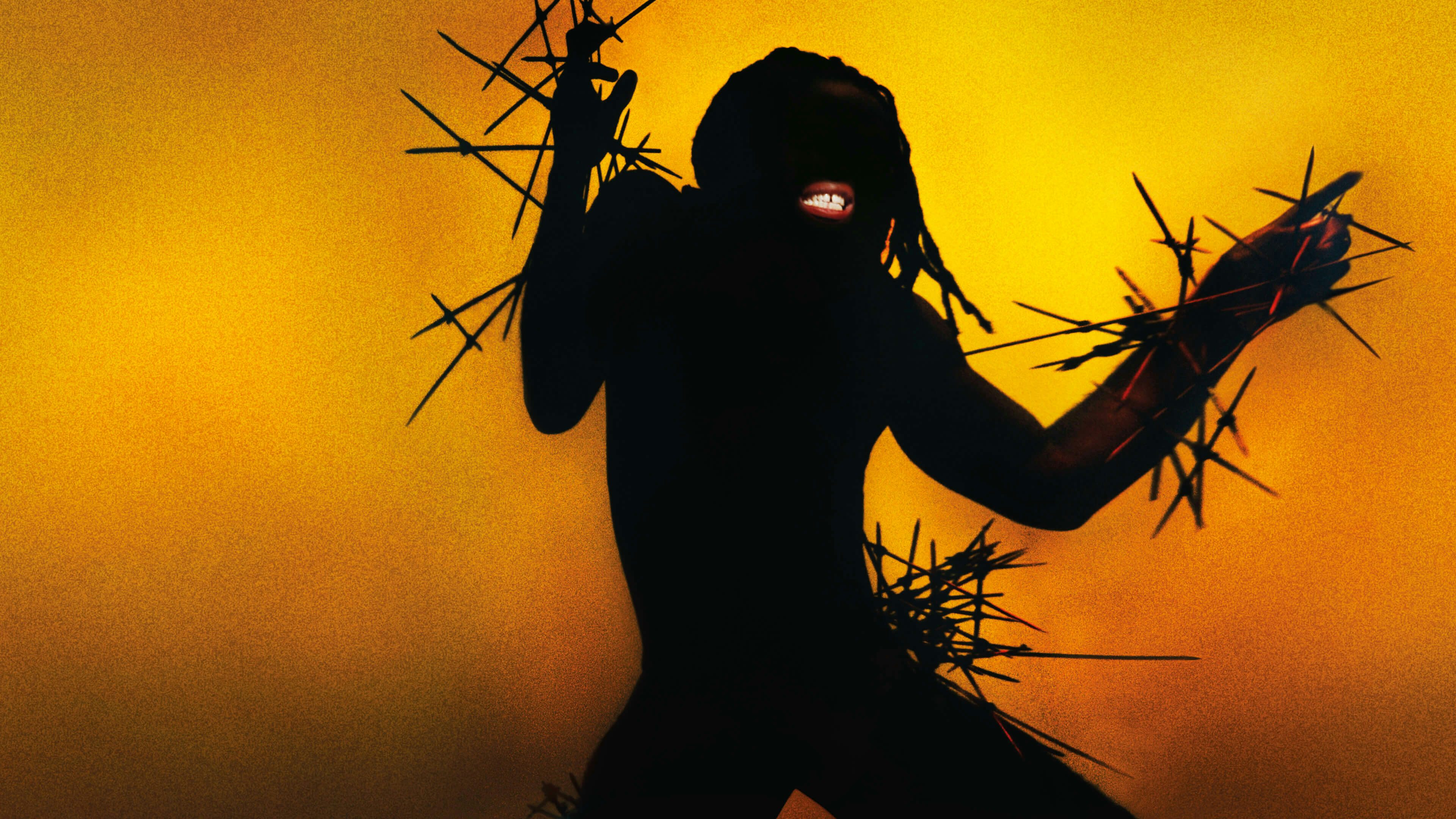
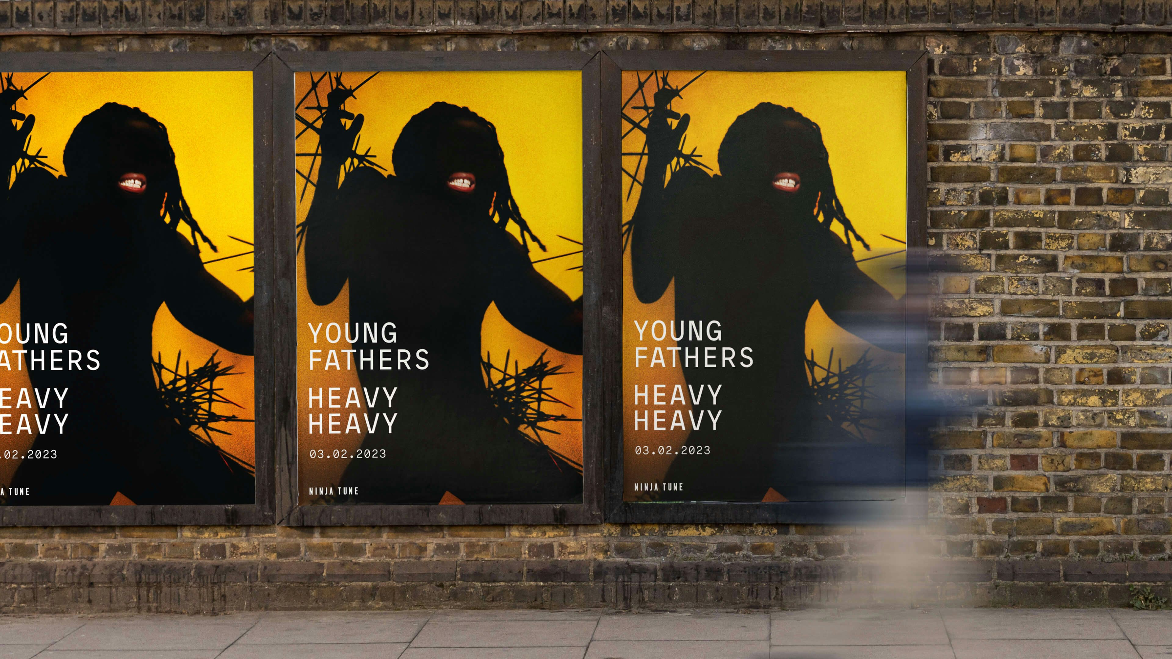
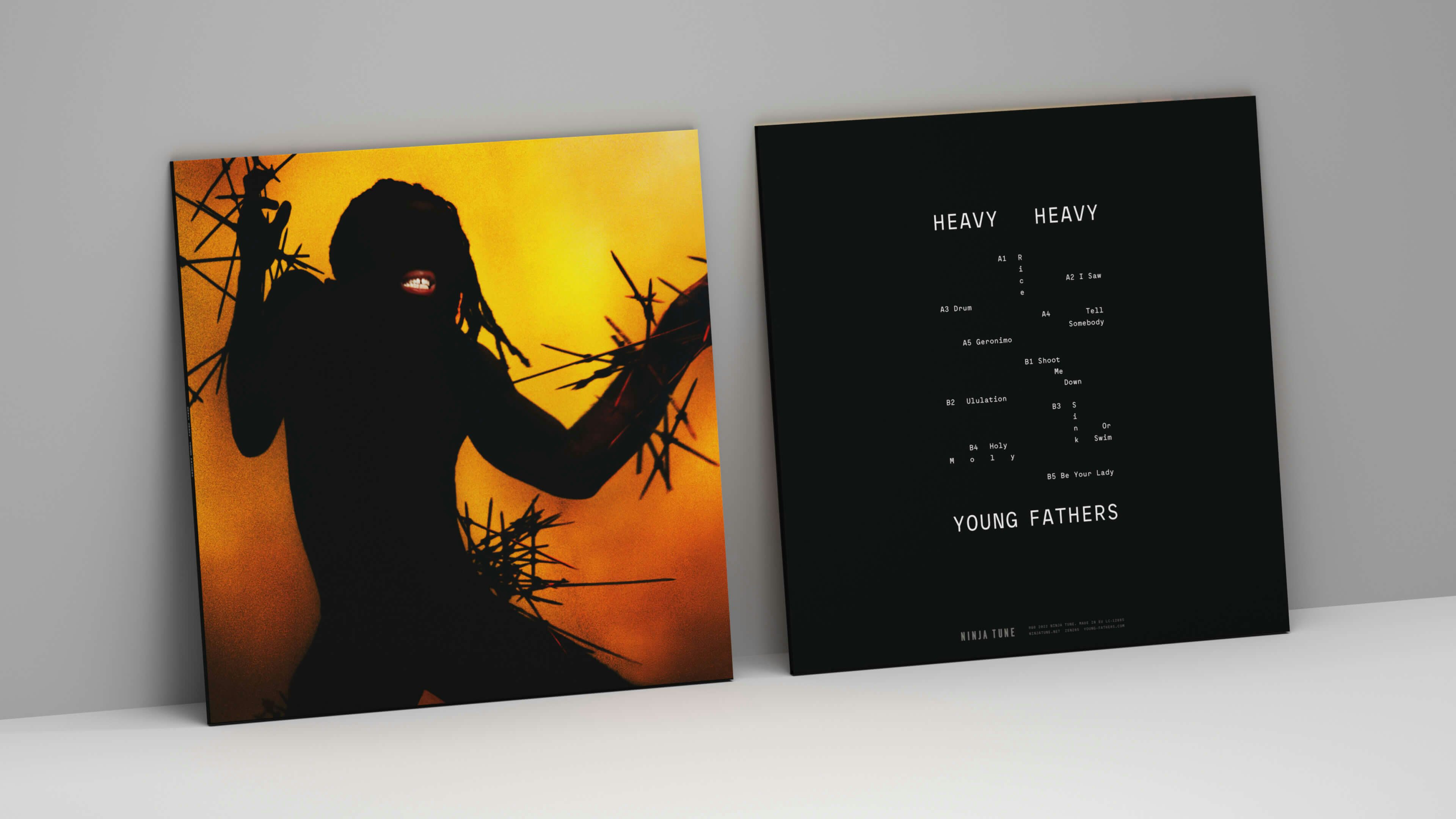
The beating heart of the album artwork is a distinctive character whose features are mostly obscured except for the mouth. His appearance is influenced by the Nkisi figure found in several west and central African cultures, which is broadly said to have powerful spiritual capabilities that many believe can banish evil and usher in good fortunes for the community. Traditionally made out of wood and metal, the figure “looks brutal at first glance because it’s covered in nails, however when you reach deeper, past surface level those nails represent the collected wishes from the village. So in this sense it forms a symbol of hope and community.
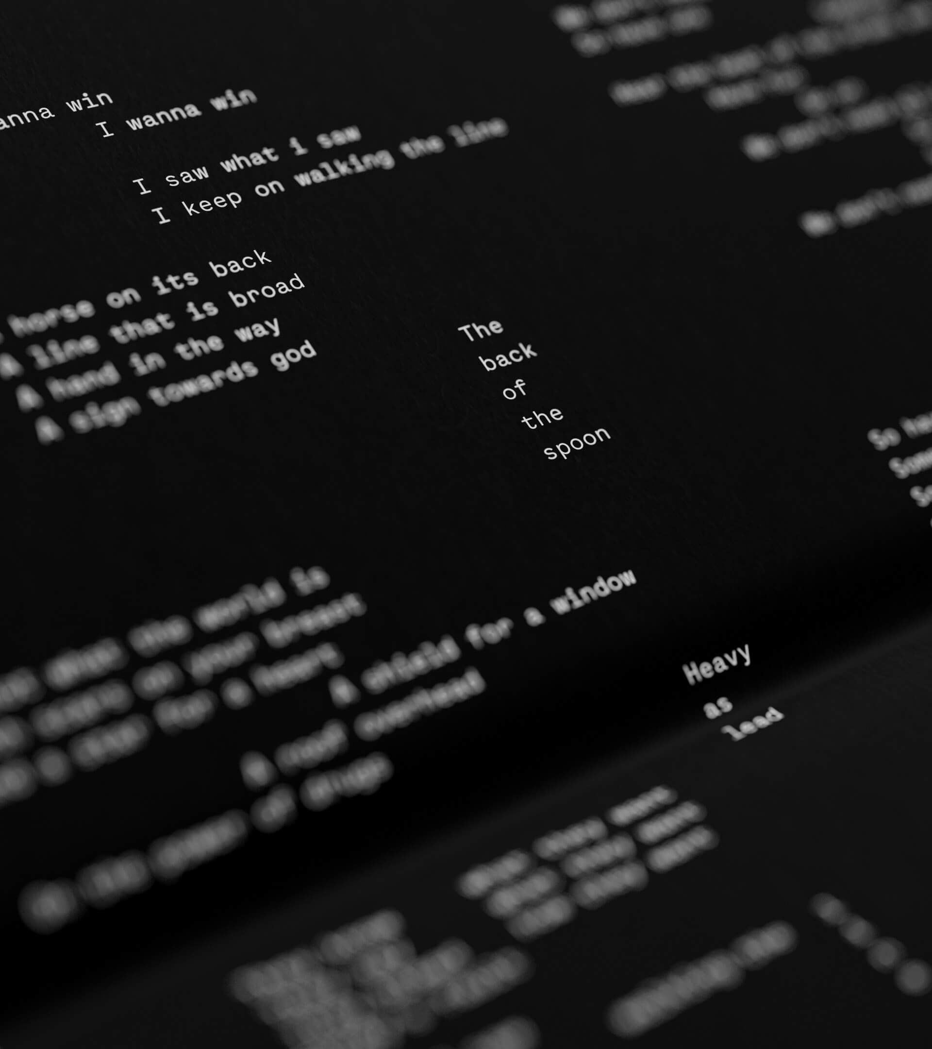
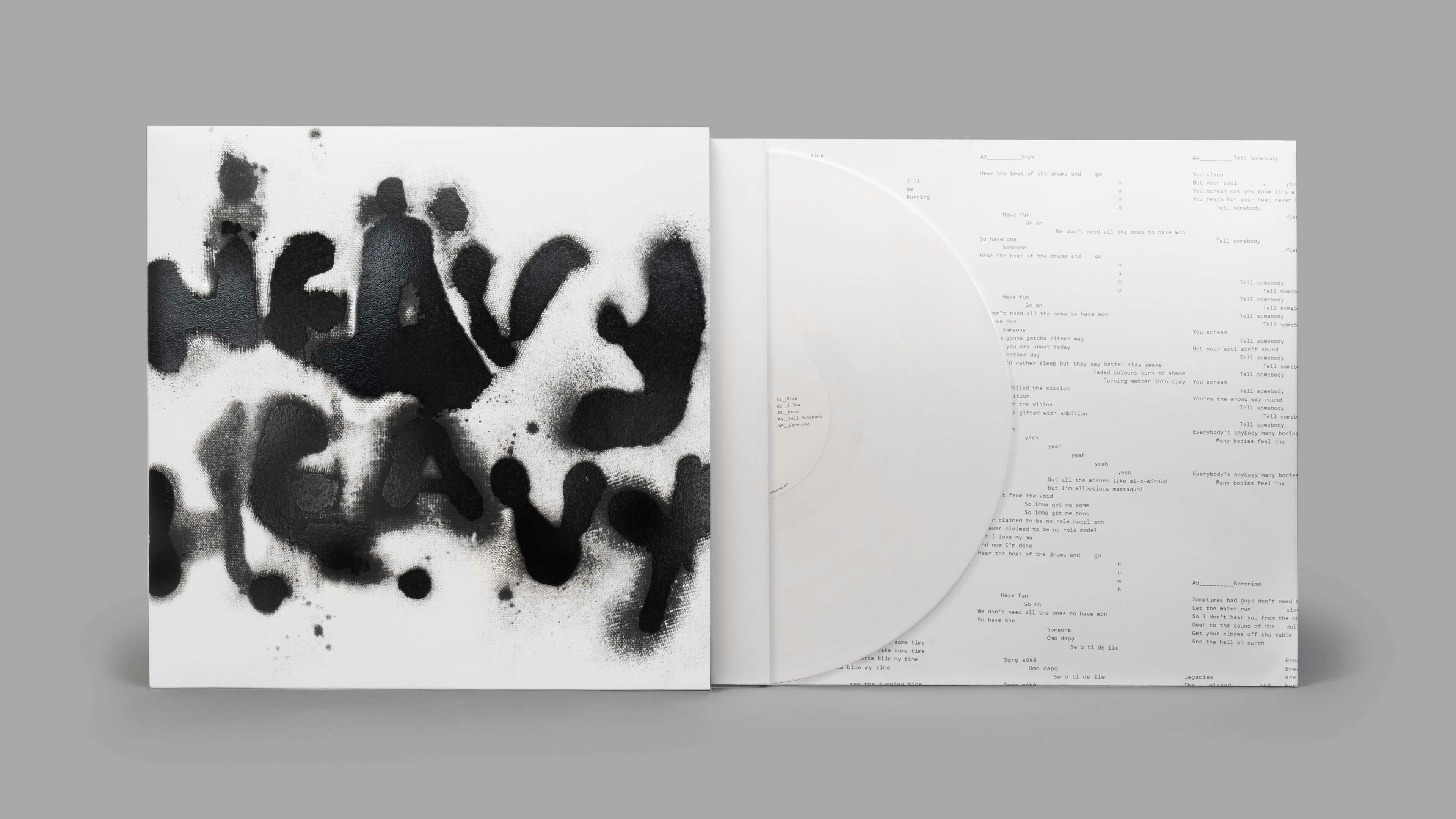
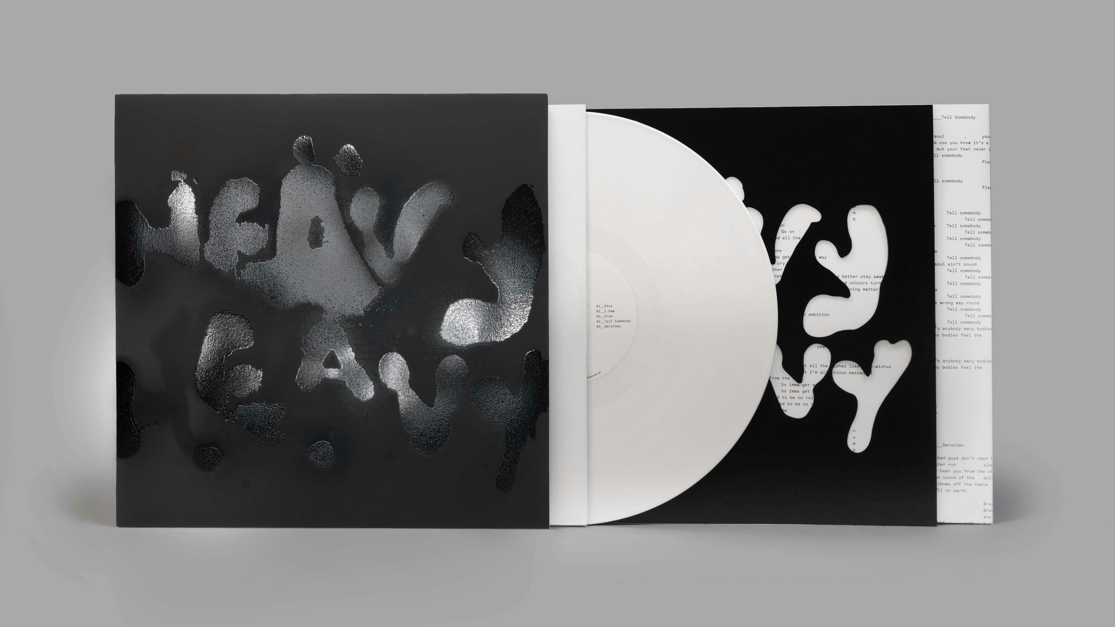
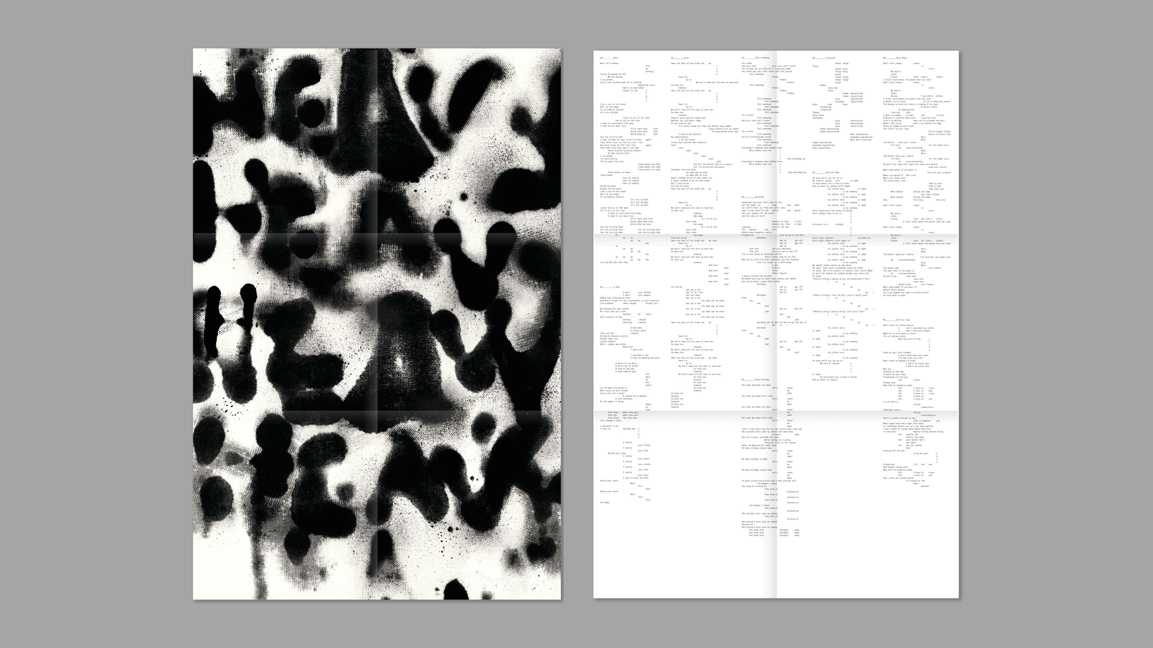
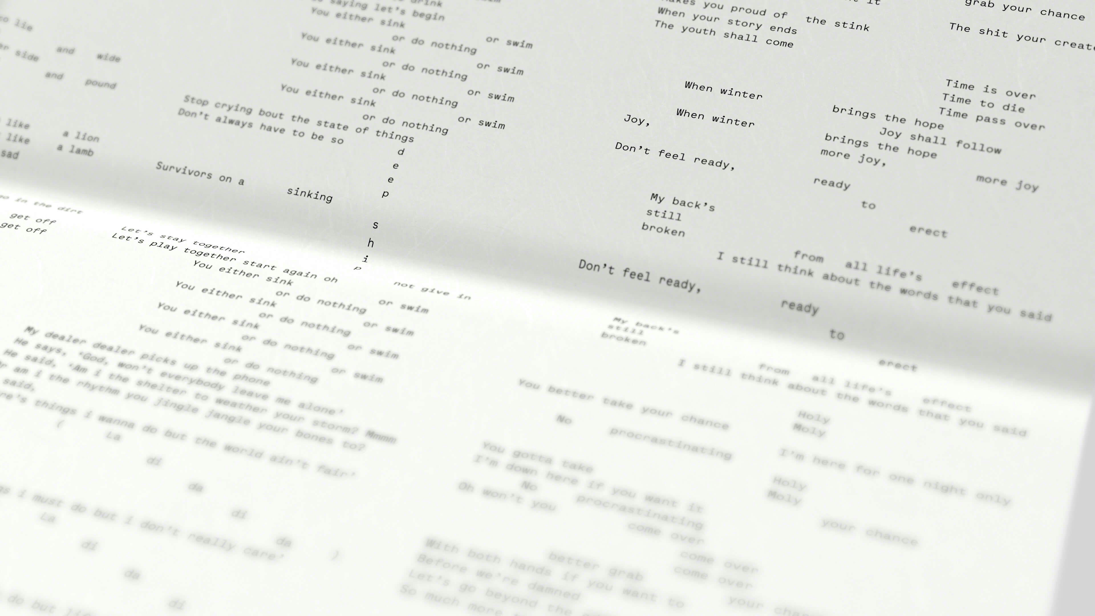
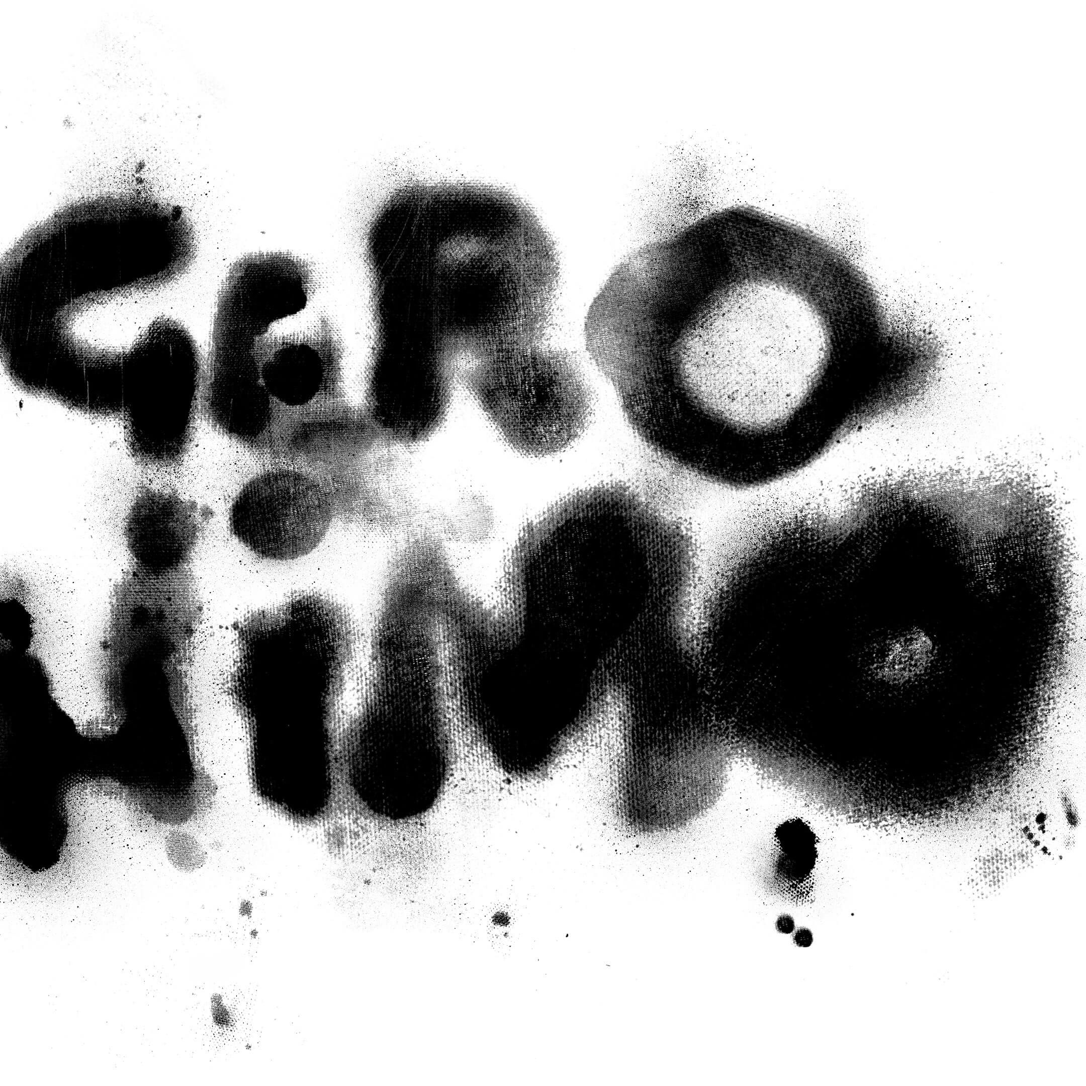
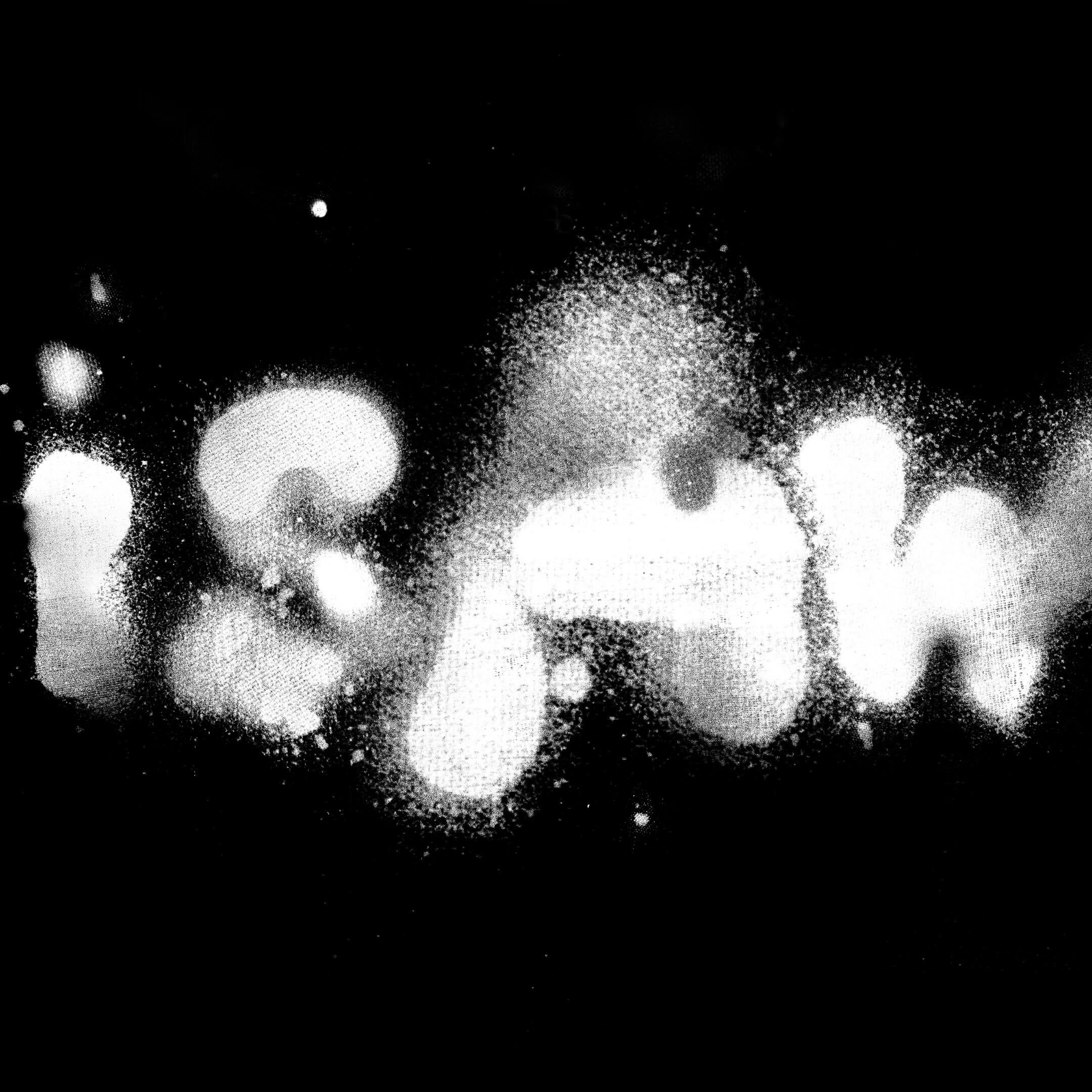
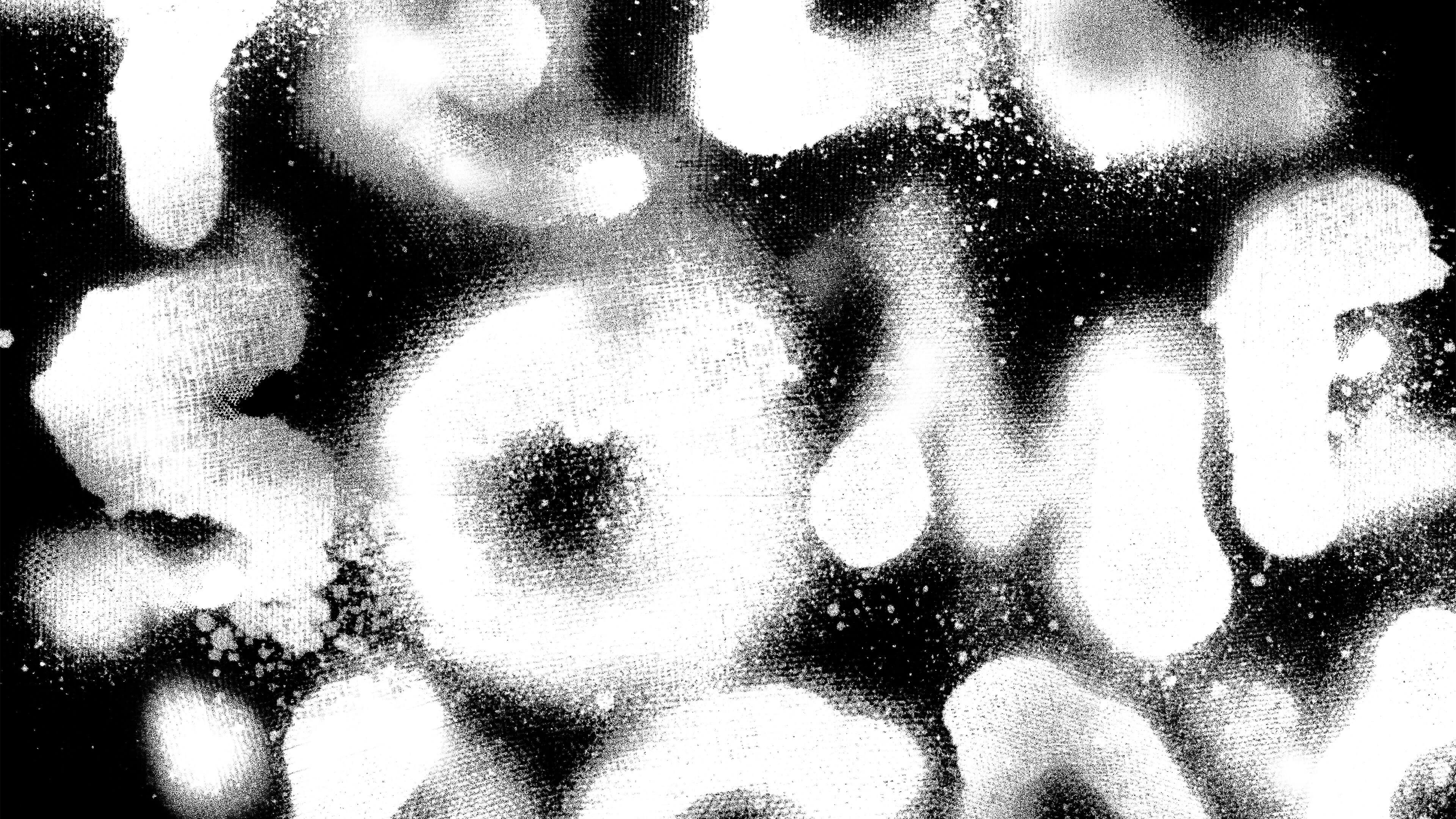
The release includes two deluxe editions. Intended as a a typographic extension of the main album character, both feature varying combinations of black and white ink onto contrasting board stocks. Painted by brush and by hand, lyrics, slogans and track titles evoke the raw, primal energy of the music – creating a very gestural language. We wanted the type itself to embody a physical substance, texture – and to feel as if it had been painted directly onto the sleeve using contrasting layers and ink finishes.
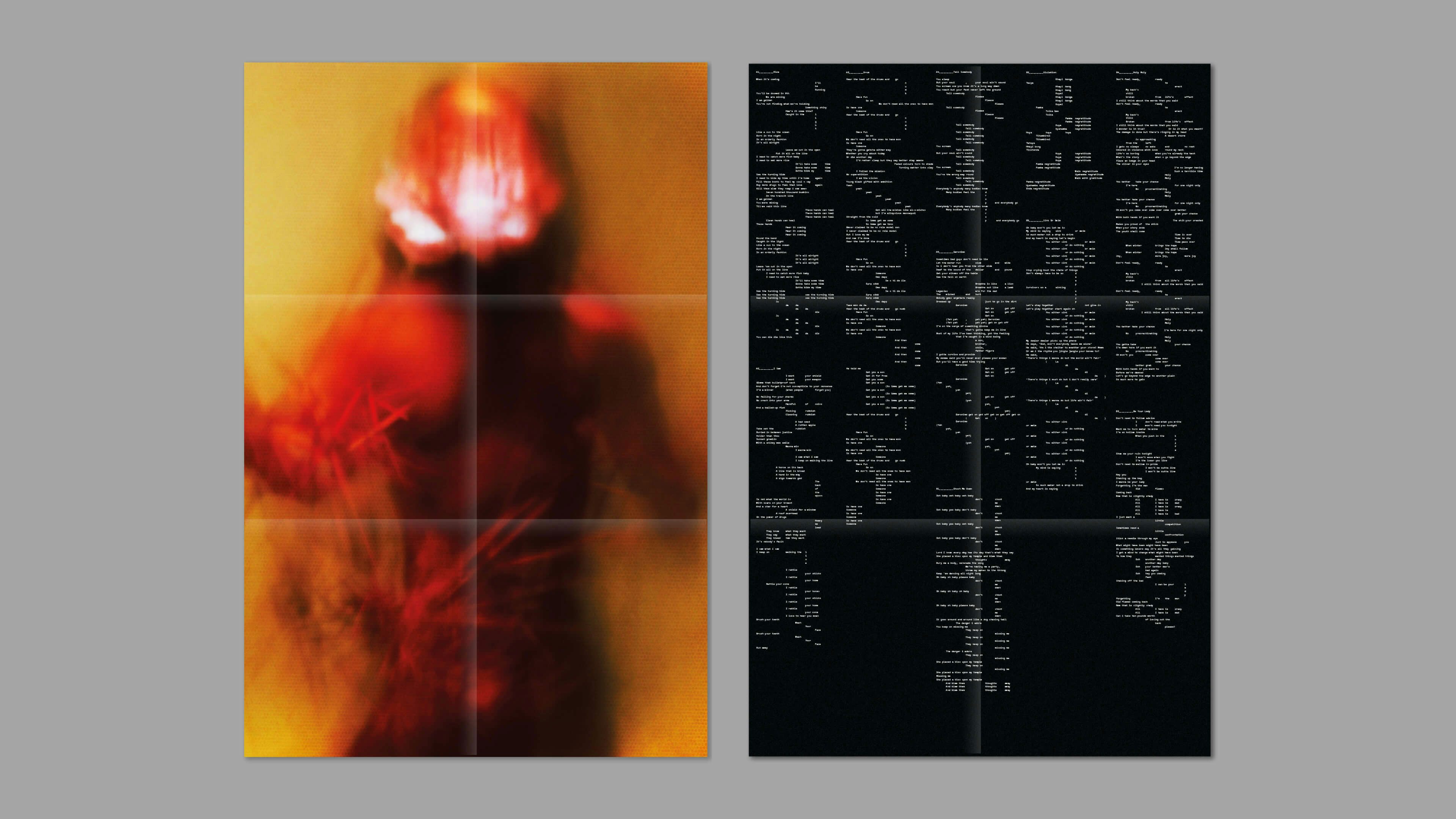
The release includes two deluxe editions. Intended as a a typographic extension of the main album character, both feature varying combinations of black and white ink onto contrasting board stocks. Painted by brush and by hand, lyrics, slogans and track titles evoke the raw, primal energy of the music – creating a very gestural language. We wanted the type itself to embody a physical substance, texture – and to feel as if it had been painted directly onto the sleeve using contrasting layers and ink finishes.