Ridley Scott Associates
Defining the Next Chapter
- Brand Identity
- CGI / Animation
- Film
Recent years of expansion within the Ridley Scott Creative Group initiated an opportunity to recalibrate and distil the essence of the RSA Films brand – to define its voice and purpose for the next chapter of evolution.
Taking an industry icon and reimagining it at a time of unprecedented change in visual communications, was a challenge that required expertise in creating a digital first brand. The new identity had to be future proofed to reflect the organisation’s bold ambitions, whilst instilling the values of craft, excellence and the humanist qualities synonymous with the RSA name.
Working closely with the founding family, HS created a new identity system for the organisation.
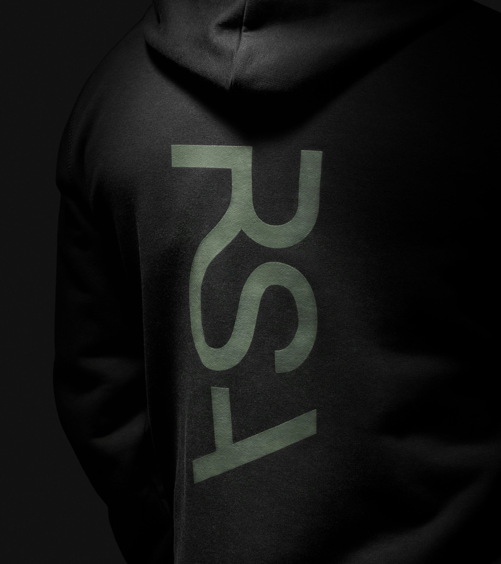
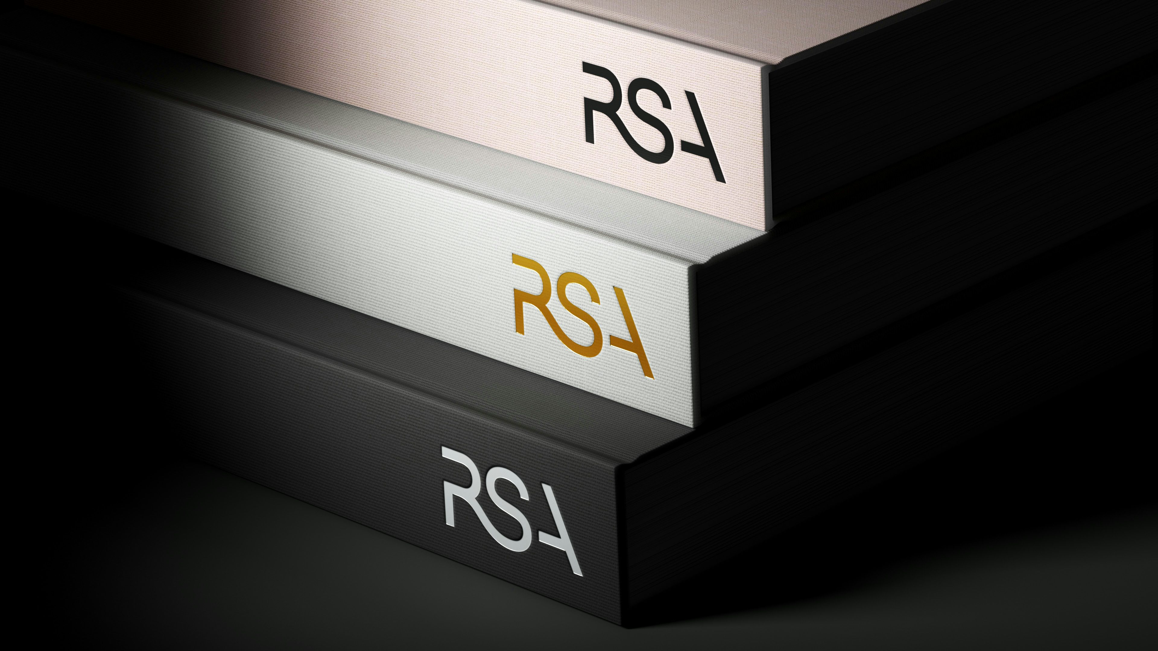
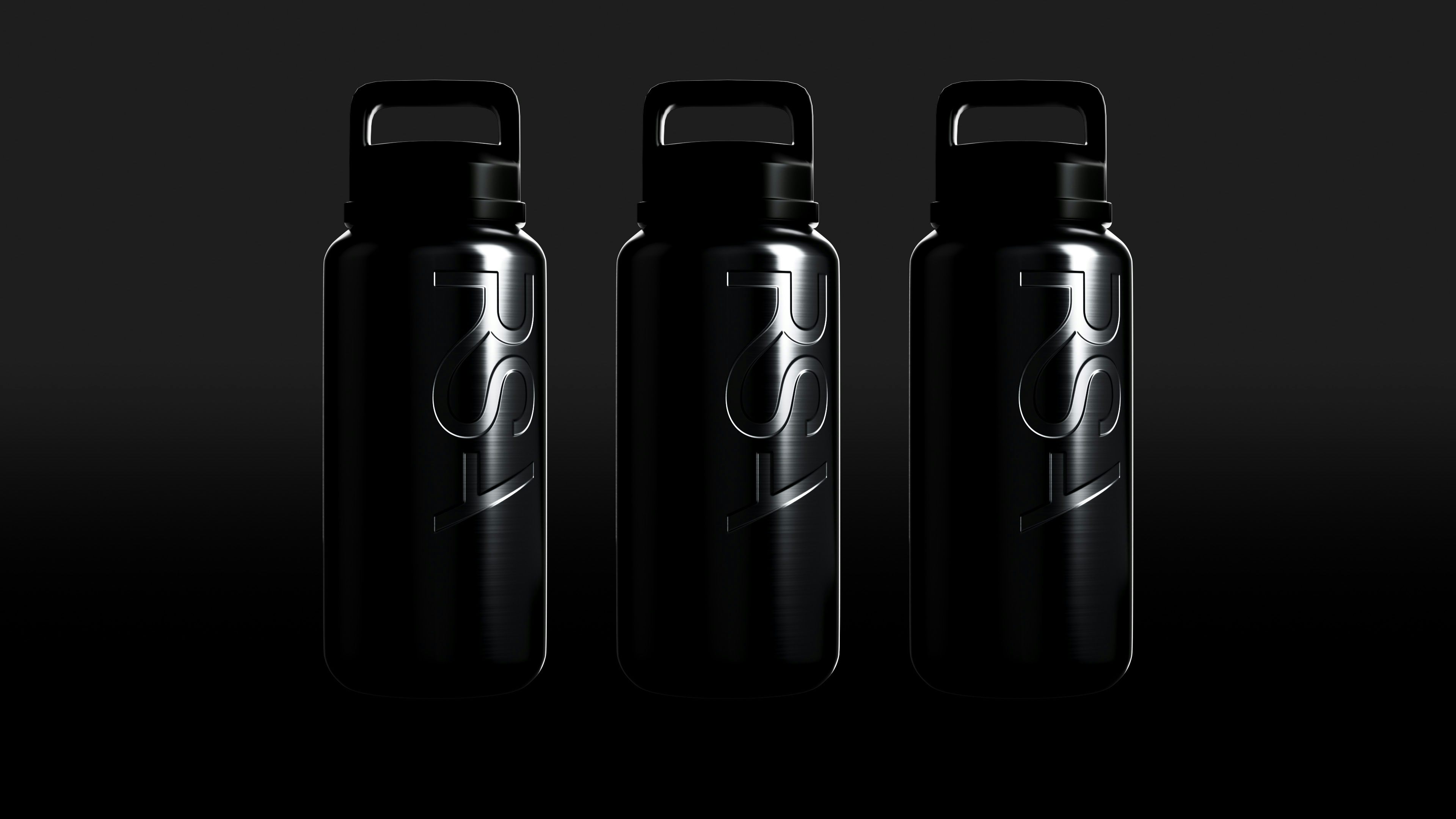
At the heart of the identity is a bespoke wordmark, a contemporary, sans serif ligature that unifies the three letters, firmly establishing the notion of collaboration and connection within the group. The new wordmark performs seamlessly at scale in digital and physical environments – from onscreen idents and user interfaces, to signage and merchandise.
HS then defined a principle based system that would allow the new RSA brand to be flexible – creating a framework through which they can evolve and create the building blocks for the future. This typographic framework needed to encompass the existing stable of subsidiaries within the group, but more importantly, serve as a long-term attribute, as the organisation and its associated entities evolve into the next decade and beyond.
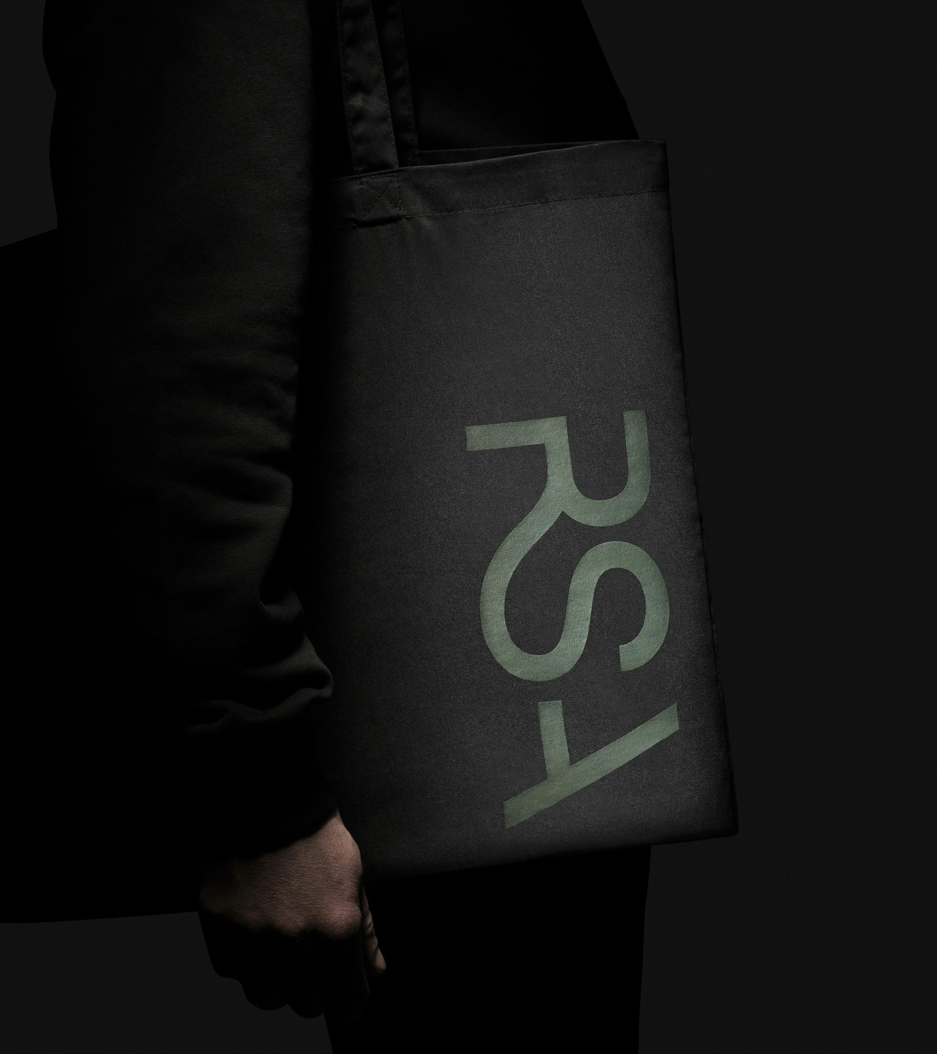